第 9 章 Basic Machine Learning
Machine learning is a very broad topic and a highly active research area. In the life sciences, much of what is described as “precision medicine” is an application of machine learning to biomedical data. The general idea is to predict or discover outcomes from measured predictors. Can we discover new types of cancer from gene expression profiles? Can we predict drug response from a series of genotypes? Here we give a very brief introduction to two major machine learning components: clustering and class prediction. There are many good resources to learn more about machine learning, for example the excellent textbook The Elements of Statistical Learning: Data Mining, Inference, and Prediction, by Trevor Hastie, Robert Tibshirani and Jerome Friedman. A free PDF of this book can be found here.
9.1 Clustering
We will demonstrate the concepts and code needed to perform clustering analysis with the tissue gene expression data:
library(tissuesGeneExpression)
data(tissuesGeneExpression)
To illustrate the main application of clustering in the life sciences, let’s pretend that we don’t know these are different tissues and are interested in clustering. The first step is to compute the distance between each sample:
d <- dist( t(e) )9.1.0.1 Hierarchical clustering
With the distance between each pair of samples computed, we need clustering algorithms to join them into groups. Hierarchical clustering is one of the many clustering algorithms available to do this. Each sample is assigned to its own group and then the algorithm continues iteratively, joining the two most similar clusters at each step, and continuing until there is just one group. While we have defined distances between samples, we have not yet defined distances between groups. There are various ways this can be done and they all rely on the individual pairwise distances. The helpfile for hclust includes detailed information.
We can perform hierarchical clustering based on the distances defined above using the hclust function. This function returns an hclust object that describes the groupings that were created using the algorithm described above. The plot method represents these relationships with a tree or dendrogram:
library(rafalib)
mypar()
hc <- hclust(d)
hc
##
## Call:
## hclust(d = d)
##
## Cluster method : complete
## Distance : euclidean
## Number of objects: 189plot(hc,labels=tissue,cex=0.5)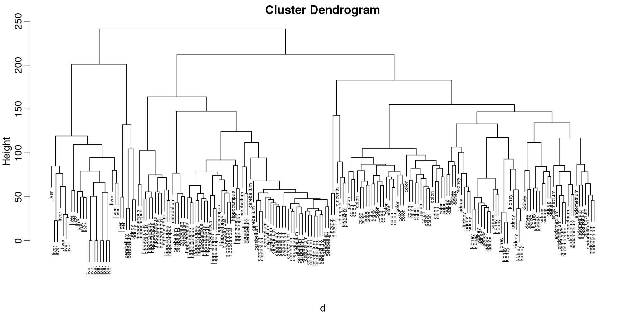
图 9.1: Dendrogram showing hierarchical clustering of tissue gene expression data.
Does this technique “discover” the clusters defined by the different tissues? In this plot, it is not easy to see the different tissues so we add colors by using the myplclust function from the rafalib package.
myplclust(hc, labels=tissue, lab.col=as.fumeric(tissue), cex=0.5)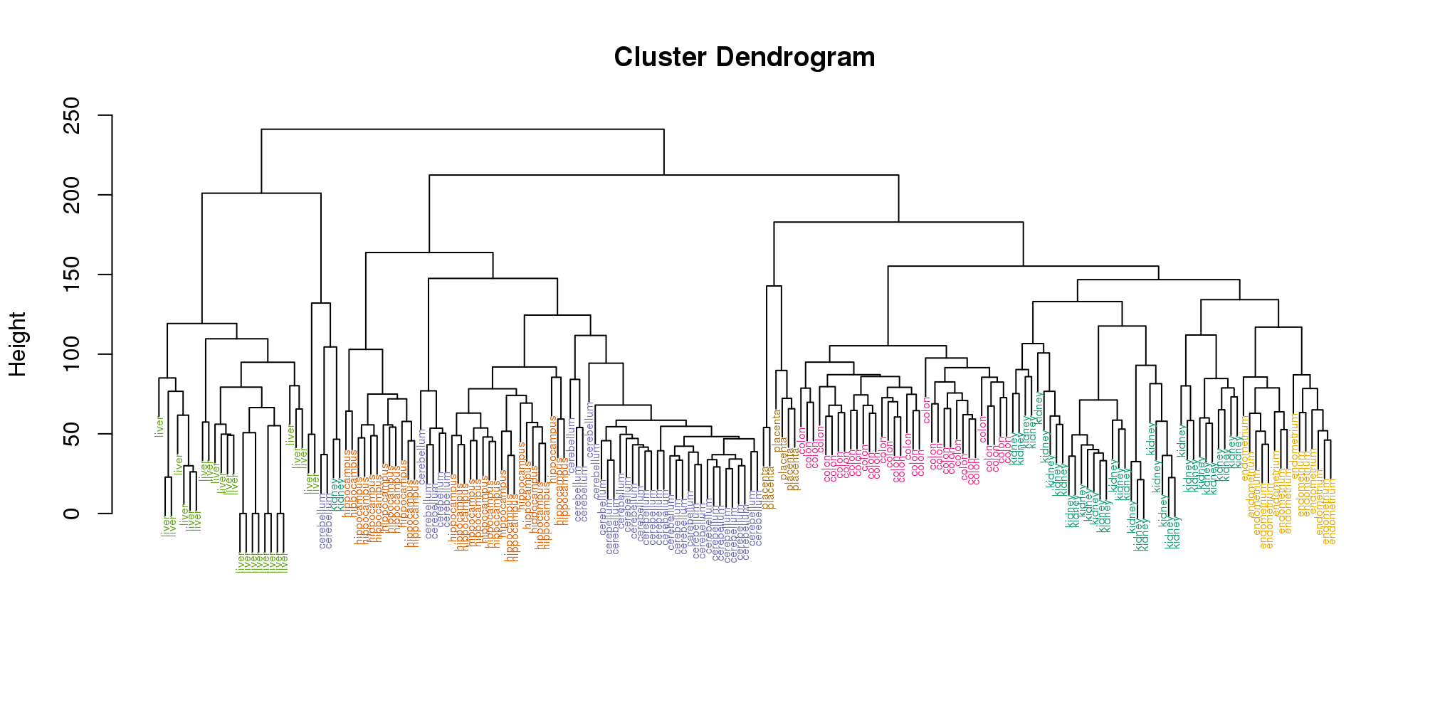
(#fig:color_dendrogram)Dendrogram showing hierarchical clustering of tissue gene expression data with colors denoting tissues.
Visually, it does seem as if the clustering technique has discovered the tissues. However, hierarchical clustering does not define specific clusters, but rather defines the dendrogram above. From the dendrogram we can decipher the distance between any two groups by looking at the height at which the two groups split into two. To define clusters, we need to “cut the tree” at some distance and group all samples that are within that distance into groups below. To visualize this, we draw a horizontal line at the height we wish to cut and this defines that line. We use 120 as an example:
myplclust(hc, labels=tissue, lab.col=as.fumeric(tissue),cex=0.5)
abline(h=120)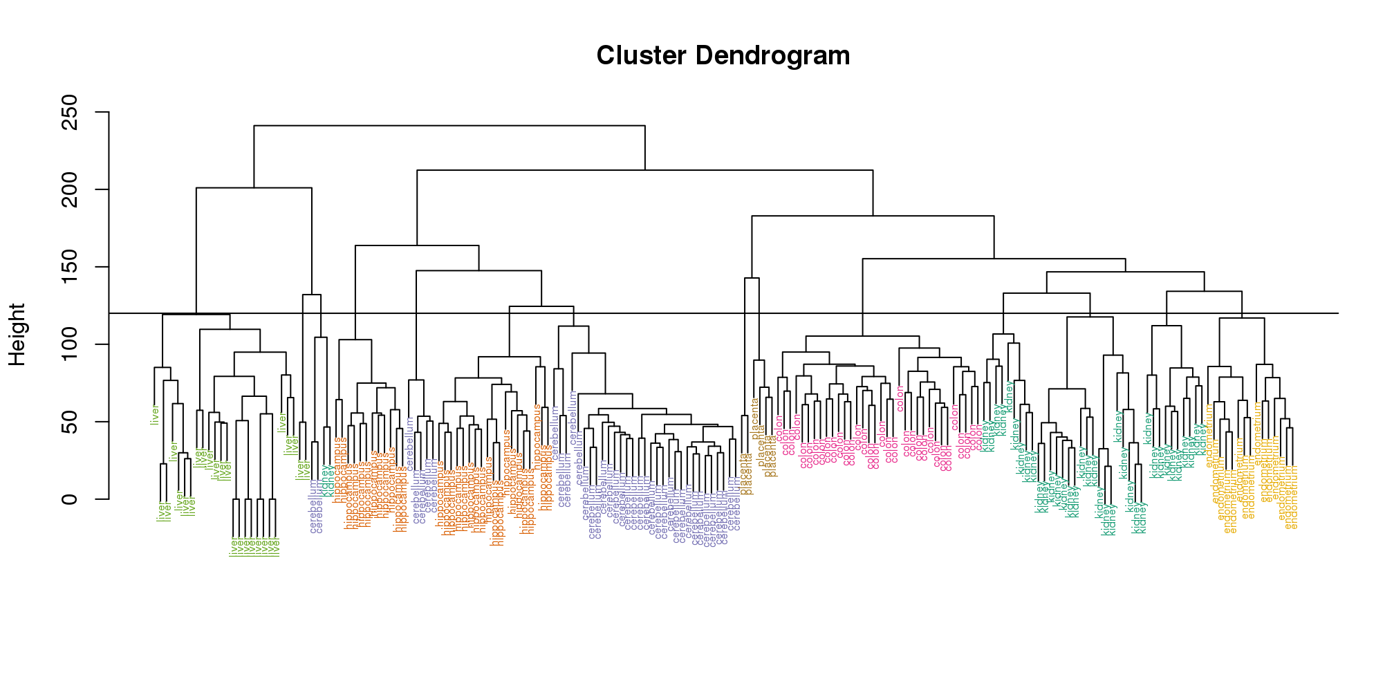
(#fig:color_dendrogram2)Dendrogram showing hierarchical clustering of tissue gene expression data with colors denoting tissues. Horizontal line defines actual clusters.
If we use the line above to cut the tree into clusters, we can examine how the clusters overlap with the actual tissues:
hclusters <- cutree(hc, h=120)
table(true=tissue, cluster=hclusters)
## cluster
## true 1 2 3 4 5 6 7 8 9 10 11 12 13
## cerebellum 0 0 0 0 31 0 0 0 2 0 0 5 0
## colon 0 0 0 0 0 0 34 0 0 0 0 0 0
## endometrium 0 0 0 0 0 0 0 0 0 0 15 0 0
## hippocampus 0 0 12 19 0 0 0 0 0 0 0 0 0
## kidney 9 18 0 0 0 10 0 0 2 0 0 0 0
## liver 0 0 0 0 0 0 0 24 0 2 0 0 0
## placenta 0 0 0 0 0 0 0 0 0 0 0 0 2
## cluster
## true 14
## cerebellum 0
## colon 0
## endometrium 0
## hippocampus 0
## kidney 0
## liver 0
## placenta 4We can also ask cutree to give us back a given number of clusters. The function then automatically finds the height that results in the requested number of clusters:
hclusters <- cutree(hc, k=8)
table(true=tissue, cluster=hclusters)
## cluster
## true 1 2 3 4 5 6 7 8
## cerebellum 0 0 31 0 0 2 5 0
## colon 0 0 0 34 0 0 0 0
## endometrium 15 0 0 0 0 0 0 0
## hippocampus 0 12 19 0 0 0 0 0
## kidney 37 0 0 0 0 2 0 0
## liver 0 0 0 0 24 2 0 0
## placenta 0 0 0 0 0 0 0 6In both cases we do see that, with some exceptions, each tissue is uniquely represented by one of the clusters. In some instances, the one tissue is spread across two tissues, which is due to selecting too many clusters. Selecting the number of clusters is generally a challenging step in practice and an active area of research.
9.1.0.2 K-means
We can also cluster with the kmeans function to perform k-means clustering. As an example, let’s run k-means on the samples in the space of the first two genes:
set.seed(1)
km <- kmeans(t(e[1:2,]), centers=7)
names(km)
## [1] "cluster" "centers" "totss"
## [4] "withinss" "tot.withinss" "betweenss"
## [7] "size" "iter" "ifault"mypar(1,2)
plot(e[1,], e[2,], col=as.fumeric(tissue), pch=16)
plot(e[1,], e[2,], col=km$cluster, pch=16)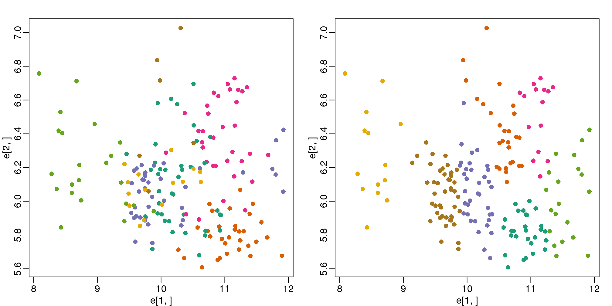
图 9.2: Plot of gene expression for first two genes (order of appearance in data) with color representing tissue (left) and clusters found with kmeans (right).
In the first plot, color represents the actual tissues, while in the second, color represents the clusters that were defined by kmeans. We can see from tabulating the results that this particular clustering exercise did not perform well:
table(true=tissue,cluster=km$cluster)## cluster
## true 1 2 3 4 5 6 7
## cerebellum 0 1 8 0 6 0 23
## colon 2 11 2 15 4 0 0
## endometrium 0 3 4 0 0 0 8
## hippocampus 19 0 2 0 10 0 0
## kidney 7 8 20 0 0 0 4
## liver 0 0 0 0 0 18 8
## placenta 0 4 0 0 0 0 2This is very likely due to the fact that the first two genes are not informative regarding tissue type. We can see this in the first plot above. If we instead perform k-means clustering using all of the genes, we obtain a much improved result. To visualize this, we can use an MDS plot:
km <- kmeans(t(e), centers=7)
mds <- cmdscale(d)

mypar(1,2)
plot(mds[,1], mds[,2])
plot(mds[,1], mds[,2], col=km$cluster, pch=16)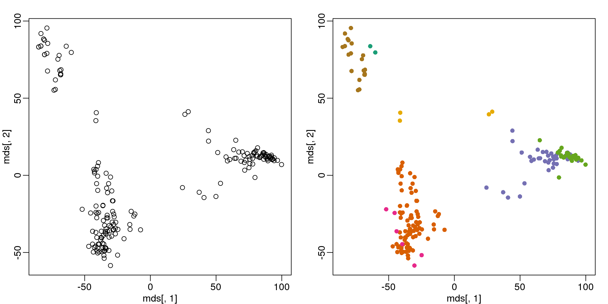
(#fig:kmeans_mds)Plot of gene expression for first two PCs with color representing tissues (left) and clusters found using all genes (right).
By tabulating the results, we see that we obtain a similar answer to that obtained with hierarchical clustering.
table(true=tissue,cluster=km$cluster)## cluster
## true 1 2 3 4 5 6 7
## cerebellum 0 0 5 0 31 2 0
## colon 0 34 0 0 0 0 0
## endometrium 0 15 0 0 0 0 0
## hippocampus 0 0 31 0 0 0 0
## kidney 0 37 0 0 0 2 0
## liver 2 0 0 0 0 0 24
## placenta 0 0 0 6 0 0 09.1.0.3 Heatmaps
Heatmaps are ubiquitous in the genomics literature. They are very useful plots for visualizing the measurements for a subset of rows over all the samples. A dendrogram is added on top and on the side that is created with hierarchical clustering. We will demonstrate how to create heatmaps from within R. Let’s begin by defining a color palette:
library(RColorBrewer)
hmcol <- colorRampPalette(brewer.pal(9, "GnBu"))(100)
Now, pick the genes with the top variance over all samples:
library(genefilter)
rv <- rowVars(e)
idx <- order(-rv)[1:40]
While a heatmap function is included in R, we recommend the heatmap.2 function from the gplots package on CRAN because it is a bit more customized. For example, it stretches to fill the window. Here we add colors to indicate the tissue on the top:
library(gplots) ##Available from CRAN
cols <- palette(brewer.pal(8, "Dark2"))[as.fumeric(tissue)]
head(cbind(colnames(e),cols))
## cols
## [1,] "GSM11805.CEL.gz" "#1B9E77"
## [2,] "GSM11814.CEL.gz" "#1B9E77"
## [3,] "GSM11823.CEL.gz" "#1B9E77"
## [4,] "GSM11830.CEL.gz" "#1B9E77"
## [5,] "GSM12067.CEL.gz" "#1B9E77"
## [6,] "GSM12075.CEL.gz" "#1B9E77"heatmap.2(e[idx,], labCol=tissue,
trace="none",
ColSideColors=cols,
col=hmcol)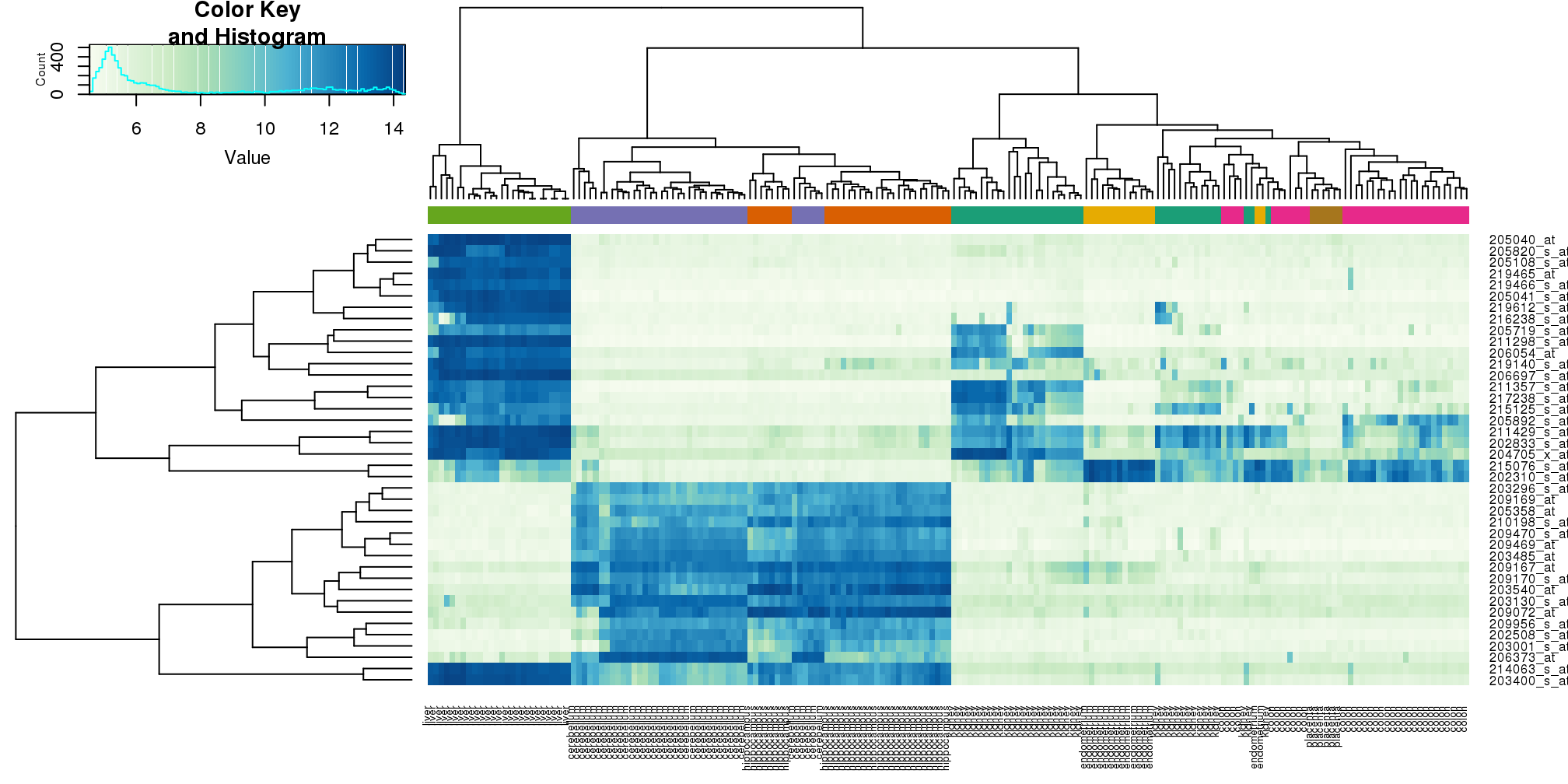
(#fig:heatmap.2)Heatmap created using the 40 most variable genes and the function heatmap.2.
We did not use tissue information to create this heatmap, and we can quickly see, with just 40 genes, good separation across tissues.
9.2 Conditional Probabilities and Expectations
Prediction problems can be divided into categorical and continuous outcomes. However, many of the algorithms can be applied to both due to the connection between conditional probabilities and conditional expectations.
For categorical data, for example binary outcomes, if we know the probability of \(Y\) being any of the possible outcomes \(k\) given a set of predictors \(X=(X_1,\dots,X_p)^\top\),
\[ f_k(x) = \mbox{Pr}(Y=k \mid X=x) \]
we can optimize our predictions. Specifically, for any \(x\) we predict the \(k\) that has the largest probability \(f_k(x)\).
To simplify the exposition below, we will consider the case of binary data. You can think of the probability \(\mbox{Pr}(Y=1 \mid X=x)\) as the proportion of 1s in the stratum of the population for which \(X=x\). Given that the expectation is the average of all \(Y\) values, in this case the expectation is equivalent to the probability: \(f(x) \equiv \mbox{E}(Y \mid X=x)=\mbox{Pr}(Y=1 \mid X=x)\). We therefore use only the expectation in the descriptions below as it is more general.
In general, the expected value has an attractive mathematical property, which is that it minimizes the expected distance between the predictor \(\hat{Y}\) and \(Y\):
\[ \mbox{E}\{ (\hat{Y} - Y)^2 \mid X=x \} \]
9.2.0.1 Regression in the context of prediction
We use the son and father height example to illustrate how regression can be interpreted as a machine learning technique. In our example, we are trying to predict the son’s height \(Y\) based on the father’s \(X\). Here we have only one predictor. Now if we were asked to predict the height of a randomly selected son, we would go with the average height:
library(rafalib)
mypar(1,1)
data(father.son,package="UsingR")
x=round(father.son$fheight) ##round to nearest inch
y=round(father.son$sheight)
hist(y,breaks=seq(min(y),max(y)))
abline(v=mean(y),col="red",lwd=2)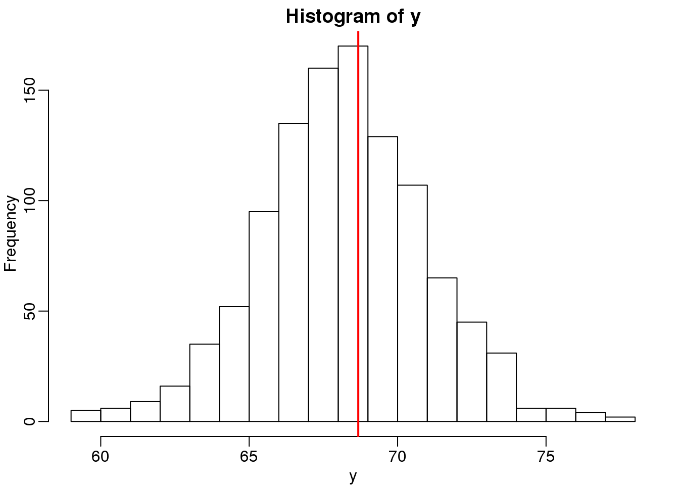
(#fig:height_hist)Histogram of son heights.
In this case, we can also approximate the distribution of \(Y\) as normal, which implies the mean maximizes the probability density.
Let’s imagine that we are given more information. We are told that the father of this randomly selected son has a height of 71 inches (1.25 SDs taller than the average). What is our prediction now?
mypar(1,2)
plot(x,y,xlab="Father's height in inches",ylab="Son's height in inches",
     main=paste("correlation =",signif(cor(x,y),2)))
abline(v=c(-0.35,0.35)+71,col="red")
hist(y[x==71],xlab="Heights",nc=8,main="",xlim=range(y))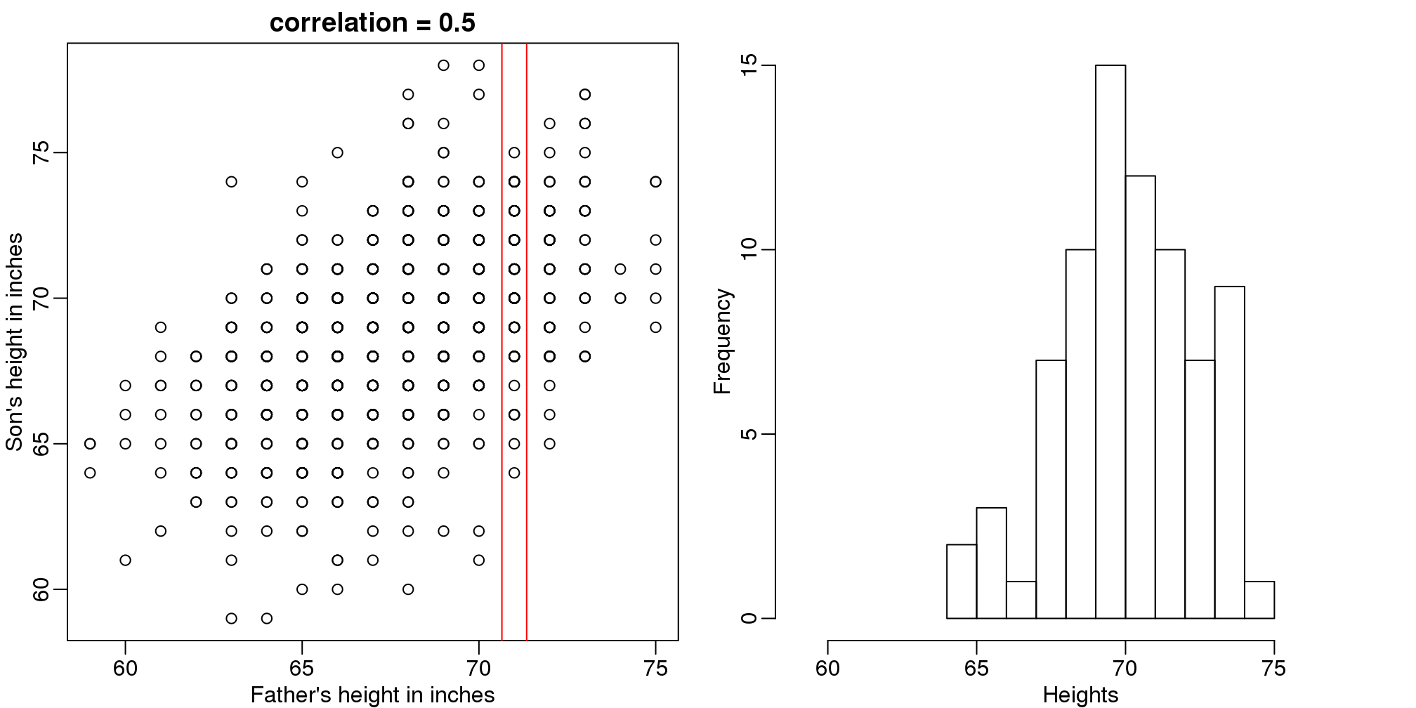
(#fig:conditional_distribution)Son versus father height (left) with the red lines denoting the stratum defined by conditioning on fathers being 71 inches tall. Conditional distribution: son height distribution of stratum defined by 71 inch fathers.
The best guess is still the expectation, but our strata has changed from all the data, to only the \(Y\) with \(X=71\). So we can stratify and take the average, which is the conditional expectation. Our prediction for any \(x\) is therefore:
\[ f(x) = E(Y \mid X=x) \]
It turns out that because this data is approximated by a bivariate normal distribution, using calculus, we can show that:
\[ f(x) = \mu_Y + \rho \frac{\sigma_Y}{\sigma_X} (X-\mu_X) \]
and if we estimate these five parameters from the sample, we get the regression line:
mypar(1,2)
plot(x,y,xlab="Father's height in inches",ylab="Son's height in inches",
     main=paste("correlation =",signif(cor(x,y),2)))
abline(v=c(-0.35,0.35)+71,col="red")

fit <- lm(y~x)
abline(fit,col=1)

hist(y[x==71],xlab="Heights",nc=8,main="",xlim=range(y))
abline(v = fit$coef[1] + fit$coef[2]*71, col=1)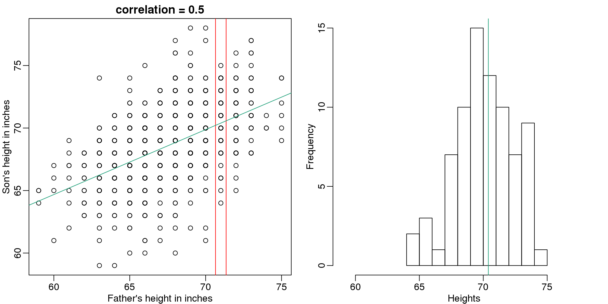
图 9.3: Son versus father height showing predicted heights based on regression line (left). Conditional distribution with vertical line representing regression prediction.
In this particular case, the regression line provides an optimal prediction function for \(Y\). But this is not generally true because, in the typical machine learning problems, the optimal \(f(x)\) is rarely a simple line.
9.3 Smoothing
Smoothing is a very powerful technique used all across data analysis. It is designed to estimate \(f(x)\) when the shape is unknown, but assumed to be smooth. The general idea is to group data points that are expected to have similar expectations and compute the average, or fit a simple parametric model. We illustrate two smoothing techniques using a gene expression example.
The following data are gene expression measurements from replicated RNA samples.
##Following three packages are available from Bioconductor
library(Biobase)
library(SpikeIn)
library(hgu95acdf)
## Warning: replacing previous import
## 'AnnotationDbi::tail' by 'utils::tail' when loading
## 'hgu95acdf'## Warning: replacing previous import
## 'AnnotationDbi::head' by 'utils::head' when loading
## 'hgu95acdf'data(SpikeIn95)We consider the data used in an MA-plot comparing two replicated samples (\(Y\) = log ratios and \(X\) = averages) and take down-sample in a way that balances the number of points for different strata of \(X\) (code not shown):
library(rafalib)
mypar()
plot(X,Y)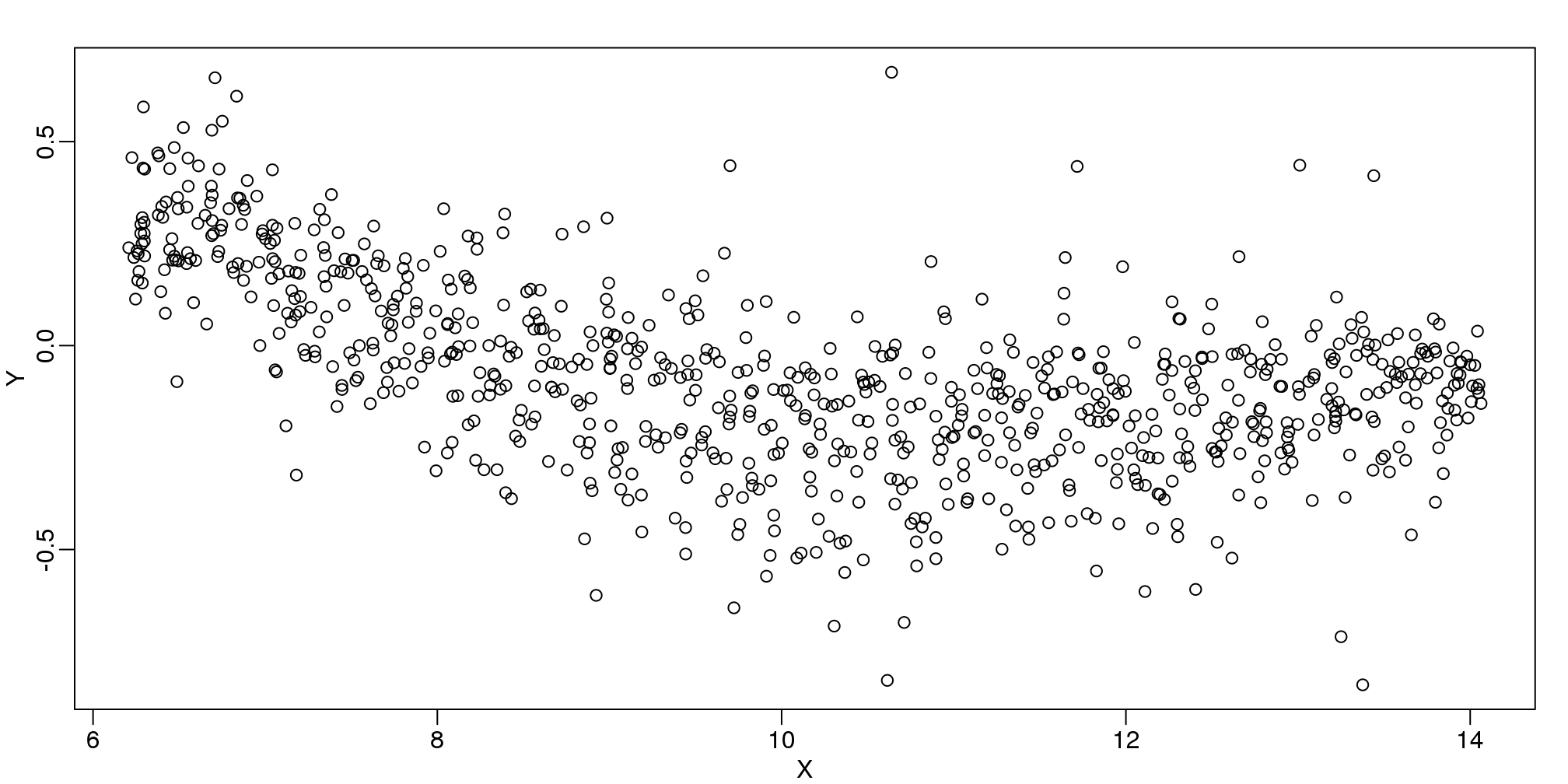
图 9.4: MA-plot comparing gene expression from two arrays.
In the MA plot we see that \(Y\) depends on \(X\). This dependence must be a bias because these are based on replicates, which means \(Y\) should be 0 on average regardless of \(X\). We want to predict \(f(x)=\mbox{E}(Y \mid X=x)\) so that we can remove this bias. Linear regression does not capture the apparent curvature in \(f(x)\):
mypar()
plot(X,Y)
fit <- lm(Y~X)
points(X,Y,pch=21,bg=ifelse(Y>fit$fitted,1,3))
abline(fit,col=2,lwd=4,lty=2)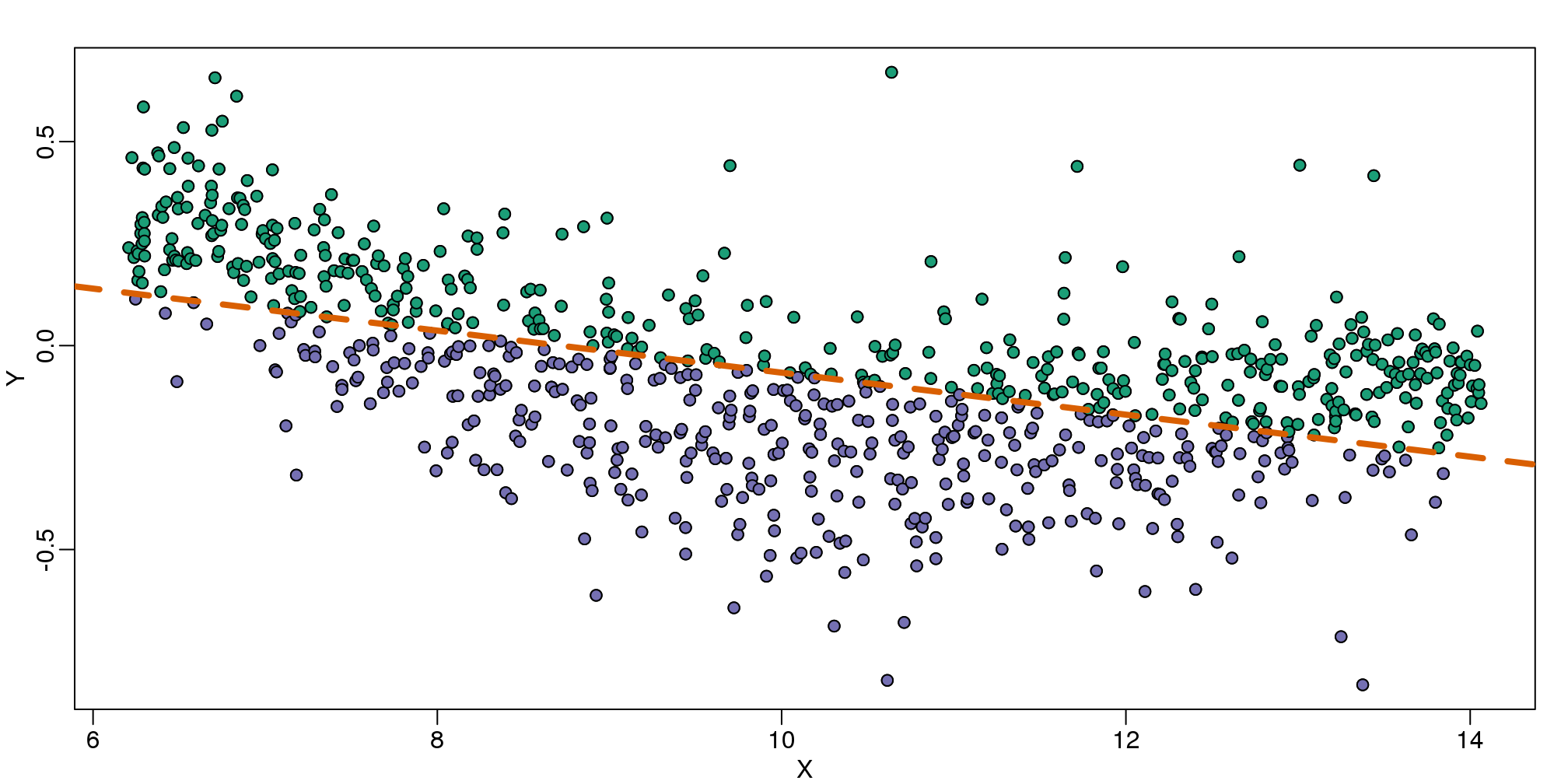
(#fig:MAplot_with_regression_line)MA-plot comparing gene expression from two arrays with fitted regression line. The two colors represent positive and negative residuals.
The points above the fitted line (green) and those below (purple) are not evenly distributed. We therefore need an alternative more flexible approach.
9.4 Bin Smoothing
Instead of fitting a line, let’s go back to the idea of stratifying and computing the mean. This is referred to as bin smoothing. The general idea is that the underlying curve is “smooth” enough so that, in small bins, the curve is approximately constant. If we assume the curve is constant, then all the \(Y\) in that bin have the same expected value. For example, in the plot below, we highlight points in a bin centered at 8.6, as well as the points of a bin centered at 12.1, if we use bins of size 1. We also show the fitted mean values for the \(Y\) in those bins with dashed lines (code not shown):
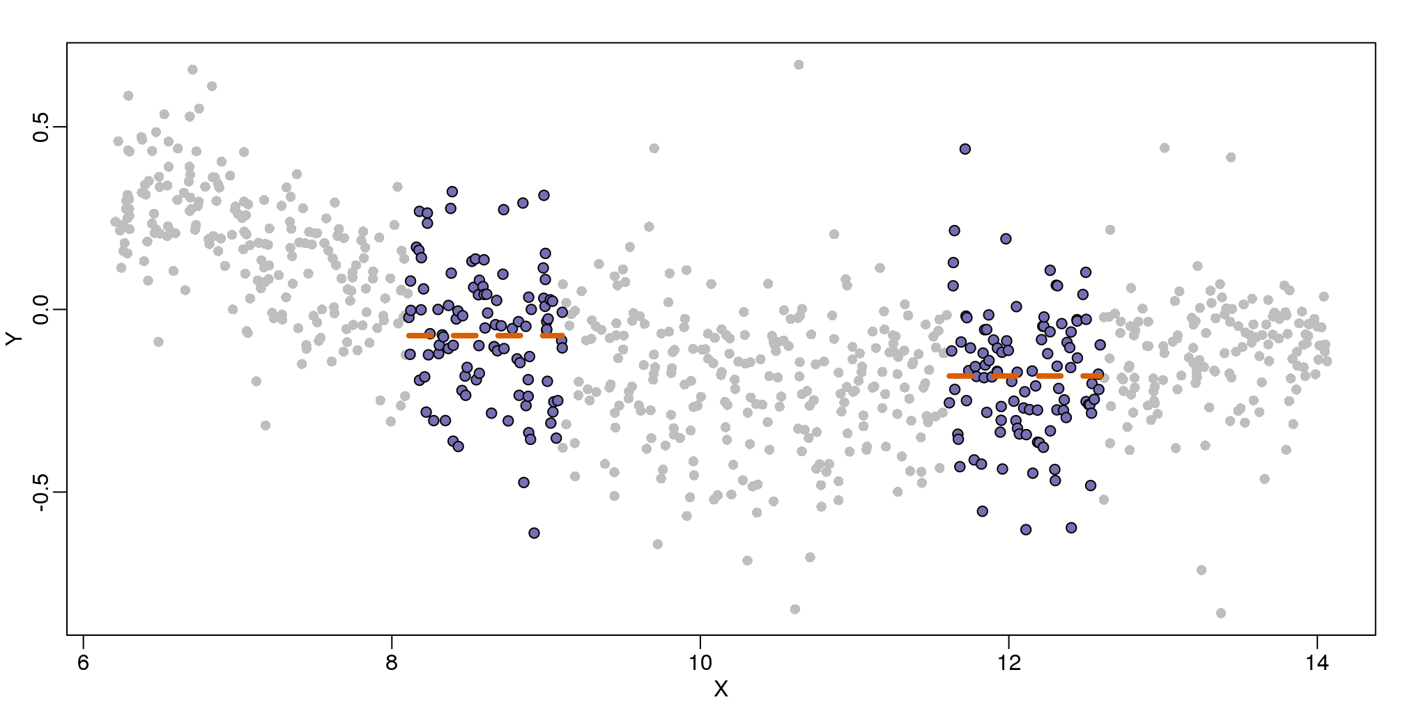
图 9.5: MAplot comparing gene expression from two arrays with bin smoother fit shown for two points.
By computing this mean for bins around every point, we form an estimate of the underlying curve \(f(x)\). Below we show the procedure happening as we move from the smallest value of \(x\) to the largest. We show 10 intermediate cases as well (code not shown):
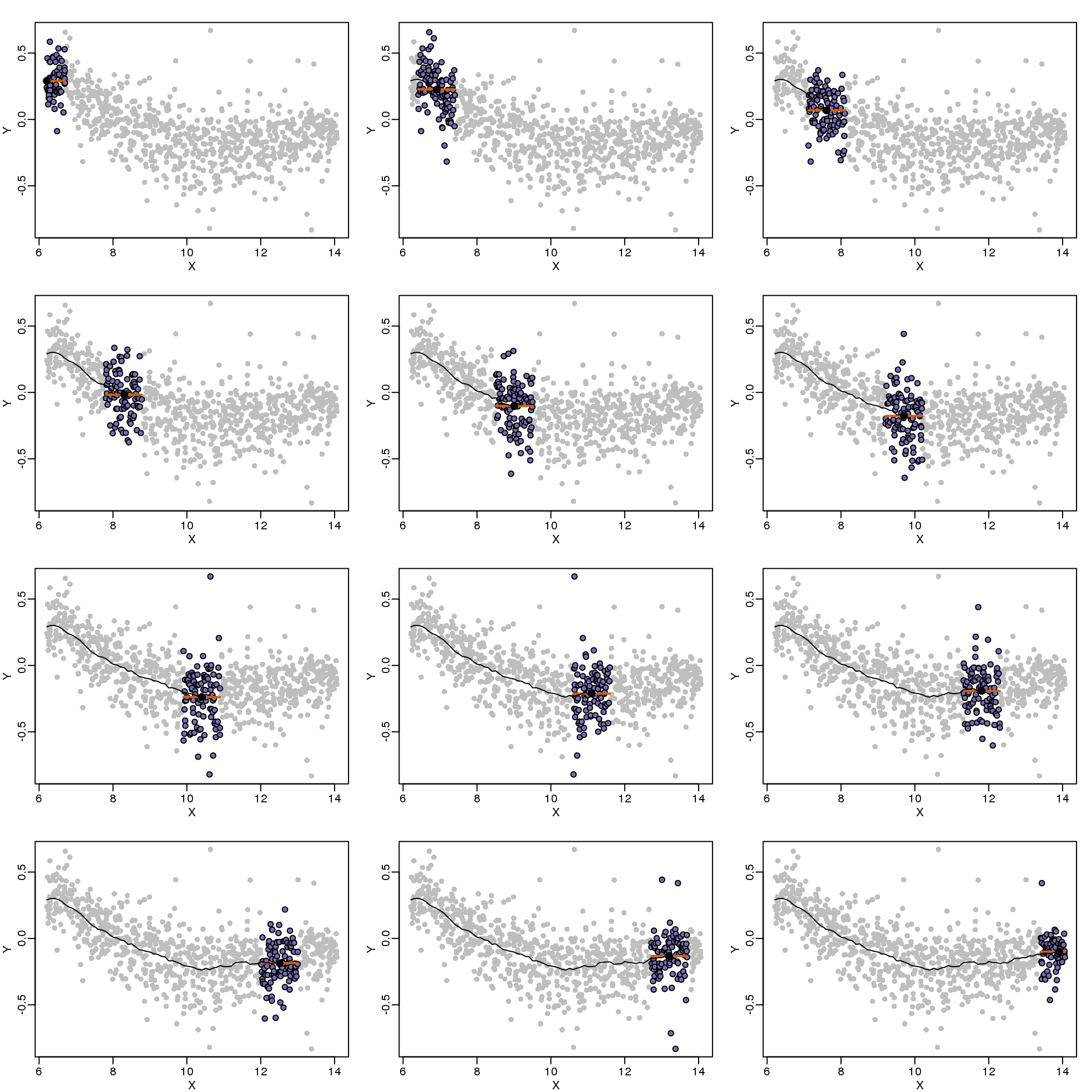
(#fig:bin_smoothing_demo)Illustration of how bin smoothing estimates a curve. Showing 12 steps of process.
The final result looks like this (code not shown):

(#fig:bin_smooth_final)MA-plot with curve obtained with bin-smoothed curve shown.
There are several functions in R that implement bin smoothers. One example is ksmooth. However, in practice, we typically prefer methods that use slightly more complicated models than fitting a constant. The final result above, for example, is somewhat wiggly. Methods such as loess, which we explain next, improve on this.
9.5 Loess
Local weighted regression (loess) is similar to bin smoothing in principle. The main difference is that we approximate the local behavior with a line or a parabola. This permits us to expand the bin sizes, which stabilizes the estimates. Below we see lines fitted to two bins that are slightly larger than those we used for the bin smoother (code not shown). We can use larger bins because fitting lines provide slightly more flexibility.
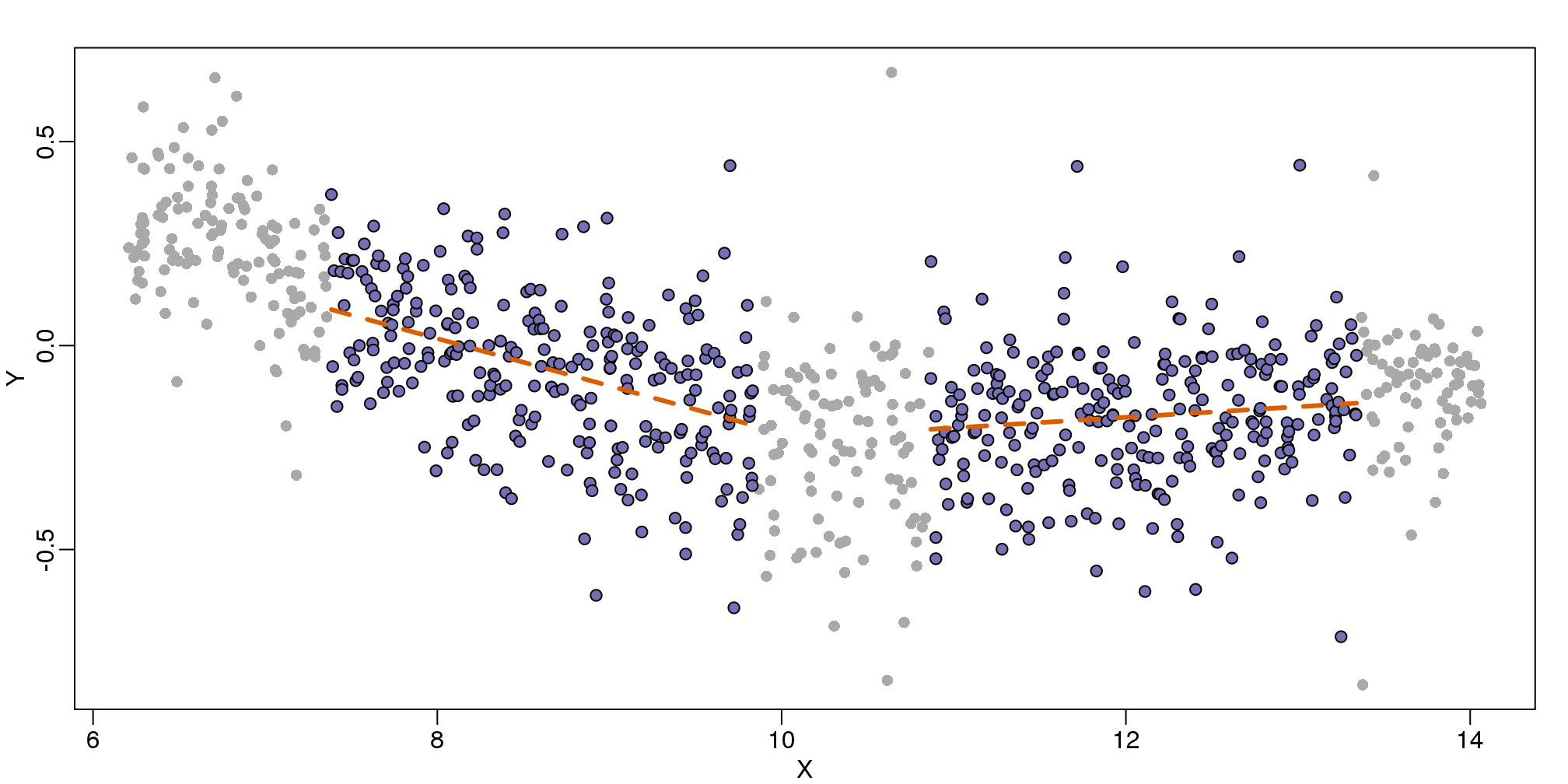
图 9.6: MA-plot comparing gene expression from two arrays with bin local regression fit shown for two points.
As we did for the bin smoother, we show 12 steps of the process that leads to a loess fit (code not shown):
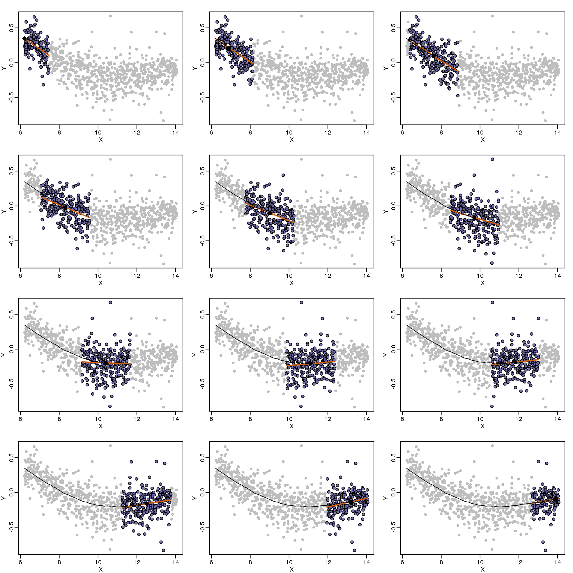
(#fig:loess_demo)Illustration of how loess estimates a curve. Showing 12 steps of the process.
The final result is a smoother fit than the bin smoother since we use larger sample sizes to estimate our local parameters (code not shown):

(#fig:loess_final)MA-plot with curve obtained with loess.
The function loess performs this analysis for us:
fit <- loess(Y~X, degree=1, span=1/3)

newx <- seq(min(X),max(X),len=100)
smooth <- predict(fit,newdata=data.frame(X=newx))

mypar ()
plot(X,Y,col="darkgrey",pch=16)
lines(newx,smooth,col="black",lwd=3)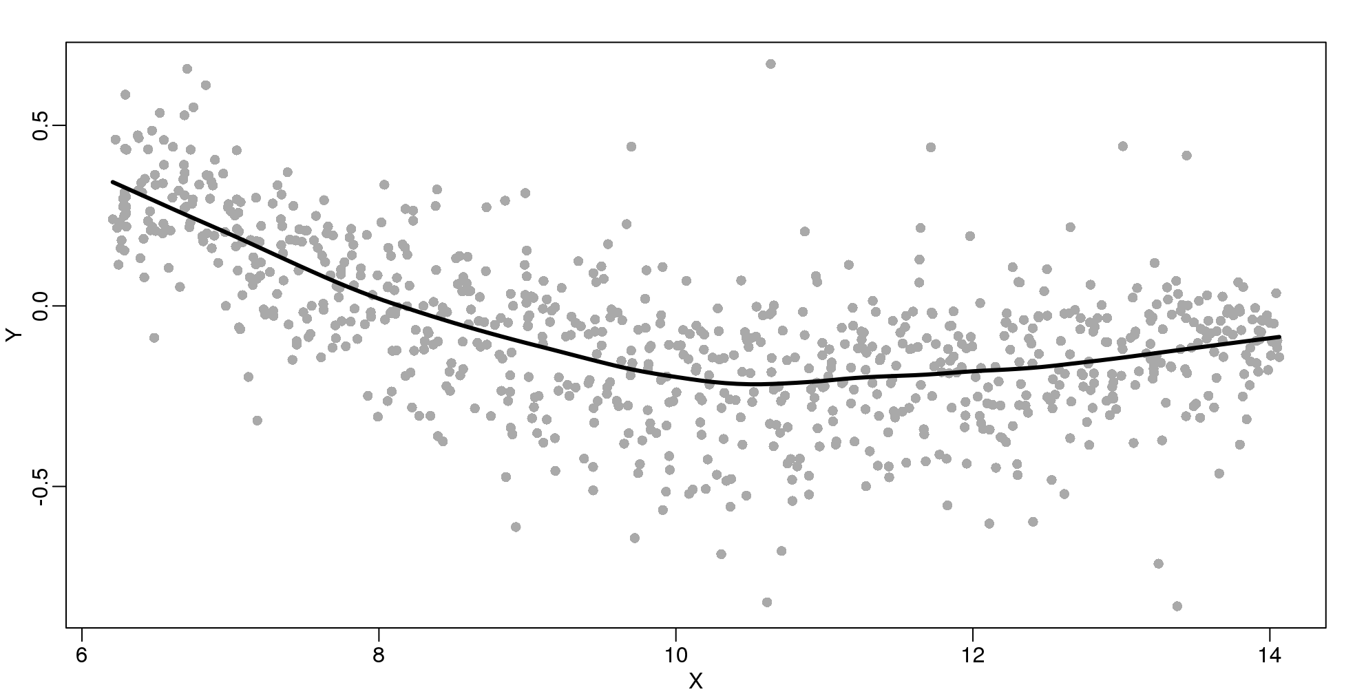
图 9.7: Loess fitted with the loess function.
There are three other important differences between loess and the typical bin smoother. The first is that rather than keeping the bin size the same, loess keeps the number of points used in the local fit the same. This number is controlled via the span argument which expects a proportion. For example, if N is the number of data points and span=0.5, then for a given \(x\) , loess will use the 0.5*N closest points to \(x\) for the fit. The second difference is that, when fitting the parametric model to obtain \(f(x)\), loess uses weighted least squares, with higher weights for points that are closer to \(x\). The third difference is that loess has the option of fitting the local model robustly. An iterative algorithm is implemented in which, after fitting a model in one iteration, outliers are detected and downweighted for the next iteration. To use this option, we use the argument family="symmetric".
9.6 Class Prediction
Here we give a brief introduction to the main task of machine learning: class prediction. In fact, many refer to class prediction as machine learning and we sometimes use the two terms interchangeably. We give a very brief introduction to this vast topic, focusing on some specific examples.
Some of the examples we give here are motivated by those in the excellent textbook The Elements of Statistical Learning: Data Mining, Inference, and Prediction, by Trevor Hastie, Robert Tibshirani and Jerome Friedman, which can be found here.
Similar to inference in the context of regression, Machine Learning (ML) studies the relationships between outcomes \(Y\) and covariates \(X\). In ML, we call \(X\) the predictors or features. The main difference between ML and inference is that, in ML, we are interested mainly in predicting \(Y\) using \(X\). Statistical models are used, but while in inference we estimate and interpret model parameters, in ML they are mainly a means to an end: predicting \(Y\).
Here we introduce the main concepts needed to understand ML, along with two specific algorithms: regression and k nearest neighbors (kNN). Keep in mind that there are dozens of popular algorithms that we do not cover here.
In a previous section, we covered the very simple one-predictor case. However, most of ML is concerned with cases with more than one predictor. For illustration purposes, we move to a case in which \(X\) is two dimensional and \(Y\) is binary. We simulate a situation with a non-linear relationship using an example from the Hastie, Tibshirani and Friedman book. In the plot below, we show the actual values of \(f(x_1,x_2)=E(Y \mid X_1=x_1,X_2=x_2)\) using colors. The following code is used to create a relatively complex conditional probability function. We create the test and train data we use later (code not shown). Here is the plot of \(f(x_1,x_2)\) with red representing values close to 1, blue representing values close to 0, and yellow values in between.
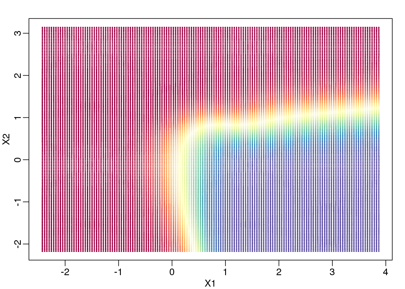
(#fig:conditional_prob)Probability of Y=1 as a function of X1 and X2. Red is close to 1, yellow close to 0.5, and blue close to 0.
If we show points for which \(E(Y \mid X=x)>0.5\) in red and the rest in blue, we see the boundary region that denotes the boundary in which we switch from predicting 0 to 1.
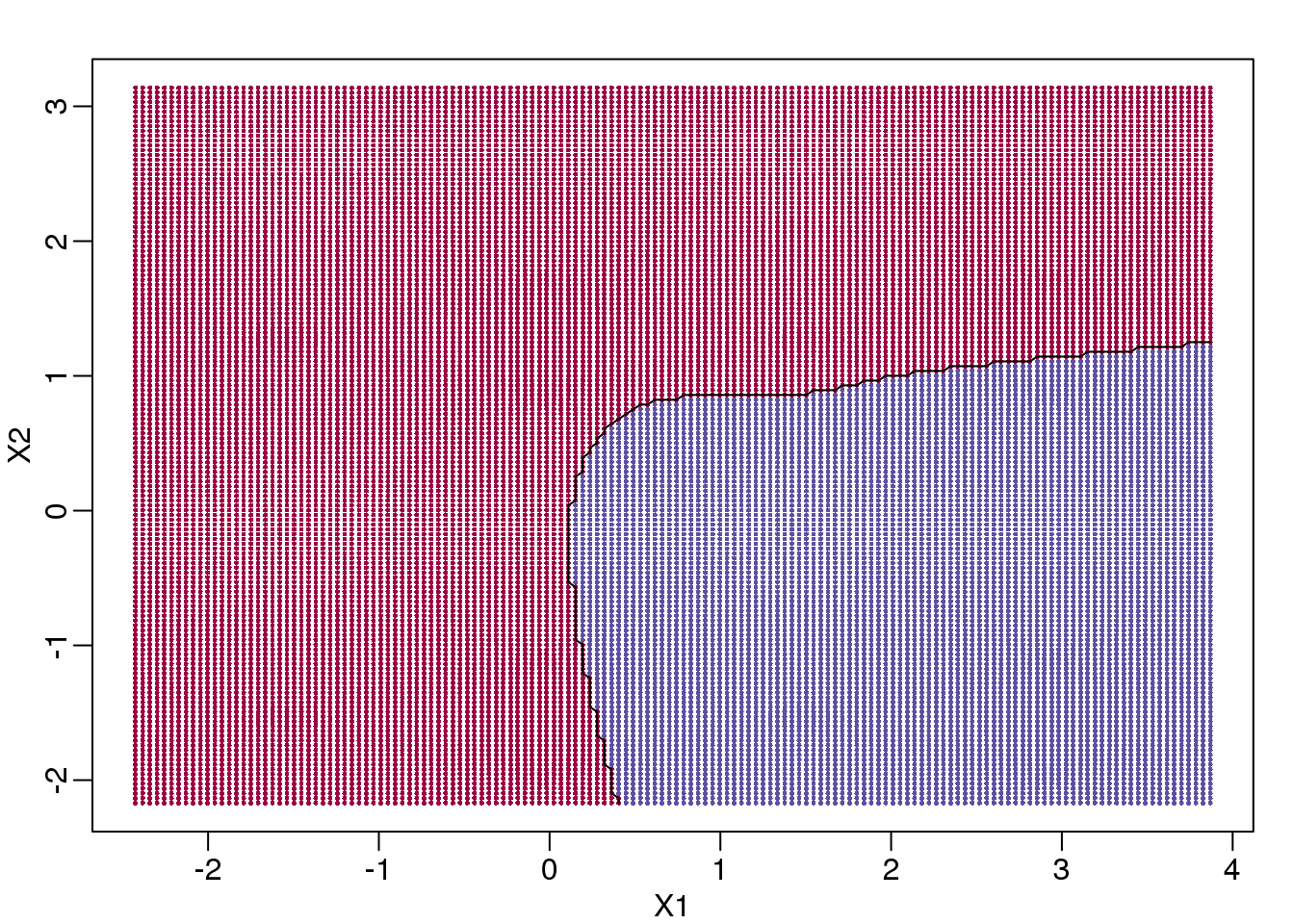
(#fig:bayes_rule)Bayes rule. The line divides part of the space for which probability is larger than 0.5 (red) and lower than 0.5 (blue).
The above plots relate to the “truth” that we do not get to see. Most ML methodology is concerned with estimating \(f(x)\). A typical first step is usually to consider a sample, referred to as the training set, to estimate \(f(x)\). We will review two specific ML techniques. First, we need to review the main concept we use to evaluate the performance of these methods.
9.6.0.1 Training and test sets
In the code (not shown) for the first plot in this chapter, we created a test and a training set. We plot them here:
#x, test, cols, and coltest were created in code that was not shown
#x is training x1 and x2, test is test x1 and x2
#cols (0=blue, 1=red) are training observations
#coltests are test observations
mypar(1,2)
plot(x,pch=21,bg=cols,xlab="X1",ylab="X2",xlim=XLIM,ylim=YLIM)
plot(test,pch=21,bg=colstest,xlab="X1",ylab="X2",xlim=XLIM,ylim=YLIM)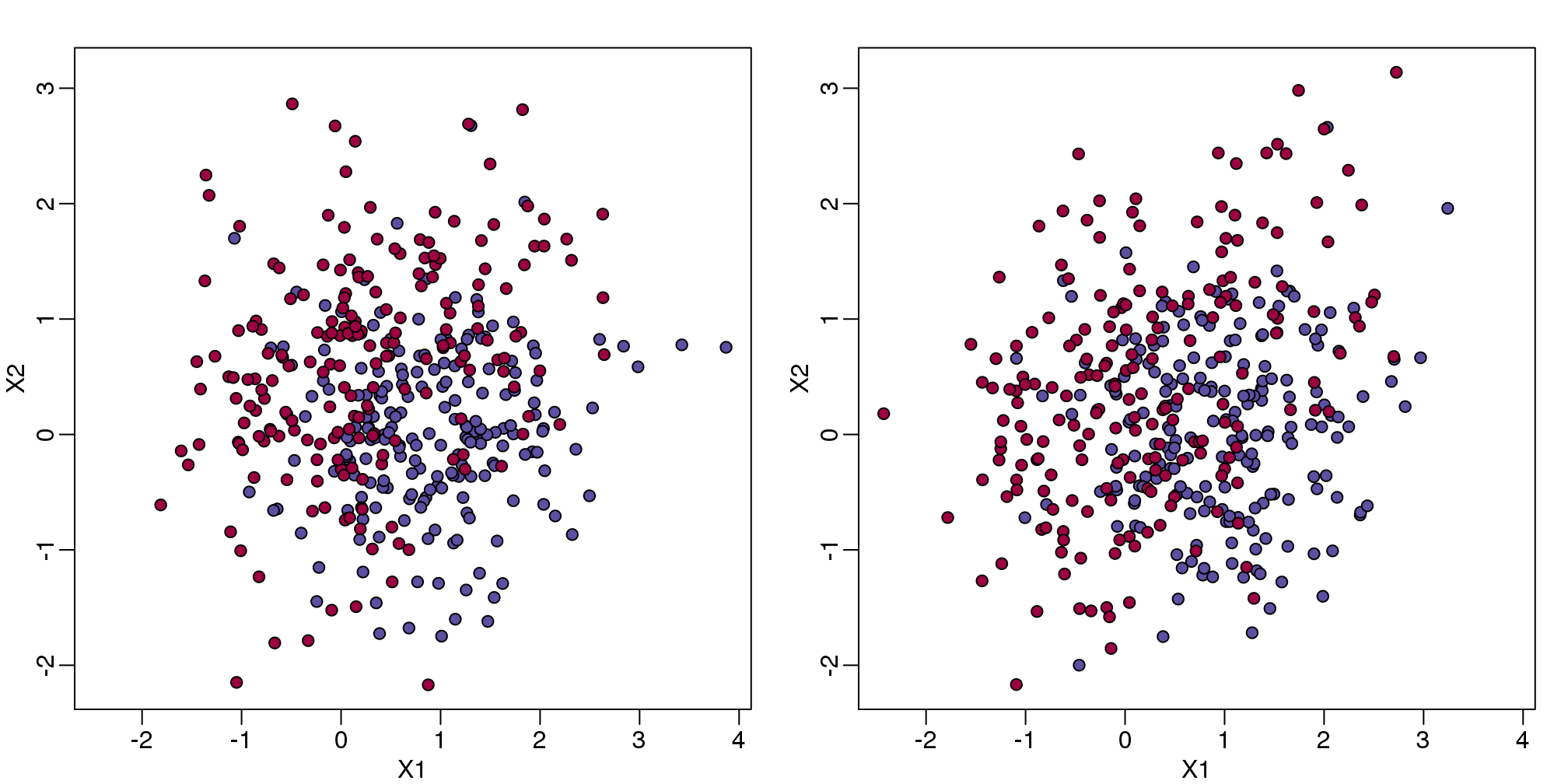
(#fig:test_train)Training data (left) and test data (right).
You will notice that the test and train set have similar global properties since they were generated by the same random variables (more blue towards the bottom right), but are, by construction, different. The reason we create test and training sets is to detect over-training by testing on a different data than the one used to fit models or train algorithms. We will see how important this is below.
9.6.0.2 Predicting with regression
A first naive approach to this ML problem is to fit a two variable linear regression model:
##x and y were created in the code (not shown) for the first plot
#y is outcome for the training set
X1 <- x[,1] ##these are the covariates
X2 <- x[,2]
fit1 <- lm(y~X1+X2)
Once we the have fitted values, we can estimate \(f(x_1,x_2)\) with \(\hat{f}(x_1,x_2)=\hat{\beta}_0 + \hat{\beta}_1x_1 +\hat{\beta}_2 x_2\). To provide an actual prediction, we simply predict 1 when \(\hat{f}(x_1,x_2)>0.5\). We now examine the error rates in the test and training sets and also plot the boundary region:
##prediction on train
yhat <- predict(fit1)
yhat <- as.numeric(yhat>0.5)
cat("Linear regression prediction error in train:",1-mean(yhat==y),"\n")
## Linear regression prediction error in train: 0.295We can quickly obtain predicted values for any set of values using the predict function:
yhat <- predict(fit1,newdata=data.frame(X1=newx[,1],X2=newx[,2]))Now we can create a plot showing where we predict 1s and where we predict 0s, as well as the boundary. We can also use the predict function to obtain predicted values for our test set. Note that nowhere do we fit the model on the test set:
colshat <- yhat
colshat[yhat>=0.5] <- mycols[2]
colshat[yhat<0.5] <- mycols[1]
m <- -fit1$coef[2]/fit1$coef[3] #boundary slope
b <- (0.5 - fit1$coef[1])/fit1$coef[3] #boundary intercept

##prediction on test
yhat <- predict(fit1,newdata=data.frame(X1=test[,1],X2=test[,2]))
yhat <- as.numeric(yhat>0.5)
cat("Linear regression prediction error in test:",1-mean(yhat==ytest),"\n")
## Linear regression prediction error in test: 0.3075plot(test,type="n",xlab="X1",ylab="X2",xlim=XLIM,ylim=YLIM)
abline(b,m)
points(newx,col=colshat,pch=16,cex=0.35)
##test was created in the code (not shown) for the first plot
points(test,bg=cols,pch=21)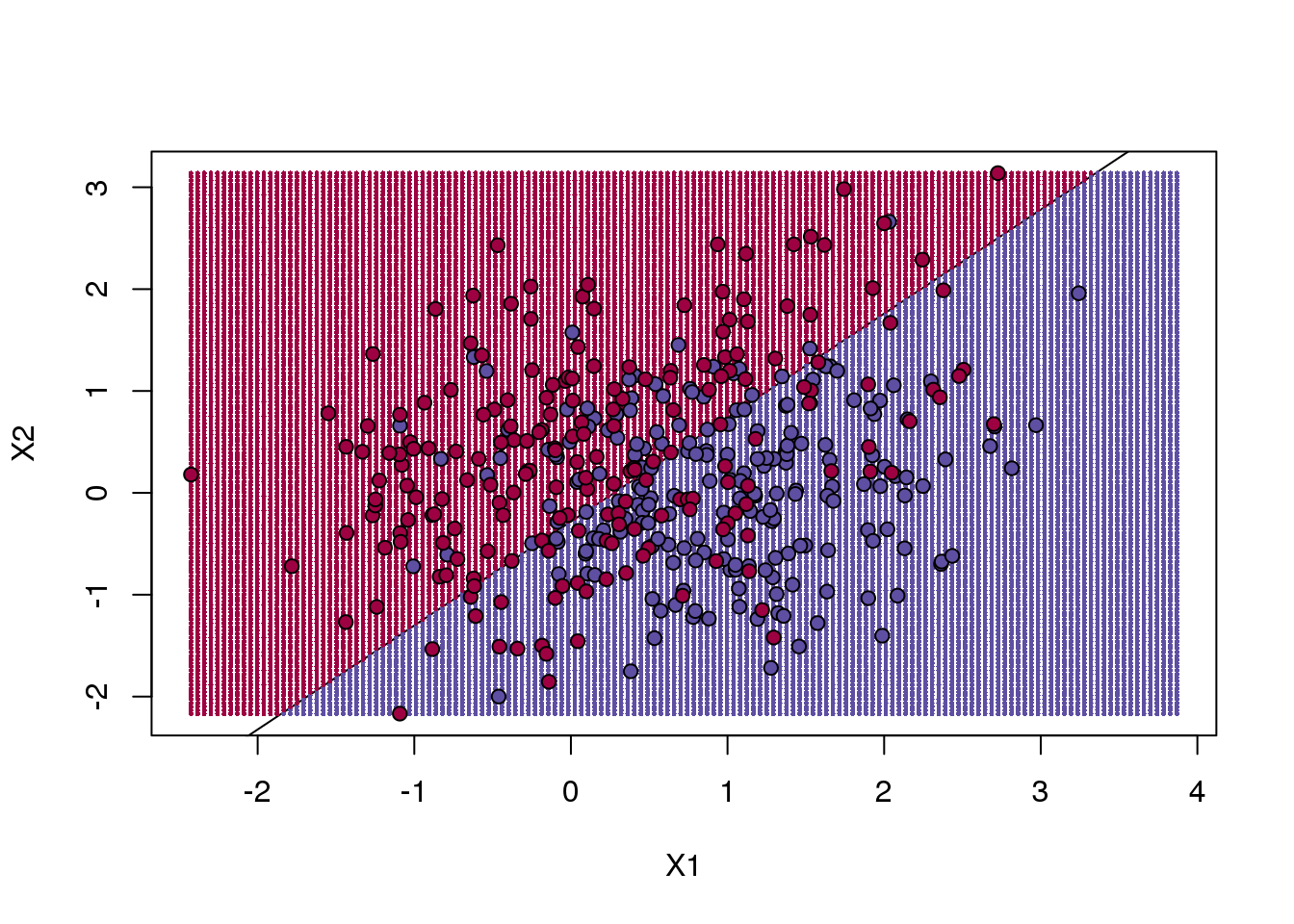
(#fig:regression_prediction)We estimate the probability of 1 with a linear regression model with X1 and X2 as predictors. The resulting prediction map is divided into parts that are larger than 0.5 (red) and lower than 0.5 (blue).
The error rates in the test and train sets are quite similar. Thus, we do not seem to be over-training. This is not surprising as we are fitting a 2 parameter model to 400 data points. However, note that the boundary is a line. Because we are fitting a plane to the data, there is no other option here. The linear regression method is too rigid. The rigidity makes it stable and avoids over-training, but it also keeps the model from adapting to the non-linear relationship between \(Y\) and \(X\). We saw this before in the smoothing section. The next ML technique we consider is similar to the smoothing techniques described before.
9.6.0.3 K-nearest neighbor
K-nearest neighbors (kNN) is similar to bin smoothing, but it is easier to adapt to multiple dimensions. Basically, for any point \(x\) for which we want an estimate, we look for the k nearest points and then take an average of these points. This gives us an estimate of \(f(x_1,x_2)\), just like the bin smoother gave us an estimate of a curve. We can now control flexibility through \(k\). Here we compare \(k=1\) and \(k=100\).
library(class)
mypar(2,2)
for(k in c(1,100)){
  ##predict on train
  yhat <- knn(x,x,y,k=k)
  cat("KNN prediction error in train:",1-mean((as.numeric(yhat)-1)==y),"\n")
  ##make plot
  yhat <- knn(x,test,y,k=k)
  cat("KNN prediction error in test:",1-mean((as.numeric(yhat)-1)==ytest),"\n")
}
## KNN prediction error in train: 0
## KNN prediction error in test: 0.375
## KNN prediction error in train: 0.2425
## KNN prediction error in test: 0.2825To visualize why we make no errors in the train set and many errors in the test set when \(k=1\) and obtain more stable results from \(k=100\), we show the prediction regions (code not shown):
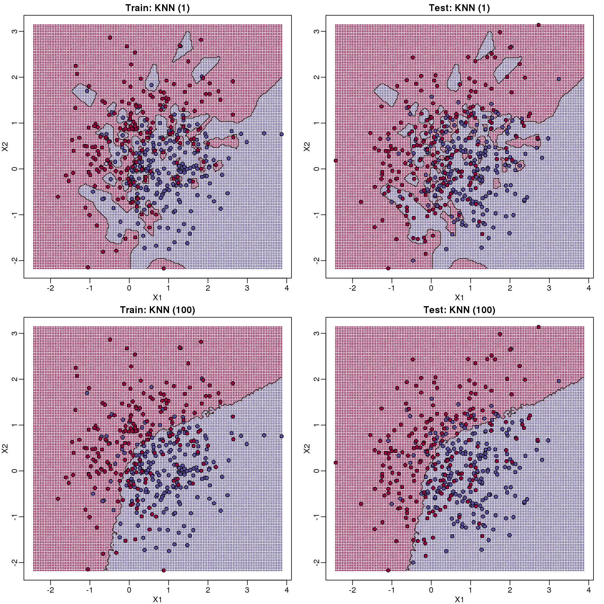
图 9.8: Prediction regions obtained with kNN for k=1 (top) and k=200 (bottom). We show both train (left) and test data (right).
When \(k=1\), we make no mistakes in the training test since every point is its closest neighbor and it is equal to itself. However, we see some islands of blue in the red area that, once we move to the test set, are more error prone. In the case \(k=100\), we do not have this problem and we also see that we improve the error rate over linear regression. We can also see that our estimate of \(f(x_1,x_2)\) is closer to the truth.
9.6.0.4 Bayes rule
Here we include a comparison of the test and train set errors for various values of \(k\). We also include the error rate that we would make if we actually knew \(\mbox{E}(Y \mid X_1=x1,X_2=x_2)\) referred to as Bayes Rule.
We start by computing the error rates…
###Bayes Rule
yhat <- apply(test,1,p)
cat("Bayes rule prediction error in train",1-mean(round(yhat)==y),"\n")
## Bayes rule prediction error in train 0.2775bayes.error=1-mean(round(yhat)==y)
train.error <- rep(0,16)
test.error <- rep(0,16)
for(k in seq(along=train.error)){
##predict on train
yhat <- knn(x,x,y,k=2^(k/2))
train.error[k] <- 1-mean((as.numeric(yhat)-1)==y)
##prediction on test
yhat <- knn(x,test,y,k=2^(k/2))
test.error[k] <- 1-mean((as.numeric(yhat)-1)==y)
}… and then plot the error rates against values of \(k\). We also show the Bayes rules error rate as a horizontal line.
ks <- 2^(seq(along=train.error)/2)
mypar()
plot(ks,train.error,type="n",xlab="K",ylab="Prediction Error",log="x",
     ylim=range(c(test.error,train.error)))
lines(ks,train.error,type="b",col=4,lty=2,lwd=2)
lines(ks,test.error,type="b",col=5,lty=3,lwd=2)
abline(h=bayes.error,col=6)
legend("bottomright",c("Train","Test","Bayes"),col=c(4,5,6),lty=c(2,3,1),box.lwd=0)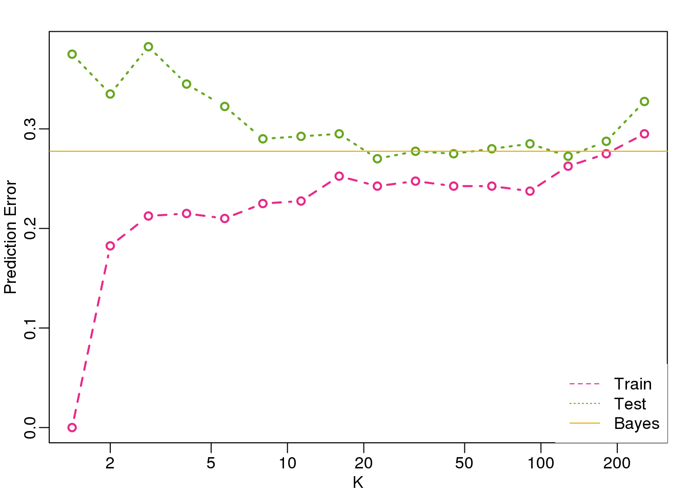
(#fig:bayes_rule2)Prediction error in train (pink) and test (green) versus number of neighbors. The yellow line represents what one obtains with Bayes Rule.
Note that these error rates are random variables and have standard errors. In the next section we describe cross-validation which helps reduce some of this variability. However, even with this variability, the plot clearly shows the problem of over-fitting when using values lower than 20 and under-fitting with values above 100.
9.7 Cross-validation
Here we describe cross-validation: one of the fundamental methods in machine learning for method assessment and picking parameters in a prediction or machine learning task. Suppose we have a set of observations with many features and each observation is associated with a label. We will call this set our training data. Our task is to predict the label of any new samples by learning patterns from the training data. For a concrete example, let’s consider gene expression values, where each gene acts as a feature. We will be given a new set of unlabeled data (the test data) with the task of predicting the tissue type of the new samples.
If we choose a machine learning algorithm with a tunable parameter, we have to come up with a strategy for picking an optimal value for this parameter. We could try some values, and then just choose the one which performs the best on our training data, in terms of the number of errors the algorithm would make if we apply it to the samples we have been given for training. However, we have seen how this leads to over-fitting.
Let’s start by loading the tissue gene expression dataset:
library(tissuesGeneExpression)
data(tissuesGeneExpression)
For illustration purposes, we will drop one of the tissues which doesn’t have many samples:
table(tissue)## tissue
## cerebellum colon endometrium hippocampus
## 38 34 15 31
## kidney liver placenta
## 39 26 6ind <- which(tissue != "placenta")
y <- tissue[ind]
X <- t( e[,ind] )This tissue will not form part of our example.
Now let’s try out k-nearest neighbors for classification, using \(k=5\). What is our average error in predicting the tissue in the training set, when we’ve used the same data for training and for testing?
library(class)
pred <- knn(train =  X, test = X, cl=y, k=5)
mean(y != pred)
## [1] 0We have no errors in prediction in the training set with \(k=5\). What if we use \(k=1\)?
pred <- knn(train=X, test=X, cl=y, k=1)
mean(y != pred)
## [1] 0Trying to classify the same observations as we use to train the model can be very misleading. In fact, for k-nearest neighbors, using k=1 will always give 0 classification error in the training set, because we use the single observation to classify itself. The reliable way to get a sense of the performance of an algorithm is to make it give a prediction for a sample it has never seen. Similarly, if we want to know what the best value for a tunable parameter is, we need to see how different values of the parameter perform on samples, which are not in the training data.
Cross-validation is a widely-used method in machine learning, which solves this training and test data problem, while still using all the data for testing the predictive accuracy. It accomplishes this by splitting the data into a number of folds. If we have \(N\) folds, then the first step of the algorithm is to train the algorithm using \((N-1)\) of the folds, and test the algorithm’s accuracy on the single left-out fold. This is then repeated N times until each fold has been used as in the test set. If we have \(M\) parameter settings to try out, then this is accomplished in an outer loop, so we have to fit the algorithm a total of \(N \times M\) times.
We will use the createFolds function from the caret package to make 5 folds of our gene expression data, which are balanced over the tissues. Don’t be confused by the fact that the createFolds function uses the same letter ‘k’ as the ‘k’ in k-nearest neighbors. These ‘k’ are totally unrelated. The caret function createFolds is asking for how many folds to create, the \(N\) from above. The ‘k’ in the knn function is for how many closest observations to use in classifying a new sample. Here we will create 10 folds:
library(caret)
set.seed(1)
idx <- createFolds(y, k=10)
sapply(idx, length)
## Fold01 Fold02 Fold03 Fold04 Fold05 Fold06 Fold07
## 18 19 17 17 18 20 19
## Fold08 Fold09 Fold10
## 19 20 16The folds are returned as a list of numeric indices. The first fold of data is therefore:
y[idx[[1]]] ##the labels## [1] "kidney" "kidney" "hippocampus"
## [4] "hippocampus" "hippocampus" "cerebellum"
## [7] "cerebellum" "cerebellum" "colon"
## [10] "colon" "colon" "colon"
## [13] "kidney" "kidney" "endometrium"
## [16] "endometrium" "liver" "liver"head( X[idx[[1]], 1:3] ) ##the genes (only showing the first 3 genes...)## 1007_s_at 1053_at 117_at
## GSM12075.CEL.gz 9.967 6.060 7.644
## GSM12098.CEL.gz 9.946 5.928 7.847
## GSM21214.cel.gz 10.955 5.777 7.494
## GSM21218.cel.gz 10.758 5.984 8.526
## GSM21230.cel.gz 11.496 5.760 7.788
## GSM87086.cel.gz 9.799 5.862 7.279We can see that, in fact, the tissues are fairly equally represented across the 10 folds:
sapply(idx, function(i) table(y[i]))## Fold01 Fold02 Fold03 Fold04 Fold05 Fold06
## cerebellum 3 4 4 4 4 4
## colon 4 3 3 3 4 4
## endometrium 2 2 1 1 1 2
## hippocampus 3 3 3 3 3 3
## kidney 4 4 3 4 4 4
## liver 2 3 3 2 2 3
## Fold07 Fold08 Fold09 Fold10
## cerebellum 4 4 4 3
## colon 3 3 4 3
## endometrium 1 2 2 1
## hippocampus 4 3 3 3
## kidney 4 4 4 4
## liver 3 3 3 2Because tissues have very different gene expression profiles, predicting tissue with all genes will be very easy. For illustration purposes we will try to predict tissue type with just two dimensional data. We will reduce the dimension of our data using cmdscale:
library(rafalib)
mypar()
Xsmall <- cmdscale(dist(X))
plot(Xsmall,col=as.fumeric(y))
legend("topleft",levels(factor(y)),fill=seq_along(levels(factor(y))))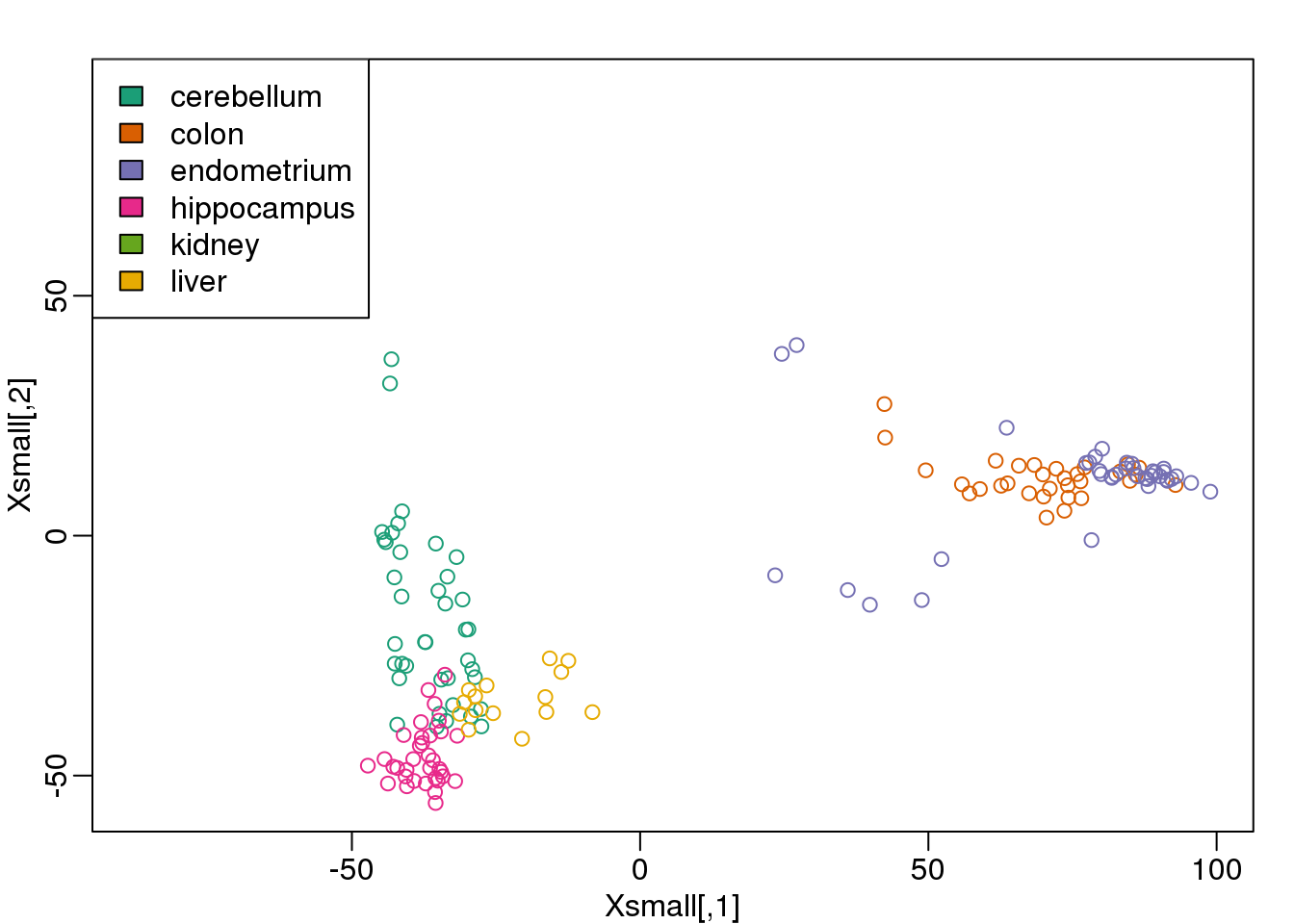
图 9.9: First two PCs of the tissue gene expression data with color representing tissue. We use these two PCs as our two predictors throughout.
Now we can try out the k-nearest neighbors method on a single fold. We provide the knn function with all the samples in Xsmall except those which are in the first fold. We remove these samples using the code -idx[[1]] inside the square brackets. We then use those samples in the test set. The cl argument is for the true classifications or labels (here, tissue) of the training data. We use 5 observations to classify in our k-nearest neighbor algorithm:
pred <- knn(train=Xsmall[ -idx[[1]] , ], test=Xsmall[ idx[[1]], ], cl=y[ -idx[[1]] ], k=5)
table(true=y[ idx[[1]] ], pred)
## pred
## true cerebellum colon endometrium hippocampus
## cerebellum 2 0 0 1
## colon 0 4 0 0
## endometrium 0 0 1 0
## hippocampus 1 0 0 2
## kidney 0 0 0 0
## liver 0 0 0 0
## pred
## true kidney liver
## cerebellum 0 0
## colon 0 0
## endometrium 1 0
## hippocampus 0 0
## kidney 4 0
## liver 0 2mean(y[ idx[[1]] ] != pred)## [1] 0.1667Now we have some misclassifications. How well do we do for the rest of the folds?
for (i in 1:10) {
  pred <- knn(train=Xsmall[ -idx[[i]] , ], test=Xsmall[ idx[[i]], ], cl=y[ -idx[[i]] ], k=5)
  print(paste0(i,") error rate: ", round(mean(y[ idx[[i]] ] != pred),3)))
}
## [1] "1) error rate: 0.167"
## [1] "2) error rate: 0.105"
## [1] "3) error rate: 0.118"
## [1] "4) error rate: 0.118"
## [1] "5) error rate: 0.278"
## [1] "6) error rate: 0.05"
## [1] "7) error rate: 0.105"
## [1] "8) error rate: 0.211"
## [1] "9) error rate: 0.15"
## [1] "10) error rate: 0.312"So we can see there is some variation for each fold, with error rates hovering around 0.1-0.3. But is k=5 the best setting for the k parameter? In order to explore the best setting for k, we need to create an outer loop, where we try different values for k, and then calculate the average test set error across all the folds.
We will try out each value of k from 1 to 12. Instead of using two for loops, we will use sapply:
set.seed(1)
ks <- 1:12
res <- sapply(ks, function(k) {
  ##try out each version of k from 1 to 12
  res.k <- sapply(seq_along(idx), function(i) {
    ##loop over each of the 10 cross-validation folds
    ##predict the held-out samples using k nearest neighbors
    pred <- knn(train=Xsmall[ -idx[[i]], ],
                test=Xsmall[ idx[[i]], ],
                cl=y[ -idx[[i]] ], k = k)
    ##the ratio of misclassified samples
    mean(y[ idx[[i]] ] != pred)
  })
  ##average over the 10 folds
  mean(res.k)
})
Now for each value of k, we have an associated test set error rate from the cross-validation procedure.
res## [1] 0.1978 0.1703 0.1883 0.1751 0.1613 0.1501 0.1553
## [8] 0.1885 0.1822 0.1763 0.1761 0.1813We can then plot the error rate for each value of k, which helps us to see in what region there might be a minimal error rate:
plot(ks, res, type="o",ylab="misclassification error")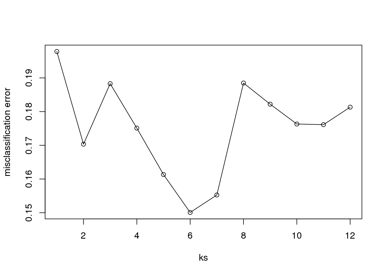
(#fig:misclassification_error)Misclassification error versus number of neighbors.
Remember, because the training set is a random sample and because our fold-generation procedure involves random number generation, the “best” value of k we pick through this procedure is also a random variable. If we had new training data and if we recreated our folds, we might get a different value for the optimal k.
Finally, to show that gene expression can perfectly predict tissue, we use 5 dimensions instead of 2, which results in perfect prediction:
Xsmall <- cmdscale(dist(X),k=5)
set.seed(1)
ks <- 1:12
res <- sapply(ks, function(k) {
  res.k <- sapply(seq_along(idx), function(i) {
    pred <- knn(train=Xsmall[ -idx[[i]], ],
                test=Xsmall[ idx[[i]], ],
                cl=y[ -idx[[i]] ], k = k)
    mean(y[ idx[[i]] ] != pred)
  })
  mean(res.k)
})
plot(ks, res, type="o",ylim=c(0,0.20),ylab="misclassification error")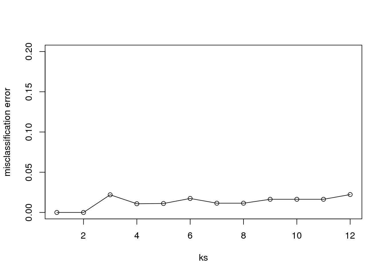
(#fig:misclassification_error2)Misclassification error versus number of neighbors when we use 5 dimensions instead of 2.
Important note: we applied cmdscale to the entire dataset to create a smaller one for illustration purposes. However, in a real machine learning application, this may result in an underestimation of test set error for small sample sizes, where dimension reduction using the unlabeled full dataset gives a boost in performance. A safer choice would have been to transform the data separately for each fold, by calculating a rotation and dimension reduction using the training set only and applying this to the test set.