第 10 章 Batch Effects
One often overlooked complication with high-throughput studies is batch effects, which occur because measurements are affected by laboratory conditions, reagent lots, and personnel differences. This becomes a major problem when batch effects are confounded with an outcome of interest and lead to incorrect conclusions. In this chapter, we describe batch effects in detail: how to detect, interpret, model, and adjust for batch effects.
Batch effects are the biggest challenge faced by genomics research, especially in the context of precision medicine. The presence of batch effects in one form or another has been reported among most, if not all, high-throughput technologies [Leek et al. (2010) Nature Reviews Genetics 11, 733-739]. But batch effects are not specific to genomics technology. In fact, in a 1972 paper, WJ Youden describes batch effects in the context of empirical estimates of physical constants. He pointed out the “subjective character of present estimates” of physical constants and how estimates changed from laboratory to laboratory. For example, in Table 1, Youden shows the following estimates of the astronomical unit from different laboratories. The reports included an estimate of spread (what we now would call a confidence interval).
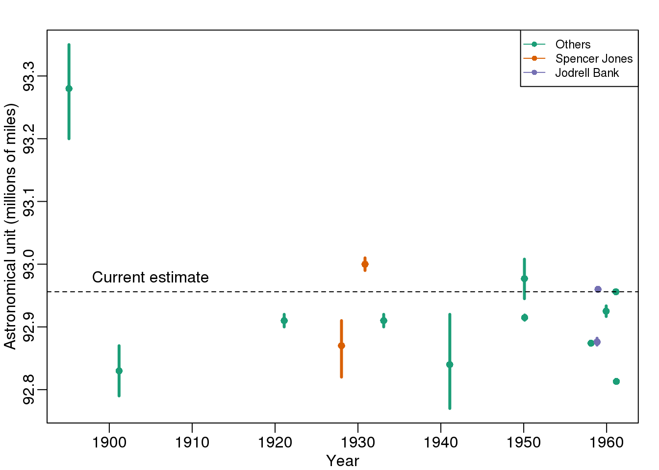
(#fig:astronomical_units)Estimates of the astronomical unit with estimates of spread, versus year it was reported. The two laboratories that reported more than one estimate are shown in color.
Judging by the variability across labs and the fact that the reported bounds do not explain this variability, clearly shows the presence of an effect that differs across labs, but not within. This type of variability is what we call a batch effect. Note that there are laboratories that reported two estimates (purple and orange) and batch effects are seen across the two different measurements from the same laboratories as well.
We can use statistical notation to precisely describe the problem. The scientists making these measurements assumed they observed:
\[ Y_{i,j} = \mu + \varepsilon_{i,j}, j=1,\dots,N \]
with \(Y_{i,j}\) the \(j\)-th measurement of laboratory \(i\), \(\mu\) the true physical constant, and \(\varepsilon_{i,j}\) independent measurement error. To account for the variability introduced by \(\varepsilon_{i,j}\), we compute standard errors from the data. As we saw earlier in the book, we estimate the physical constant with the average of the \(N\) measurements…
\[ \bar{Y}_i = \frac{1}{N} \sum_{i=1}^{N} Y_{i,j} \]
.. and we can construct a confidence interval by:
\[ \bar{Y}_i \pm 2 s_i / \sqrt{N} \mbox{ with } s_i^2= \frac{1}{N-1} \sum_{i=1}^N (Y_{i,j} - \bar{Y}_i)^2 \]
However, this confidence interval will be too small because it does not catch the batch effect variability. A more appropriate model is:
\[ Y_{i,j} = \mu + \gamma_i + \varepsilon_{i,j}, j=1, \dots, N \]
with \(\gamma_i\) a laboratory specific bias or batch effect.
From the plot it is quite clear that the variability of \(\gamma\) across laboratories is larger than the variability of \(\varepsilon\) within a lab. The problem here is that there is no information about \(\gamma\) in the data from a single lab. The statistical term for the problem is that \(\mu\) and \(\gamma\) are unidentifiable. We can estimate the sum \(\mu_i+\gamma_i\) , but we can’t distinguish one from the other.
We can also view \(\gamma\) as a random variable. In this case, each laboratory has an error term \(\gamma_i\) that is the same across measurements from that lab, but different from lab to lab. Under this interpretation the problem is that:
\[ s_i / \sqrt{N} \mbox{ with } s_i^2= \frac{1}{N-1} \sum_{i=1}^N (Y_{ij} - \bar{Y}_i)^2 \]
is an underestimate of the standard error since it does not account for the within lab correlation induced by \(\gamma\).
With data from several laboratories we can in fact estimate the \(\gamma\), if we assume they average out to 0. Or we can consider them to be random effects and simply estimate a new estimate and standard error with all measurements. Here is a confidence interval treating each reported average as a random observation:
avg <- mean(dat[,3])
se <- sd(dat[,3]) / sqrt(nrow(dat))
## 95% confidence interval is: [ 92.87 , 92.99 ]## which does include the current estimate is: 92.96Youden’s paper also includes batch effect examples from more recent estimates of the speed of light, as well as estimates of the gravity constant. Here we demonstrate the widespread presence and complex nature of batch effects in high-throughput biological measurements.
10.1 Confounding
Batch effects have the most devastating effects when they are confounded with outcomes of interest. Here we describe confounding and how it relates to data interpretation.
“Correlation is not causation” is one of the most important lessons you should take from this or any other data analysis course. A common example for why this statement is so often true is confounding. Simply stated confounding occurs when we observe a correlation or association between \(X\) and \(Y\), but this is strictly the result of both \(X\) and \(Y\) depending on an extraneous variable \(Z\). Here we describe Simpson’s paradox, an example based on a famous legal case, and an example of confounding in high-throughput biology.
10.1.0.1 Example of Simpson’s Paradox
Admission data from U.C. Berkeley 1973 showed that more men were being admitted than women: 44% men were admitted compared to 30% women.See: PJ Bickel, EA Hammel, and JW O’Connell. Science (1975). Here is the data:
library(dagdata)
data(admissions)
admissions$total=admissions$Percent*admissions$Number/100

##percent men get in
sum(admissions$total[admissions$Gender==1]/sum(admissions$Number[admissions$Gender==1]))
## [1] 0.4452##percent women get in
sum(admissions$total[admissions$Gender==0]/sum(admissions$Number[admissions$Gender==0]))## [1] 0.3033A chi-square test clearly rejects the hypothesis that gender and admission are independent:
##make a 2 x 2 table
index = admissions$Gender==1
men = admissions[index,]
women = admissions[!index,]
menYes = sum(men$Number*men$Percent/100)
menNo = sum(men$Number*(1-men$Percent/100))
womenYes = sum(women$Number*women$Percent/100)
womenNo = sum(women$Number*(1-women$Percent/100))
tab = matrix(c(menYes,womenYes,menNo,womenNo),2,2)
print(chisq.test(tab)$p.val)
## [1] 9.139e-22But closer inspection shows a paradoxical result. Here are the percent admissions by major:
y=cbind(admissions[1:6,c(1,3)],admissions[7:12,3])
colnames(y)[2:3]=c("Male","Female")
y
## Major Male Female
## 1 A 62 82
## 2 B 63 68
## 3 C 37 34
## 4 D 33 35
## 5 E 28 24
## 6 F 6 7Notice that we no longer see a clear gender bias. The chi-square test we performed above suggests a dependence between admission and gender. Yet when the data is grouped by major, this dependence seems to disappear. What’s going on?
This is an example of Simpson’s paradox. A plot showing the percentages that applied to a major against the percent that get into that major, for males and females starts to point to an explanation.
y=cbind(admissions[1:6,5],admissions[7:12,5])
y=sweep(y,2,colSums(y),"/")*100
x=rowMeans(cbind(admissions[1:6,3],admissions[7:12,3]))

library(rafalib)
mypar()
matplot(x,y,xlab="percent that gets in the major",
        ylab="percent that applies to major",
        col=c("blue","red"),cex=1.5)
legend("topleft",c("Male","Female"),col=c("blue","red"),pch=c("1","2"),box.lty=0)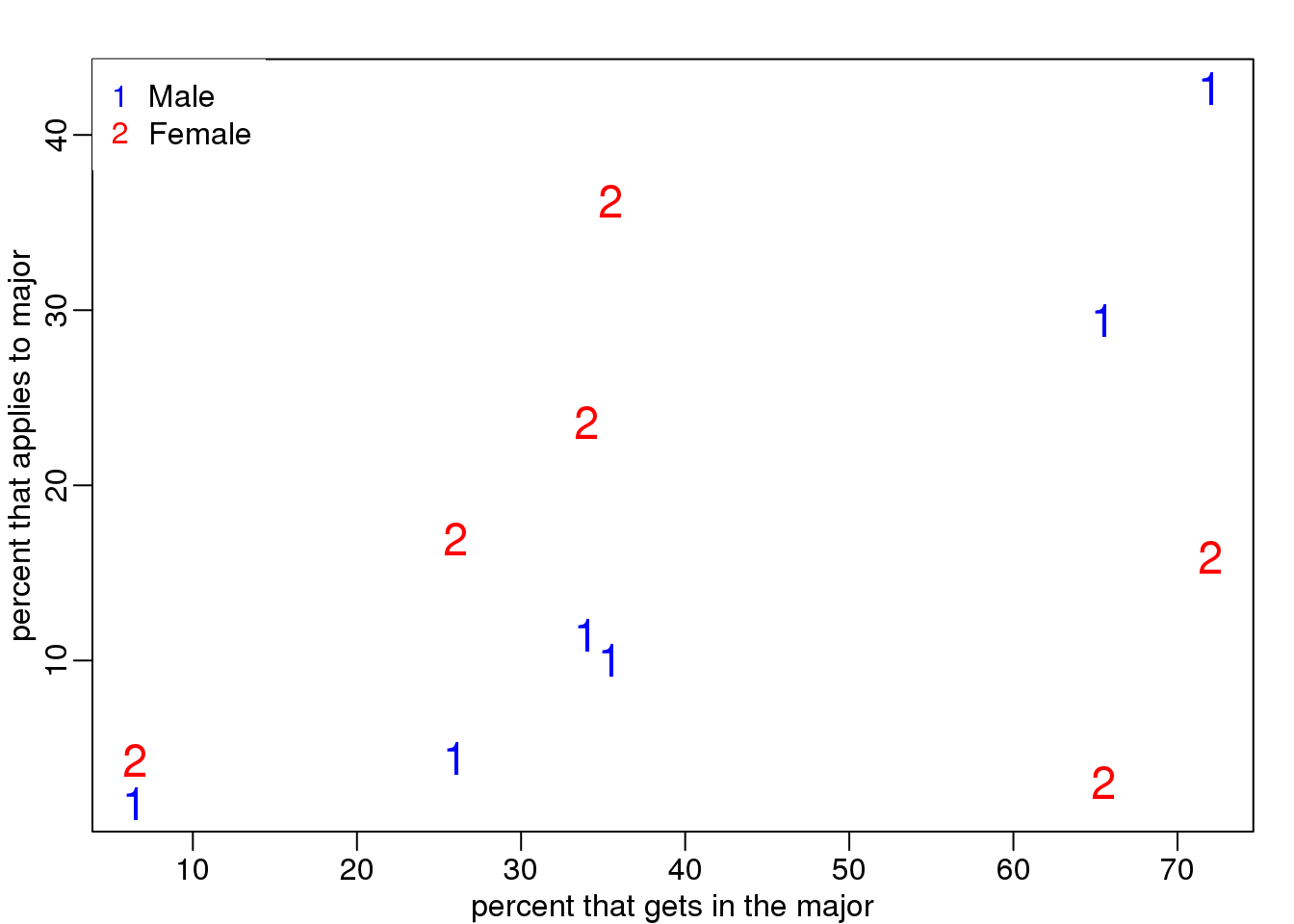
(#fig:hard_major_confounding)Percent of students that applied versus percent that were admitted by gender.
What the plot suggests is that males were much more likely to apply to “easy” majors. The plot shows that males and “easy” majors are confounded.
10.1.0.2 Confounding explained graphically
Here we visualize the confounding. In the plots below, each letter represents a person. Accepted individuals are denoted in green and not admitted in orange. The letter indicates the major. In this first plot we group all the students together and notice that the proportion of green is larger for men.
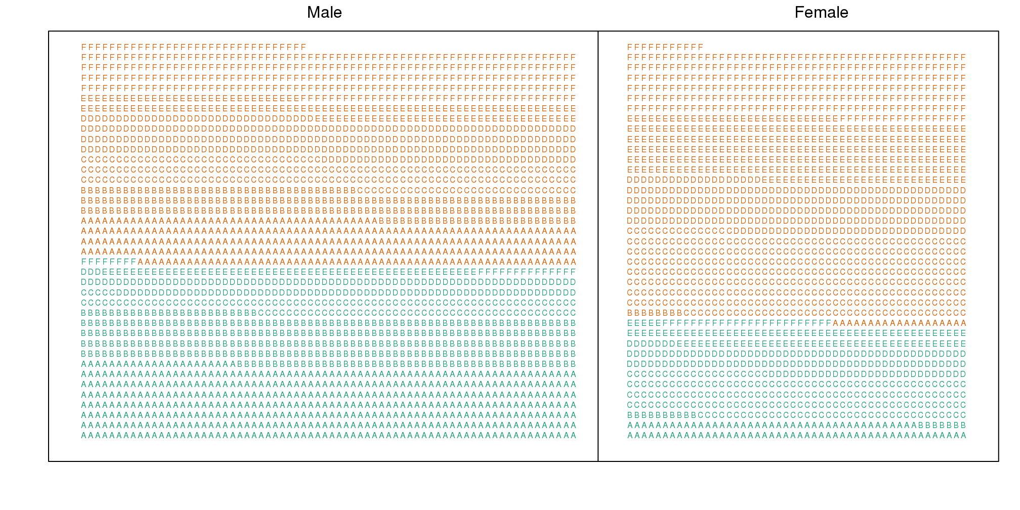
(#fig:simpsons_paradox_illustration)Admitted are in green and majors are denoted with letters. Here we clearly see that more males were admitted.
Now we stratify the data by major. The key point here is that most of the accepted men (green) come from the easy majors: A and B.
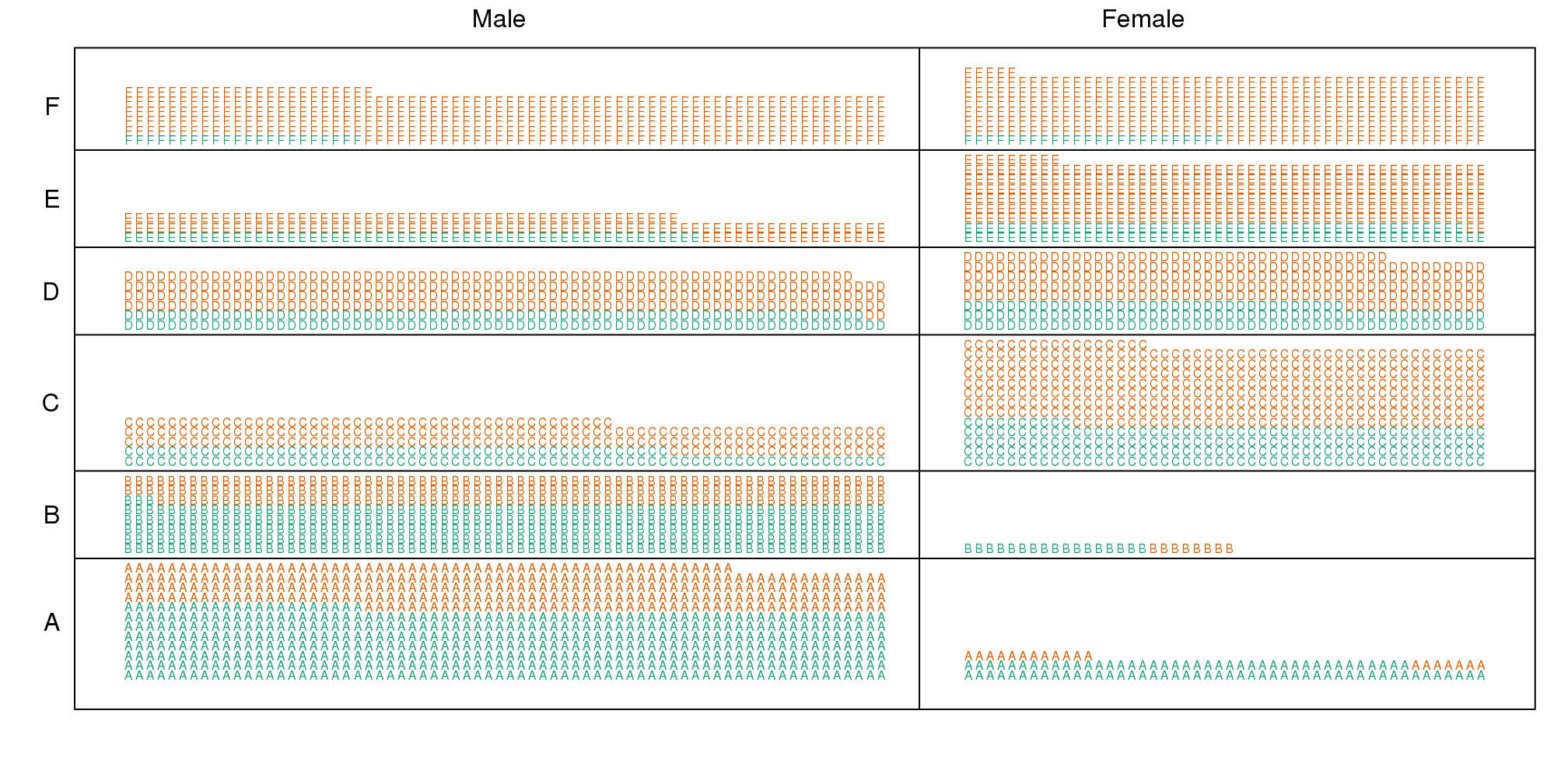
(#fig:simpsons_paradox_illustration2)Simpon’s Paradox illustrated. Admitted students are in green. Students are now stratified by the major to which they applied.
10.1.0.3 Average after stratifying
In this plot, we can see that if we condition or stratify by major, and then look at differences, we control for the confounder and this effect goes away.
y=cbind(admissions[1:6,3],admissions[7:12,3])
matplot(1:6,y,xaxt="n",xlab="major",ylab="percent",col=c("blue","red"),cex=1.5)
axis(1,1:6,LETTERS[1:6])
legend("topright",c("Male","Female"),col=c("blue","red"),pch=c("1","2"),
       box.lty=0)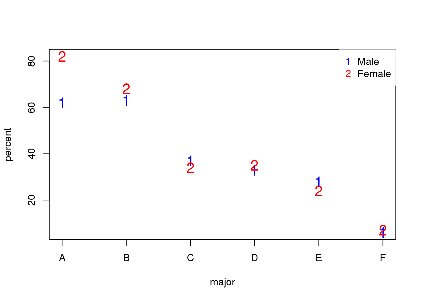
(#fig:admission_by_major)Admission percentage by major for each gender.
The average difference by major is actually 3.5% higher for women.
mean(y[,1]-y[,2])## [1] -3.510.1.0.4 Simpson’s Paradox in baseball
Simpson’s Paradox is commonly seen in baseball statistics. Here is a well known example in which David Justice had a higher batting average than Derek Jeter in both 1995 and 1996, but Jeter had a higher overall average:
| 1995 | 1996 | Combined | |
|---|---|---|---|
| Derek Jeter | 12/48 (.250) | 183/582 (.314) | 195/630 (.310) |
| David Justice | 104/411 (.253) | 45/140 (.321) | 149/551 (.270) |
The confounder here is games played. Jeter played more games during the year he batted better, while the opposite is true for Justice.
10.2 Confounding: High-Throughput Example
To describe the problem of confounding with a real example, we will use a dataset from this paper that claimed that roughly 50% of genes where differentially expressed when comparing blood from two ethnic groups. We include the data in one of our data packages:
library(Biobase) ##available from Bioconductor
library(genefilter)
library(GSE5859) ##available from github
data(GSE5859)
We can extract the gene expression data and sample information table using the Bioconductor functions exprs and pData like this:
geneExpression = exprs(e)
sampleInfo = pData(e)
Note that some samples were processed at different times.
head(sampleInfo$date)## [1] "2003-02-04" "2003-02-04" "2002-12-17" "2003-01-30"
## [5] "2003-01-03" "2003-01-16"This is an extraneous variable and should not affect the values in geneExpression. However, as we have seen in previous analyses, it does appear to have an effect. We will therefore explore this here.
We can immediately see that year and ethnicity are almost completely confounded:
year = factor( format(sampleInfo$date,"%y") )
tab = table(year,sampleInfo$ethnicity)
print(tab)
##
## year ASN CEU HAN
## 02 0 32 0
## 03 0 54 0
## 04 0 13 0
## 05 80 3 0
## 06 2 0 24By running a t-test and creating a volcano plot, we note that thousands of genes appear to be differentially expressed between ethnicities. Yet when we perform a similar comparison only on the CEU population between the years 2002 and 2003, we again obtain thousands of differentially expressed genes:
library(genefilter)

##remove control genes
out <- grep("AFFX",rownames(geneExpression))

eth <- sampleInfo$ethnicity
ind<- which(eth%in%c("CEU","ASN"))
res1 <- rowttests(geneExpression[-out,ind],droplevels(eth[ind]))
ind <- which(year%in%c("02","03") & eth=="CEU")
res2 <- rowttests(geneExpression[-out,ind],droplevels(year[ind]))

XLIM <- max(abs(c(res1$dm,res2$dm)))*c(-1,1)
YLIM <- range(-log10(c(res1$p,res2$p)))
mypar(1,2)
plot(res1$dm,-log10(res1$p),xlim=XLIM,ylim=YLIM,
     xlab="Effect size",ylab="-log10(p-value)",main="Populations")
plot(res2$dm,-log10(res2$p),xlim=XLIM,ylim=YLIM,
     xlab="Effect size",ylab="-log10(p-value)",main="2003 v 2002")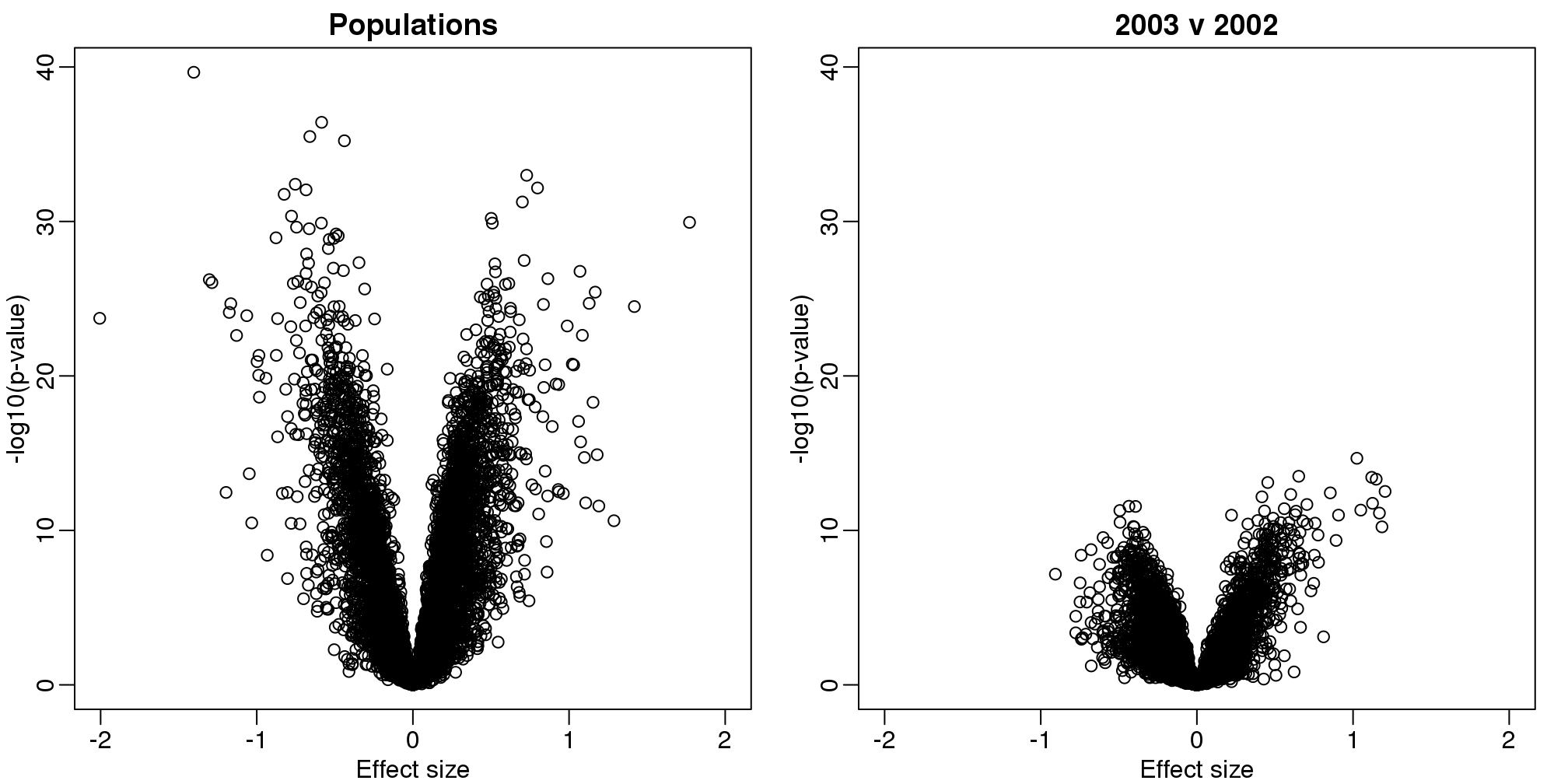
(#fig:volcano_plots)Volcano plots for gene expression data. Comparison by ethnicity (left) and by year within one ethnicity (right).
10.3 Discovering Batch Effects with EDA
Now that we understand PCA, we are going to demonstrate how we use it in practice with an emphasis on exploratory data analysis. To illustrate, we will go through an actual dataset that has not been sanitized for teaching purposes. We start with the raw data as it was provided in the public repository. The only step we did for you is to preprocess these data and create an R package with a preformed Bioconductor object.
10.4 Gene Expression Data
Start by loading the data:
library(rafalib)
library(Biobase)
library(GSE5859) ##Available from GitHub
data(GSE5859)
We start by exploring the sample correlation matrix and noting that one pair has a correlation of 1. This must mean that the same sample was uploaded twice to the public repository, but given different names. The following code identifies this sample and removes it.
cors <- cor(exprs(e))
Pairs=which(abs(cors)>0.9999,arr.ind=TRUE)
out = Pairs[which(Pairs[,1]<Pairs[,2]),,drop=FALSE]
if(length(out[,2])>0) e=e[,-out[2]]
We also remove control probes from the analysis:
out <- grep("AFFX",featureNames(e))
e <- e[-out,]
Now we are ready to proceed. We will create a detrended gene expression data matrix and extract the dates and outcome of interest from the sample annotation table.
y <- exprs(e)-rowMeans(exprs(e))
dates <- pData(e)$date
eth <- pData(e)$ethnicity
The original dataset did not include sex in the sample information. We did this for you in the subset dataset we provided for illustrative purposes. In the code below, we show how we predict the sex of each sample. The basic idea is to look at the median gene expression levels on Y chromosome genes. Males should have much higher values. To do this, we need to upload an annotation package that provides information for the features of the platform used in this experiment:
annotation(e)## [1] "hgfocus"We need to download and install the hgfocus.db package and then extract the chromosome location information.
library(hgfocus.db) ##install from Bioconductor## Warning in rsqlite_fetch(res@ptr, n = n): Don't need to
## call dbFetch() for statements, only for queriesmap2gene <- mapIds(hgfocus.db, keys=featureNames(e),
column="ENTREZID", keytype="PROBEID",
multiVals="first")## Warning in rsqlite_fetch(res@ptr, n = n): Don't need to
## call dbFetch() for statements, only for queries
## Warning in rsqlite_fetch(res@ptr, n = n): Don't need to
## call dbFetch() for statements, only for querieslibrary(Homo.sapiens)
map2chr <- mapIds(Homo.sapiens, keys=map2gene,
column="TXCHROM", keytype="ENTREZID",
multiVals="first")
chryexp <- colMeans(y[which(unlist(map2chr)=="chrY"),])If we create a histogram of the median gene expression values on chromosome Y, we clearly see two modes which must be females and males:
mypar()
hist(chryexp)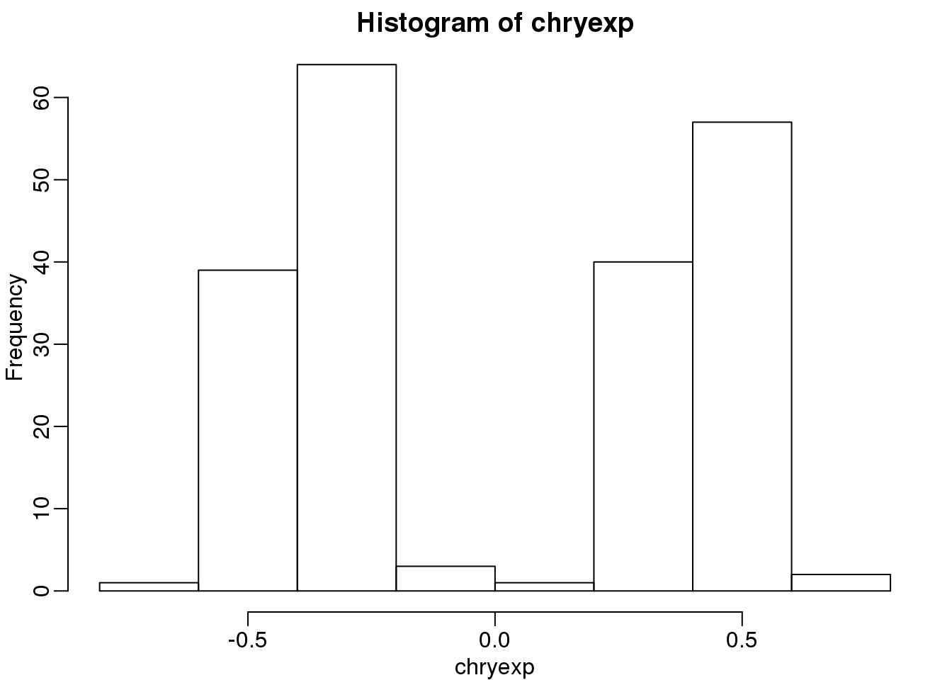
(#fig:predict_sex)Histogram of median expression y-axis. We can see females and males.
So we can predict sex this way:
sex <- factor(ifelse(chryexp<0,"F","M"))10.4.0.1 Calculating the PCs
We have shown how we can compute principal components using:
s <- svd(y)
dim(s$v)
## [1] 207 207We can also use prcomp which creates an object with just the PCs and also demeans by default. They provide practically the same principal components so we continue the analysis with the object \(s\).
10.4.0.2 Variance explained
A first step in determining how much sample correlation induced structure there is in the data.
library(RColorBrewer)
cols=colorRampPalette(rev(brewer.pal(11,"RdBu")))(100)
n <- ncol(y)
image(1:n,1:n,cor(y),xlab="samples",ylab="samples",col=cols,zlim=c(-1,1))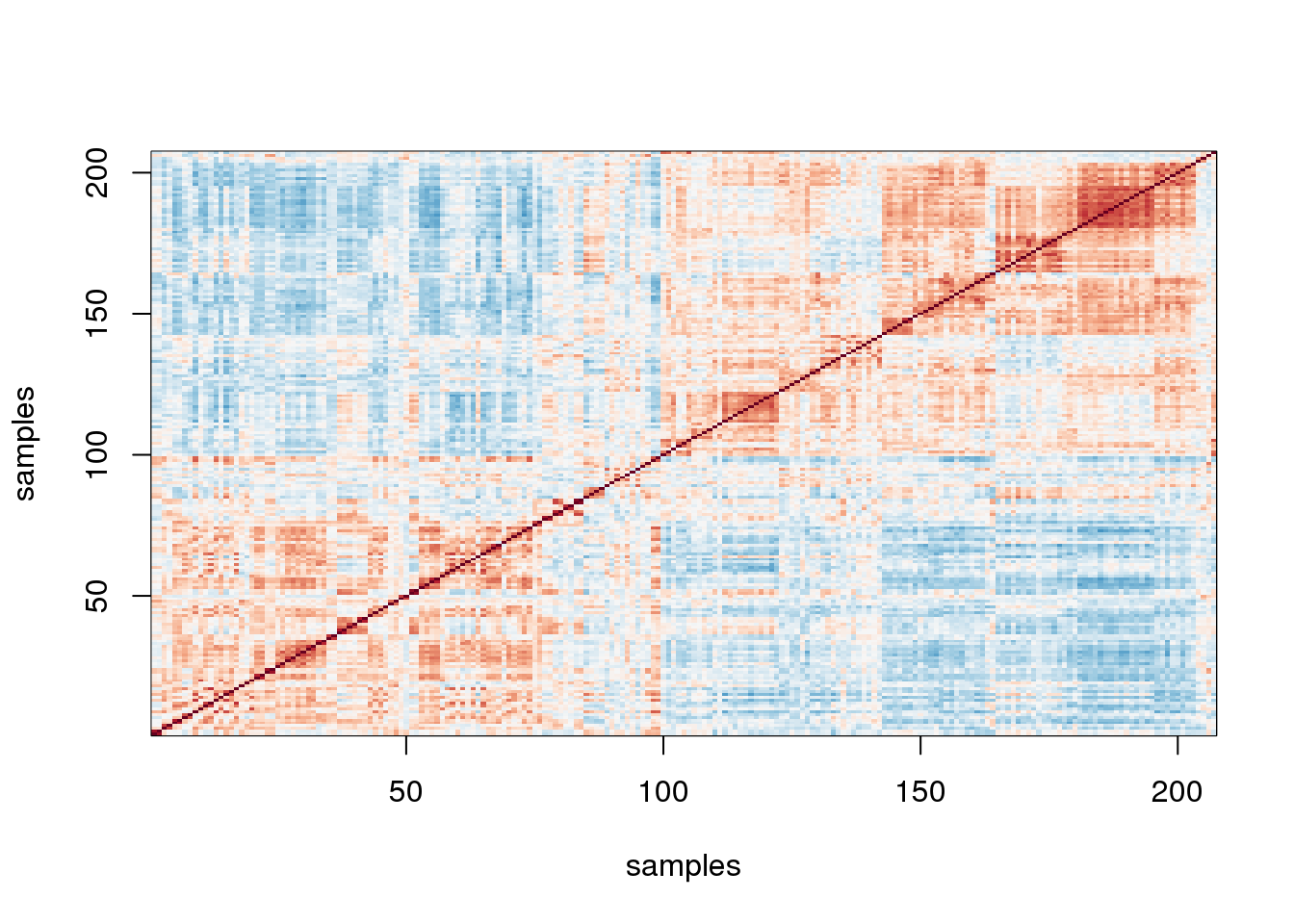
图 10.1: Image of correlations. Cell (i,j) represents correlation between samples i and j. Red is high, white is 0 and red is negative.
Here we are using the term structure to refer to the deviation from what one would see if the samples were in fact independent from each other. The plot above clearly shows groups of samples that are more correlated between themselves than to others.
One simple exploratory plot we make to determine how many principal components we need to describe this structure is the variance-explained plot. This is what the variance explained for the PCs would look like if data were independent :
y0 <- matrix( rnorm( nrow(y)*ncol(y) ) , nrow(y), ncol(y) )
d0 <- svd(y0)$d
plot(d0^2/sum(d0^2),ylim=c(0,.25))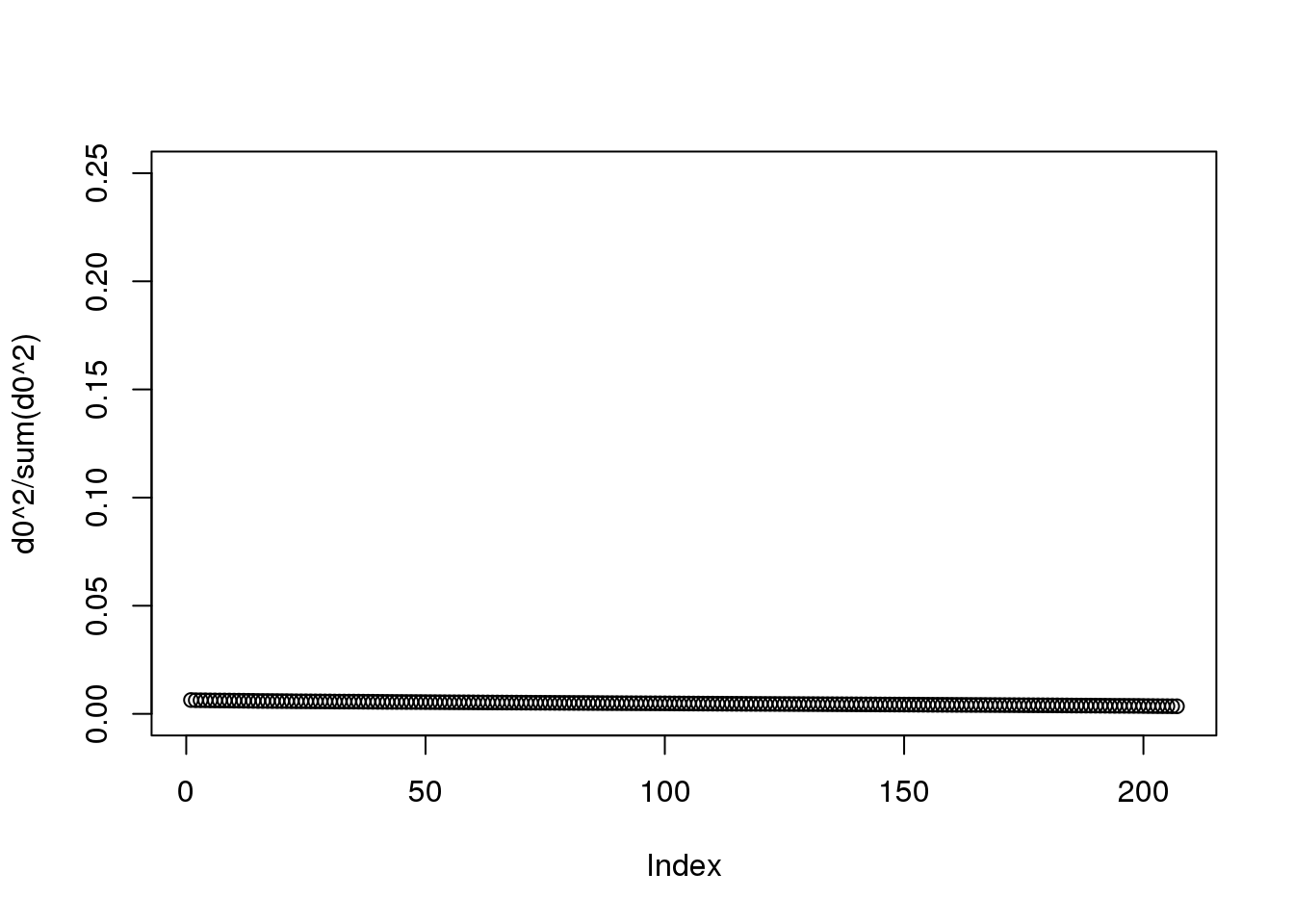
(#fig:null_variance_explained1)Variance explained plot for simulated independent data.
Instead we see this:
plot(s$d^2/sum(s$d^2))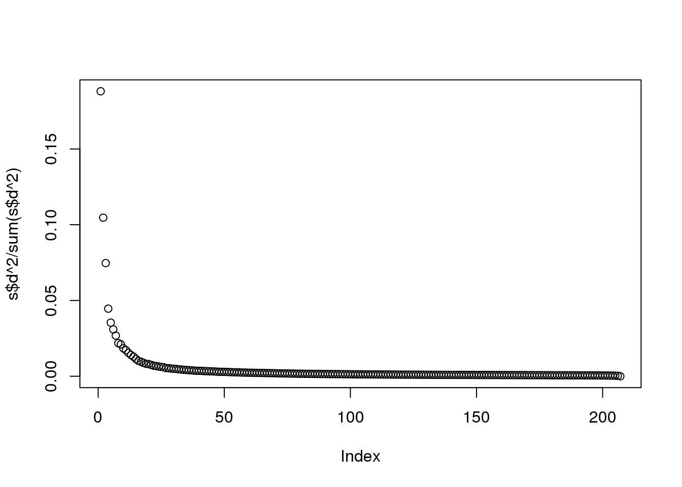
(#fig:variance_explained2)Variance explained plot for gene expression data.
At least 20 or so PCs appear to be higher than what we would expect with independent data. A next step is to try to explain these PCs with measured variables. Is this driven by ethnicity? Sex? Date? Or something else?
10.4.0.3 MDS plot
As previously shown, we can make MDS plots to start exploring the data to answer these questions. One way to explore the relationship between variables of interest and PCs is to use color to denote these variables. For example, here are the first two PCs with color representing ethnicity:
cols = as.numeric(eth)
mypar()
plot(s$v[,1],s$v[,2],col=cols,pch=16,
     xlab="PC1",ylab="PC2")
legend("bottomleft",levels(eth),col=seq(along=levels(eth)),pch=16)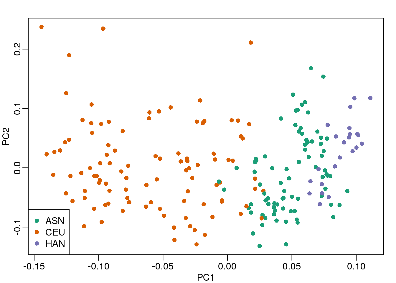
(#fig:mds_plot)First two PCs for gene expression data with color representing ethnicity.
There is a very clear association between the first PC and ethnicity. However, we also see that for the orange points there are sub-clusters. We know from previous analyses that ethnicity and preprocessing date are correlated:
year = factor(format(dates,"%y"))
table(year,eth)
## eth
## year ASN CEU HAN
## 02 0 32 0
## 03 0 54 0
## 04 0 13 0
## 05 80 3 0
## 06 2 0 23So explore the possibility of date being a major source of variability by looking at the same plot, but now with color representing year:
cols = as.numeric(year)
mypar()
plot(s$v[,1],s$v[,2],col=cols,pch=16,
     xlab="PC1",ylab="PC2")
legend("bottomleft",levels(year),col=seq(along=levels(year)),pch=16)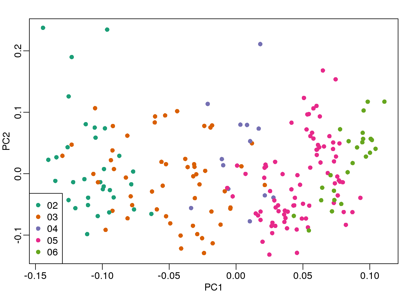
(#fig:mds_plot2)First two PCs for gene expression data with color representing processing year.
We see that year is also very correlated with the first PC. So which variable is driving this? Given the high level of confounding, it is not easy to parse out. Nonetheless, in the assessment questions and below, we provide some further exploratory approaches.
10.4.0.4 Boxplot of PCs
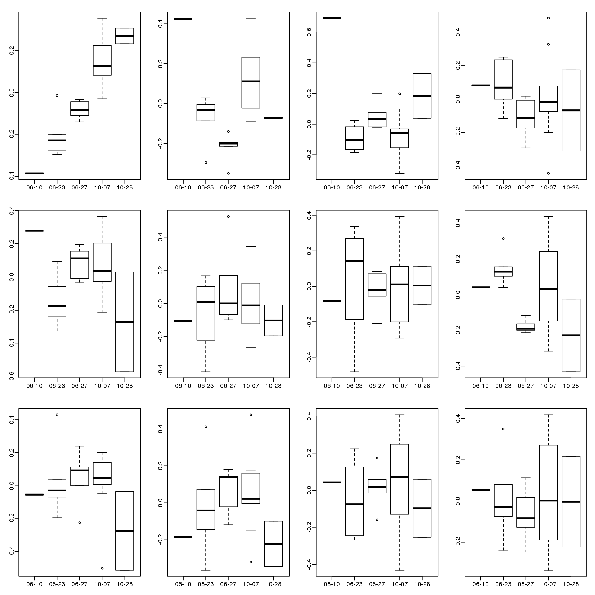
The structure seen in the plot of the between sample correlations shows a complex structure that seems to have more than 5 factors (one for each year). It certainly has more complexity than what would be explained by ethnicity. We can also explore the correlation with months.
month <- format(dates,"%y%m")
length( unique(month))
## [1] 21Because there are so many months (21), it becomes complicated to use color. Instead we can stratify by month and look at boxplots of our PCs:
variable <- as.numeric(month)
mypar(2,2)
for(i in 1:4){
  boxplot(split(s$v[,i],variable),las=2,range=0)
  stripchart(split(s$v[,i],variable),add=TRUE,vertical=TRUE,pch=1,cex=.5,col=1)
  }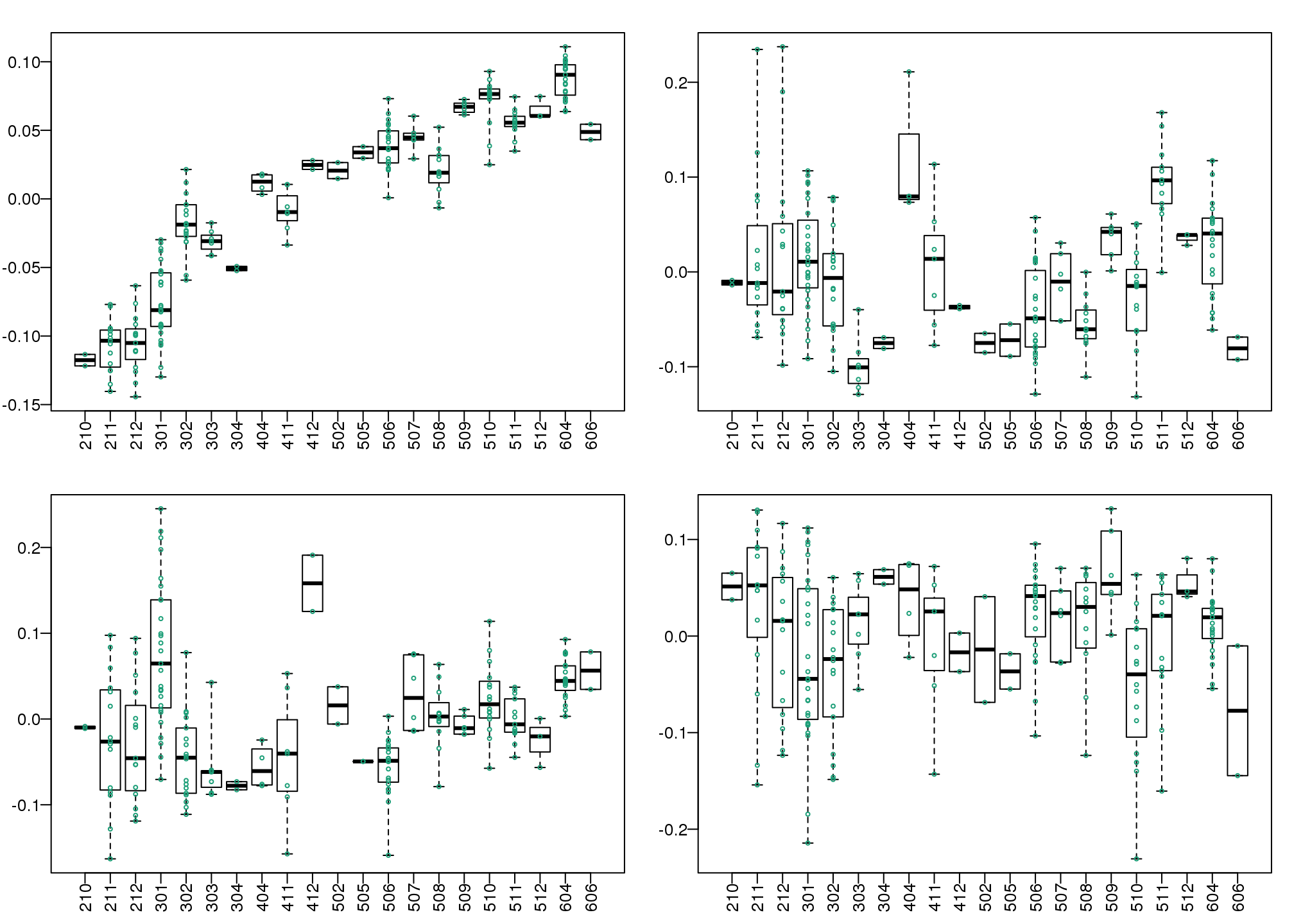
(#fig:pc_boxplots)Boxplot of first four PCs stratified by month.
Here we see that month has a very strong correlation with the first PC, even when stratifying by ethnic group as well as some of the others. Remember that samples processed between 2002-2004 are all from the same ethnic group. In cases such as these, in which we have many samples, we can use an analysis of variance to see which PCs correlate with month:
corr <- sapply(1:ncol(s$v),function(i){
  fit <- lm(s$v[,i]~as.factor(month))
  return( summary(fit)$adj.r.squared  )
  })
mypar()
plot(seq(along=corr), corr, xlab="PC")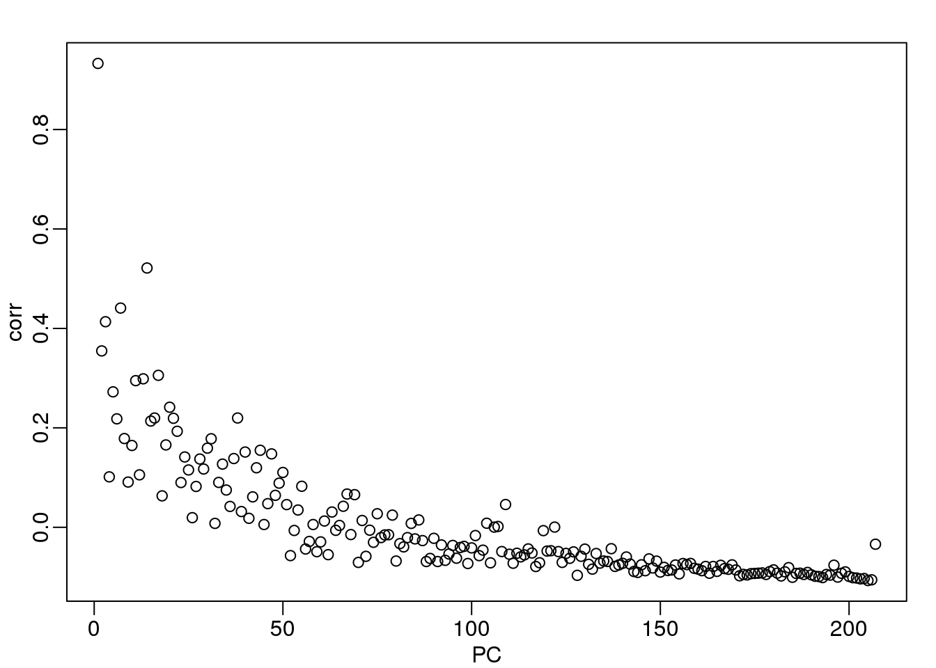
(#fig:month_PC_corr)Adjusted R-squared after fitting a model with each month as a factor to each PC.
We see a very strong correlation with the first PC and relatively strong correlations for the first 20 or so PCs. We can also compute F-statistics comparing within month to across month variability:
Fstats<- sapply(1:ncol(s$v),function(i){
   fit <- lm(s$v[,i]~as.factor(month))
   Fstat <- summary(aov(fit))[[1]][1,4]
   return(Fstat)
  })
mypar()
plot(seq(along=Fstats),sqrt(Fstats))
p <- length(unique(month))
abline(h=sqrt(qf(0.995,p-1,ncol(s$v)-1)))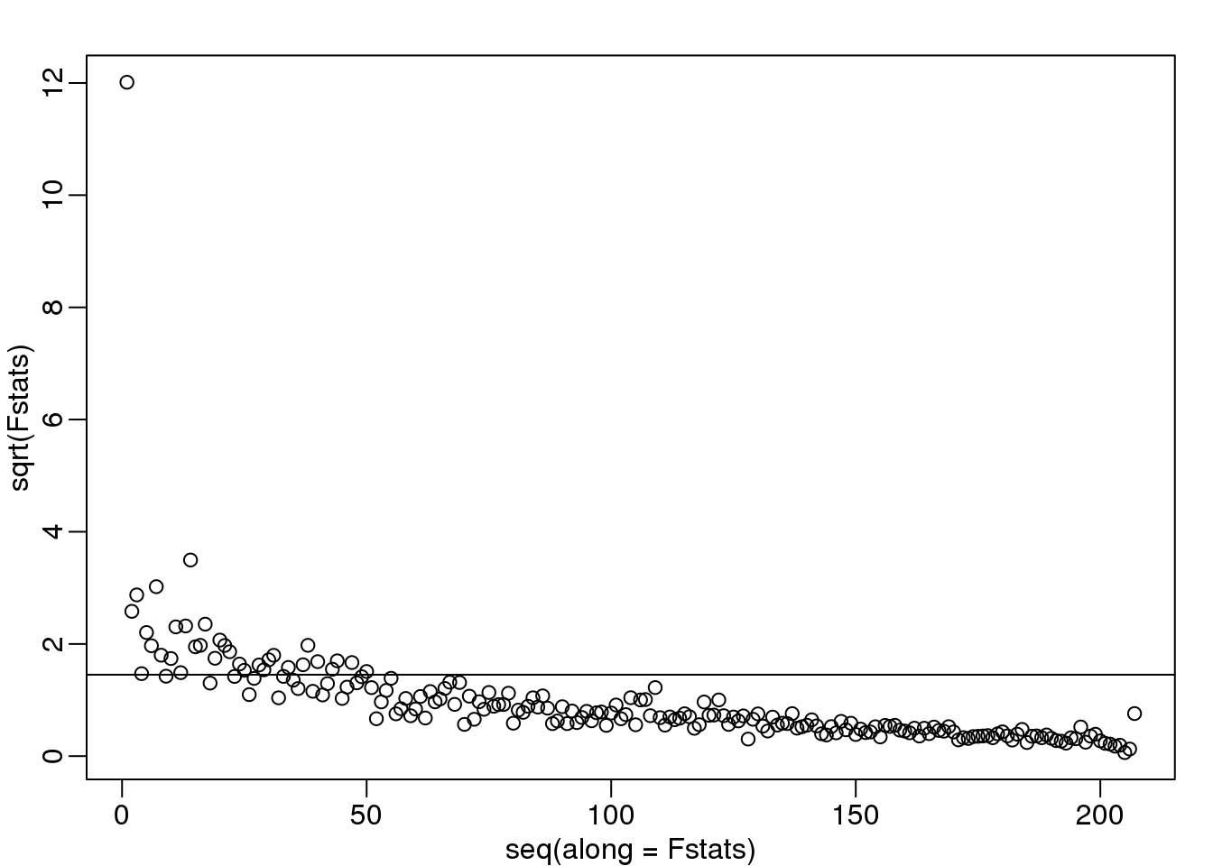
(#fig:fstat_month_PC)Square root of F-statistics from an analysis of variance to explain PCs with month.
We have seen how PCA combined with EDA can be a powerful technique to detect and understand batches. In a later section, we will see how we can use the PCs as estimates in factor analysis to improve model estimates.
10.5 Motivation for Statistical Approaches
10.5.0.1 Data example
To illustrate how we can adjust for batch effects using statistical methods, we will create a data example in which the outcome of interest is somewhat confounded with batch, but not completely. To aid with the illustration and assessment of the methods we demonstrate, we will also select an outcome for which we have an expectation of what genes should be differentially expressed. Namely, we make sex the outcome of interest and expect genes on the Y chromosome to be differentially expressed. We may also see genes from the X chromosome as differentially expressed since some escape X inactivation. The data with these properties is the one included in this dataset:
##available from course github repository
library(GSE5859Subset)
data(GSE5859Subset)
We can see the correlation between sex and month:
month <- format(sampleInfo$date,"%m")
table(sampleInfo$group, month)
## month
## 06 10
## 0 9 3
## 1 3 9To illustrate the confounding, we will pick some genes to show in a heatmap plot. We pick 1) all Y chromosome genes, 2) some genes that we see correlate with batch, and 3) some randomly selected genes. The image below (code not shown) shows high values in red, low values in blue, middle values in yellow. Each column is a sample and each row is one of the randomly selected genes:
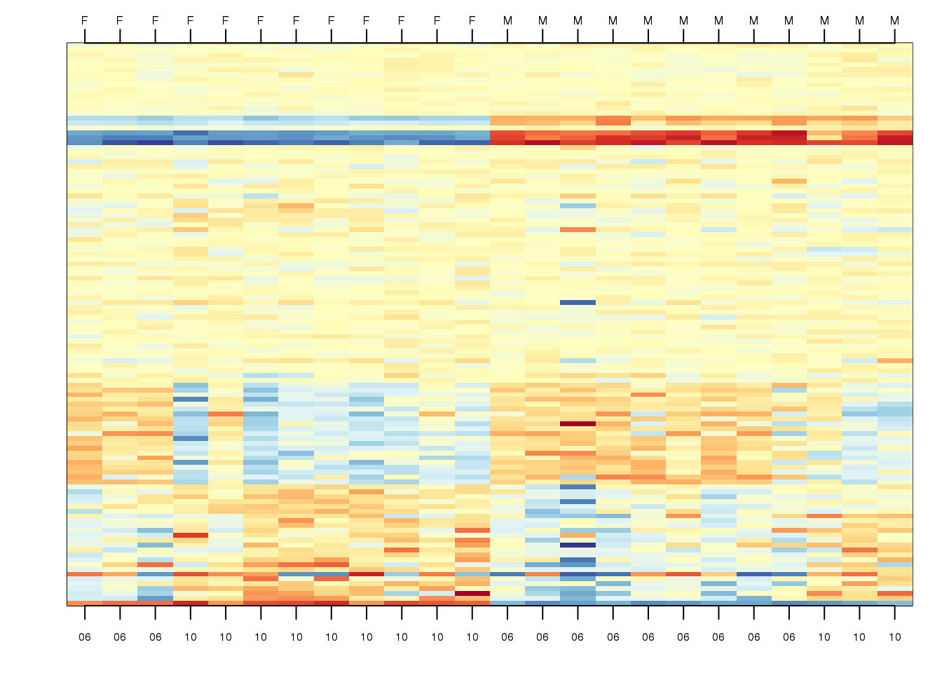
(#fig:image_of_subset)Image of gene expression data for genes selected to show difference in group as well as the batch effect, along with some randomly chosen genes.
In the plot above, the first 12 columns are females (1s) and the last 12 columns are males (0s). We can see some Y chromosome genes towards the top since they are blue for females and red from males. We can also see some genes that correlate with month towards the bottom of the image. Some genes are low in June (6) and high in October (10), while others do the opposite. The month effect is not as clear as the sex effect, but it is certainly present.
In what follows, we will imitate the typical analysis we would do in practice. We will act as if we don’t know which genes are supposed to be differentially expressed between males and females, find genes that are differentially expressed, and the evaluate these methods by comparing to what we expect to be correct. Note while in the plot we only show a few genes, for the analysis we analyze all 8,793.
10.5.0.2 Assessment plots and summaries
For the assessment of the methods we present, we will assume that autosomal (not on chromosome X or Y) genes on the list are likely false positives. We will also assume that genes on chromosome Y are likely true positives. Chromosome X genes could go either way. This gives us the opportunity to estimate both specificity and sensitivity. Since in practice we rarely know the “truth”, these evaluations are not possible. Simulations are therefore commonly used for evaluation purposes: we know the truth because we construct the data. However, simulations are at risk of not capturing all the nuances of real experimental data. In contrast, this dataset is an experimental dataset.
In the next sections, we will use the histogram p-values to evaluate the specificity (low false positive rates) of the batch adjustment procedures presented here. Because the autosomal genes are not expected to be differentially expressed, we should see a a flat p-value histogram. To evaluate sensitivity (low false negative rates), we will report the number of the reported genes on chromosome X and chromosome Y for which we reject the null hypothesis. We also include a volcano plot with a horizontal dashed line separating the genes called significant from those that are not, and colors used to highlight chromosome X and Y genes.
Below are the results of applying a naive t-test and report genes with q-values smaller than 0.1.
library(qvalue)
res <- rowttests(geneExpression,as.factor( sampleInfo$group ))
mypar(1,2)
hist(res$p.value[which(!chr%in%c("chrX","chrY") )],main="",ylim=c(0,1300))

plot(res$dm,-log10(res$p.value))
points(res$dm[which(chr=="chrX")],-log10(res$p.value[which(chr=="chrX")]),col=1,pch=16)
points(res$dm[which(chr=="chrY")],-log10(res$p.value[which(chr=="chrY")]),col=2,pch=16,
       xlab="Effect size",ylab="-log10(p-value)")
legend("bottomright",c("chrX","chrY"),col=1:2,pch=16)
qvals <- qvalue(res$p.value)$qvalue
index <- which(qvals<0.1)
abline(h=-log10(max(res$p.value[index])))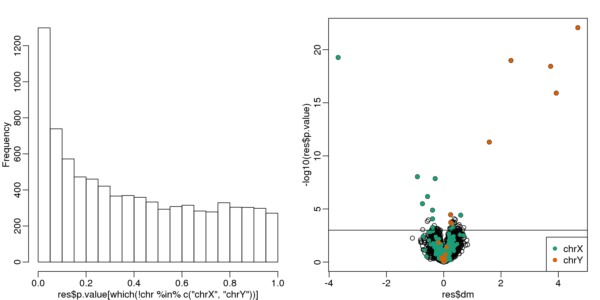
(#fig:pvalue_hist_and_volcano_plots)p-value histogram and volcano plot for comparison between sexes. The Y chromosome genes (considered to be positives) are highlighted in red. The X chromosome genes (a subset is considered to be positive) are shown in green.
cat("Total genes with q-value < 0.1: ",length(index),"\n",
    "Number of selected genes on chrY: ", sum(chr[index]=="chrY",na.rm=TRUE),"\n",
    "Number of selected genes on chrX: ", sum(chr[index]=="chrX",na.rm=TRUE),sep="")
## Total genes with q-value < 0.1: 59
## Number of selected genes on chrY: 8
## Number of selected genes on chrX: 12We immediately note that the histogram is not flat. Instead, low p-values are over-represented. Furthermore, more than half of the genes on the final list are autosomal. We now describe two statistical solutions and try to improve on this.
10.6 Adjusting for Batch Effects with Linear Models
We have already observed that processing date has an effect on gene expression. We will therefore try to adjust for this by including it in a model. When we perform a t-test comparing the two groups, it is equivalent to fitting the following linear model:
\[Y_{ij} = \alpha_j + x_i \beta_{j} + \varepsilon_{ij}\]
to each gene \(j\) with \(x_i=1\) if subject \(i\) is female and 0 otherwise. Note that \(\beta_{j}\) represents the estimated difference for gene \(j\) and \(\varepsilon_{ij}\) represents the within group variation. So what is the problem?
The theory we described in the linear models chapter assumes that the error terms are independent. We know that this is not the case for all genes because we know the error terms from October will be more alike to each other than the June error terms. We can adjust for this by including a term that models this effect:
\[Y_{ij} = \alpha_j + x_i \beta_{j} + z_i \gamma_j+\varepsilon_{ij}.\]
Here \(z_i=1\) if sample \(i\) was processed in October and 0 otherwise and \(\gamma_j\) is the month effect for gene \(j\). This an example of how linear models give us much more flexibility than procedures such as the t-test.
We construct a model matrix that includes batch.
sex <- sampleInfo$group
X <- model.matrix(~sex+batch)
Now we can fit a model for each gene. For example, note the difference between the original model and one that has been adjusted for batch:
j <- 7635
y <- geneExpression[j,]
X0 <- model.matrix(~sex)
fit <- lm(y~X0-1)
summary(fit)$coef
## Estimate Std. Error t value Pr(>|t|)
## X0(Intercept) 6.9556 0.2166 32.112 5.612e-20
## X0sex -0.6557 0.3063 -2.141 4.365e-02X <- model.matrix(~sex+batch)
fit <- lm(y~X)
summary(fit)$coef## Estimate Std. Error t value Pr(>|t|)
## (Intercept) 7.26330 0.1606 45.2384 2.036e-22
## Xsex -0.04024 0.2427 -0.1658 8.699e-01
## Xbatch10 -1.23090 0.2427 -5.0709 5.071e-05We then fit this new model for each gene. For instance, we can use sapply to recover the estimated coefficient and p-value in the following way:
res <- t( sapply(1:nrow(geneExpression),function(j){
  y <- geneExpression[j,]
  fit <- lm(y~X-1)
  summary(fit)$coef[2,c(1,4)]
} ) )


##turn into data.frame so we can use the same code for plots as above
res <- data.frame(res)
names(res) <- c("dm","p.value")

mypar(1,2)
hist(res$p.value[which(!chr%in%c("chrX","chrY") )],main="",ylim=c(0,1300))

plot(res$dm,-log10(res$p.value))
points(res$dm[which(chr=="chrX")],-log10(res$p.value[which(chr=="chrX")]),col=1,pch=16)
points(res$dm[which(chr=="chrY")],-log10(res$p.value[which(chr=="chrY")]),col=2,pch=16,
       xlab="Effect size",ylab="-log10(p-value)")
legend("bottomright",c("chrX","chrY"),col=1:2,pch=16)
qvals <- qvalue(res$p.value)$qvalue
index <- which(qvals<0.1)
abline(h=-log10(max(res$p.value[index])))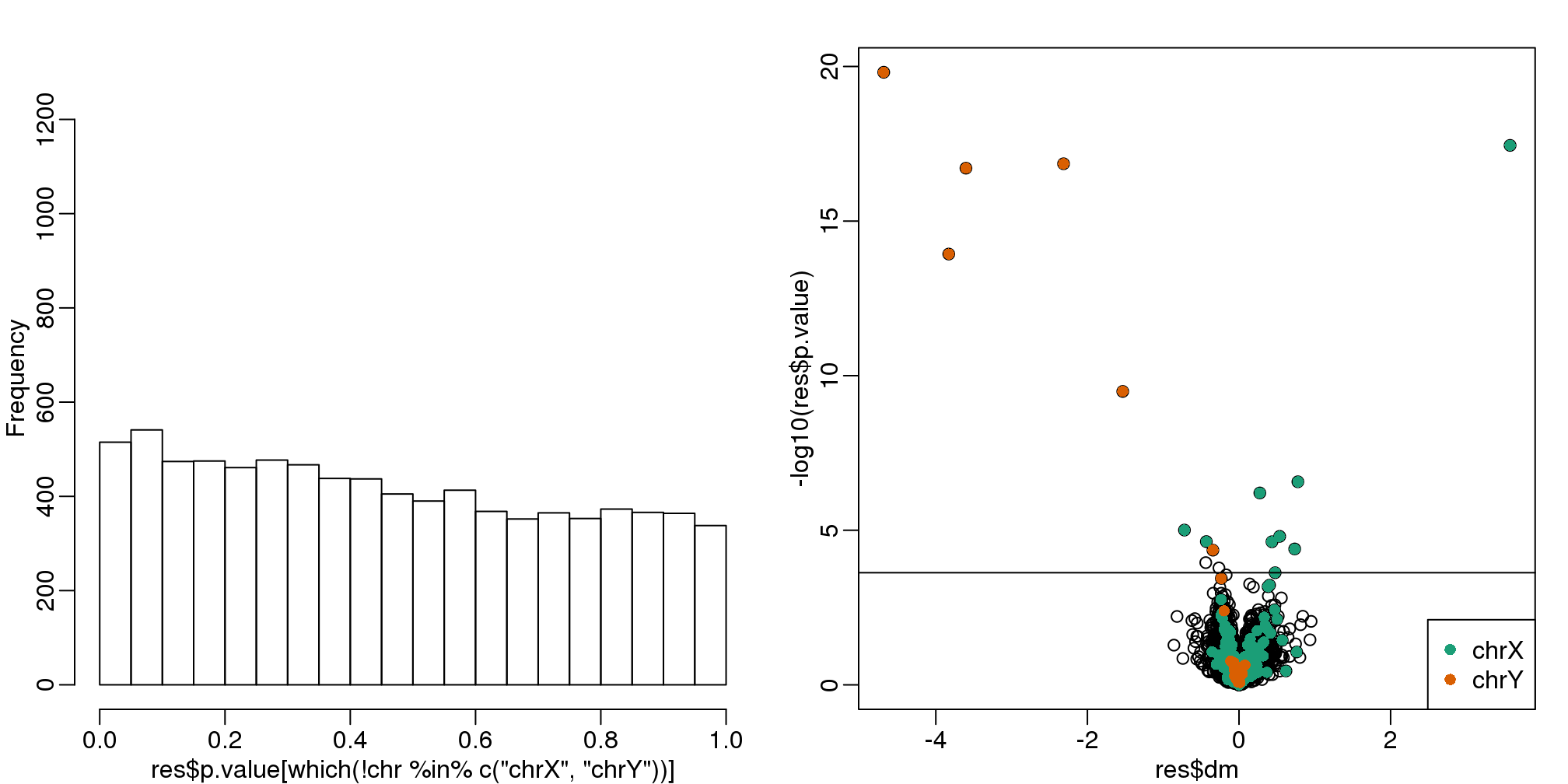
(#fig:pvalue_hist_and_volcano_plots2)p-value histogram and volcano plot for comparison between sexes after adjustment for month. The Y chromosome genes (considered to be positives) are highlighted in red. The X chromosome genes (a subset is considered to be positive) are shown in green.
cat("Total genes with q-value < 0.1: ",length(index),"\n",
    "Number of selected genes on chrY: ", sum(chr[index]=="chrY",na.rm=TRUE),"\n",
    "Number of selected genes on chrX: ", sum(chr[index]=="chrX",na.rm=TRUE),sep="")
## Total genes with q-value < 0.1: 17
## Number of selected genes on chrY: 6
## Number of selected genes on chrX: 9There is a great improvement in specificity (less false positives) without much loss in sensitivity (we still find many chromosome Y genes). However, we still see some bias in the histogram. In a later section we will see that month does not perfectly account for the batch effect and that better estimates are possible.
10.6.0.1 A note on computing efficiency
In the code above, the design matrix does not change within the iterations we are computing \((X^\top X)^{-1}\) repeatedly and applying to each gene. Instead we can perform this calculation in one matrix algebra calculation by computing it once and then obtaining all the betas by multiplying \((X^\top X)^{-1}X^\top Y\) with the columns of \(Y\) representing genes in this case. The limma package has an implementation of this idea (using the QR decomposition). Notice how much faster this is:
library(limma)
X <- model.matrix(~sex+batch)
fit <- lmFit(geneExpression,X)
The estimated regression coefficients for each gene are obtained like this:
dim( fit$coef)## [1] 8793 3We have one estimate for each gene. To obtain p-values for one of these, we have to construct the ratios:
k <- 2 ##second coef
ses <- fit$stdev.unscaled[,k]*fit$sigma
ttest <- fit$coef[,k]/ses
pvals <- 2*pt(-abs(ttest),fit$df)
10.6.0.2 Combat
Combat is a popular method and is based on using linear models to adjust for batch effects. It fits a hierarchical model to estimate and remove row specific batch effects. Combat uses a modular approach. In a first step, what is considered to be a batch effect is removed:
library(sva) #available from Bioconductor
mod <- model.matrix(~sex)
cleandat <- ComBat(geneExpression,batch,mod)
## Found 2 batches
## Adjusting for 1 covariate(s) or covariate level(s)
## Standardizing Data across genes
## Fitting L/S model and finding priors
## Finding parametric adjustments
## Adjusting the DataThen the results can be used to fit a model with our variable of interest:
res<-genefilter::rowttests(cleandat,factor(sex))In this case, the results are less specific than what we obtain by fitting the simple linear model:
mypar(1,2)
hist(res$p.value[which(!chr%in%c("chrX","chrY") )],main="",ylim=c(0,1300))

plot(res$dm,-log10(res$p.value))
points(res$dm[which(chr=="chrX")],-log10(res$p.value[which(chr=="chrX")]),col=1,pch=16)
points(res$dm[which(chr=="chrY")],-log10(res$p.value[which(chr=="chrY")]),col=2,pch=16,
       xlab="Effect size",ylab="-log10(p-value)")
legend("bottomright",c("chrX","chrY"),col=1:2,pch=16)
qvals <- qvalue(res$p.value)$qvalue
index <- which(qvals<0.1)
abline(h=-log10(max(res$p.value[index])))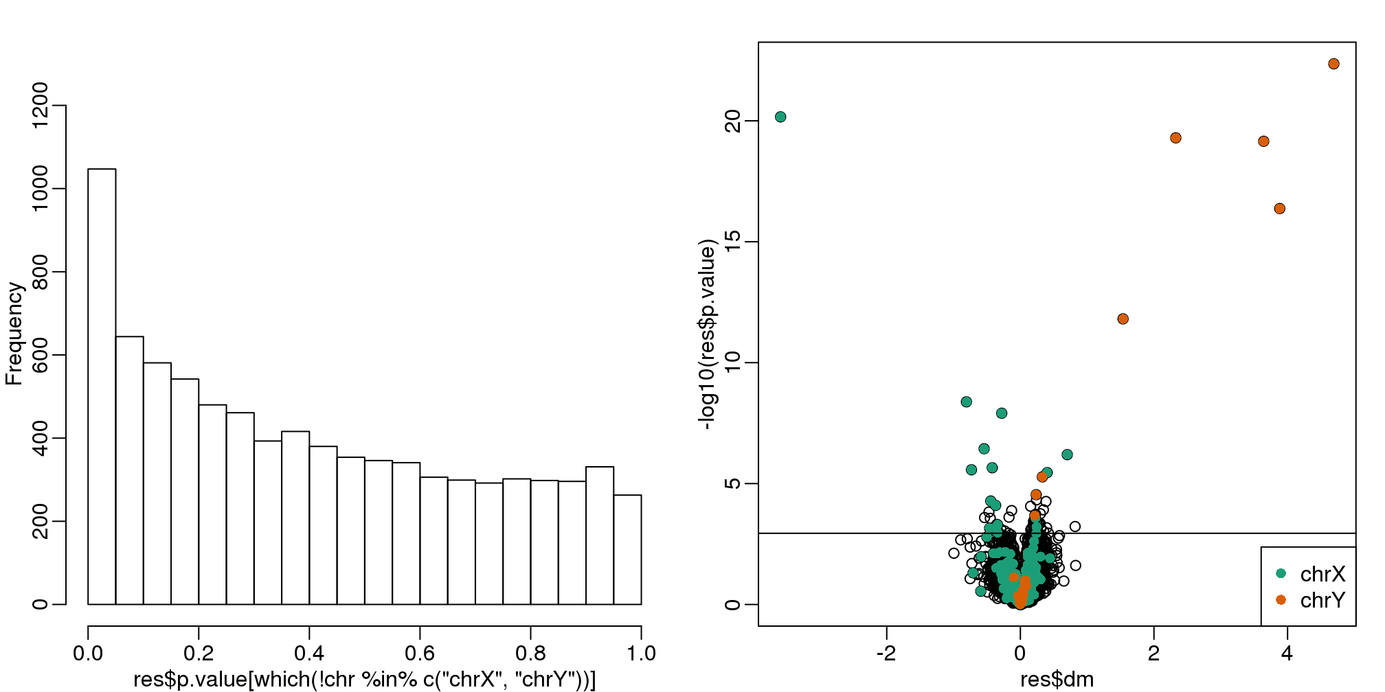
(#fig:pvalue_hist_and_volcano_plots3)p-value histogram and volcano plot for comparison between sexes for Combat. The Y chromosome genes (considered to be positives) are highlighted in red. The X chromosome genes (a subset is considered to be positive) are shown in green.
cat("Total genes with q-value < 0.1: ",length(index),"\n",
    "Number of selected genes on chrY: ", sum(chr[index]=="chrY",na.rm=TRUE),"\n",
    "Number of selected genes on chrX: ", sum(chr[index]=="chrX",na.rm=TRUE),sep="")
## Total genes with q-value < 0.1: 68
## Number of selected genes on chrY: 8
## Number of selected genes on chrX: 1610.7 Factor Analysis
Before we introduce the next type of statistical method for batch effect correction, we introduce the statistical idea that motivates the main idea: Factor Analysis. Factor Analysis was first developed over a century ago. Karl Pearson noted that correlation between different subjects when the correlation was computed across students. To explain this, he posed a model having one factor that was common across subjects for each student that explained this correlation:
\[ Y_ij = \alpha_i W_1 + \varepsilon_{ij} \]
with \(Y_{ij}\) the grade for individual \(i\) on subject \(j\) and \(\alpha_i\) representing the ability of student \(i\) to obtain good grades.
In this example, \(W_1\) is a constant. Here we will motivate factor analysis with a slightly more complicated situation that resembles the presence of batch effects. We generate a random \(N \times 6\) matrix \(\mathbf{Y}\) with representing grades in six different subjects for N different children. We generate the data in a way that subjects are correlated with some more than others:
10.7.0.1 Sample correlations
Note that we observe high correlation across the six subjects:
round(cor(Y),2)## Math Science CS Eng Hist Classics
## Math 1.00 0.67 0.64 0.34 0.29 0.28
## Science 0.67 1.00 0.65 0.29 0.29 0.26
## CS 0.64 0.65 1.00 0.35 0.30 0.29
## Eng 0.34 0.29 0.35 1.00 0.71 0.72
## Hist 0.29 0.29 0.30 0.71 1.00 0.68
## Classics 0.28 0.26 0.29 0.72 0.68 1.00A graphical look shows that the correlation suggests a grouping of the subjects into STEM and the humanities.
In the figure below, high correlations are red, no correlation is white and negative correlations are blue (code not shown).
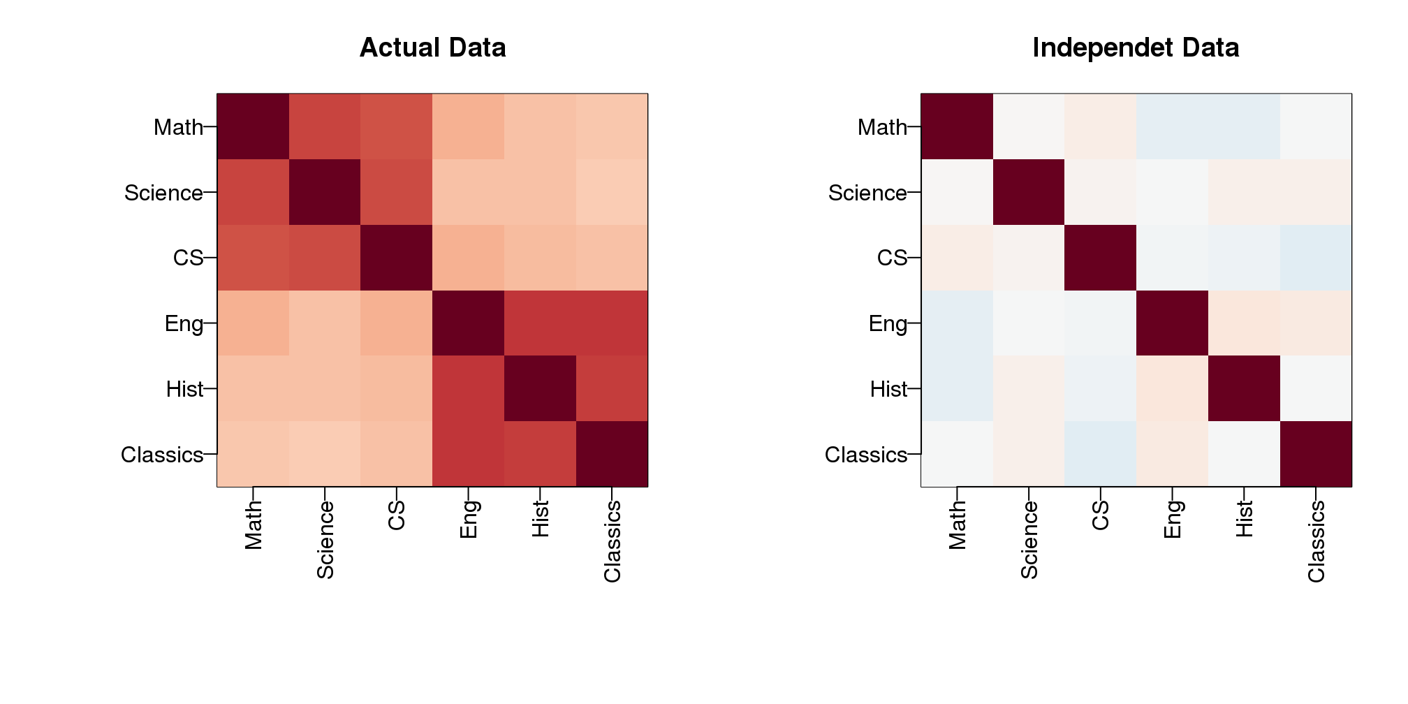
(#fig:correlation_images)Images of correlation between columns. High correlation is red, no correlation is white, and negative correlation is blue.
The figure shows the following: there is correlation across all subjects, indicating that students have an underlying hidden factor (academic ability for example) that results in subjects begin correlated since students that test high in one subject tend to test high in the others. We also see that this correlation is higher with the STEM subjects and within the humanities subjects. This implies that there is probably another hidden factor that determines if students are better in STEM or humanities. We now show how these concepts can be explained with a statistical model.
10.7.0.2 Factor model
Based on the plot above, we hypothesize that there are two hidden factors \(\mathbf{W}_1\) and \(\mathbf{W}_2\) and, to account for the observed correlation structure, we model the data in the following way:
\[ Y_{ij} = \alpha_{i,1} W_{1,j} + \alpha_{i,2} W_{2,j} + \varepsilon_{ij} \]
The interpretation of these parameters are as follows: \(\alpha_{i,1}\) is the overall academic ability for student \(i\) and \(\alpha_{i,2}\) is the difference in ability between the STEM and humanities for student \(i\). Now, can we estimate the \(W\) and \(\alpha\) ?
10.7.0.3 Factor analysis and PCA
It turns out that under certain assumptions, the first two principal components are optimal estimates for \(W_1\) and \(W_2\). So we can estimate them like this:
s <- svd(Y)
What <- t(s$v[,1:2])
colnames(What)<-colnames(Y)
round(What,2)
## Math Science CS Eng Hist Classics
## [1,] 0.36 0.36 0.36 0.47 0.43 0.45
## [2,] -0.44 -0.49 -0.42 0.34 0.34 0.39As expected, the first factor is close to a constant and will help explain the observed correlation across all subjects, while the second is a factor differs between STEM and humanities. We can now use these estimates in the model:
\[ Y_{ij} = \alpha_{i,1} \hat{W}_{1,j} + \alpha_{i,2} \hat{W}_{2,j} + \varepsilon_{ij} \]
and we can now fit the model and note that it explains a large percent of the variability.
fit = s$u[,1:2]%*% (s$d[1:2]*What)
var(as.vector(fit))/var(as.vector(Y))
## [1] 0.7881The important lesson here is that when we have correlated units, the standard linear models are not appropriate. We need to account for the observed structure somehow. Factor analysis is a powerful way of achieving this.
10.7.0.4 Factor analysis in general
In high-throughput data, it is quite common to see correlation structure. For example, notice the complex correlations we see across samples in the plot below. These are the correlations for a gene expression experiment with columns ordered by date:
library(Biobase)
library(GSE5859)
data(GSE5859)
n <- nrow(pData(e))
o <- order(pData(e)$date)
Y=exprs(e)[,o]
cors=cor(Y-rowMeans(Y))
cols=colorRampPalette(rev(brewer.pal(11,"RdBu")))(100)

mypar()
image(1:n,1:n,cors,col=cols,xlab="samples",ylab="samples",zlim=c(-1,1))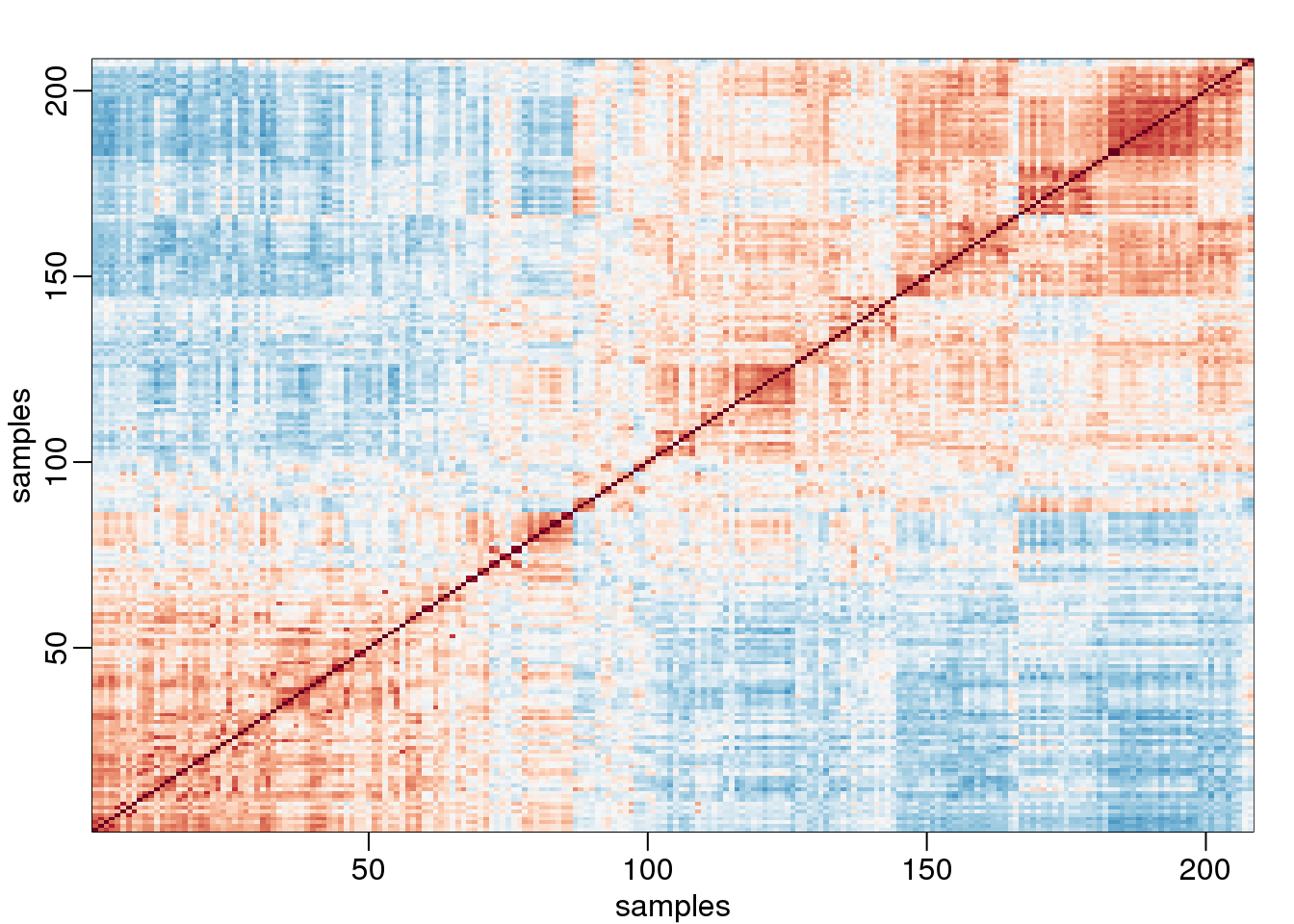
(#fig:gene_expression_correlations)Image of correlations. Cell (i,j) represents correlation between samples i and j. Red is high, white is 0 and red is negative.
Two factors will not be enough to model the observed correlation structure. However, a more general factor model can be useful:
\[ Y_{ij} = \sum_{k=1}^K \alpha_{i,k} W_{j,k} + \varepsilon_{ij} \]
And we can use PCA to estimate \(\mathbf{W}_1,\dots,\mathbf{W}_K\). However, choosing \(k\) is a challenge and a topic of current research. In the next section we describe how exploratory data analysis might help.
10.8 Modeling Batch Effects with Factor Analysis
We continue to use this data set:
library(GSE5859Subset)
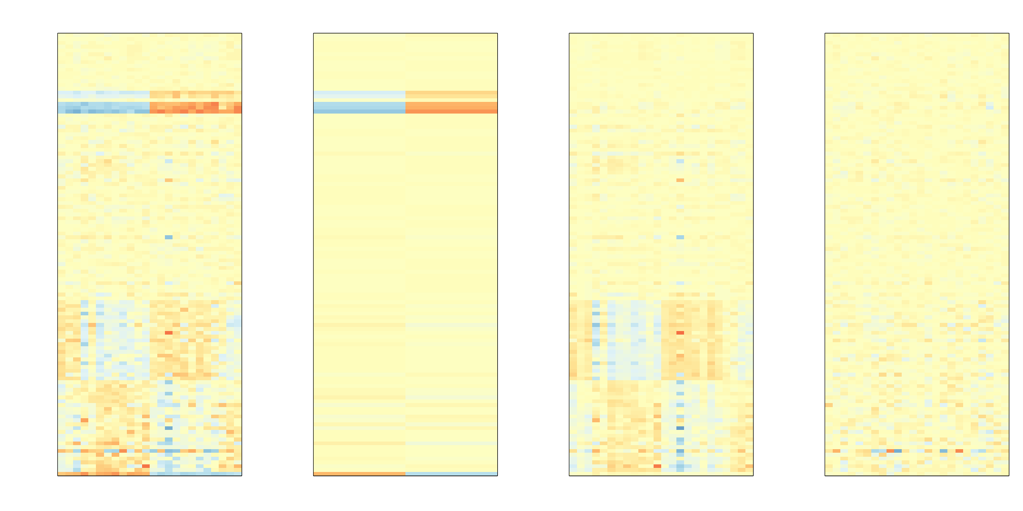
data(GSE5859Subset)Below is the image we showed earlier with a subset of genes showing both the sex effect and the month time effects, but now with an image showing the sample to sample correlations (computed on all genes) showing the complex structure of the data (code not shown):
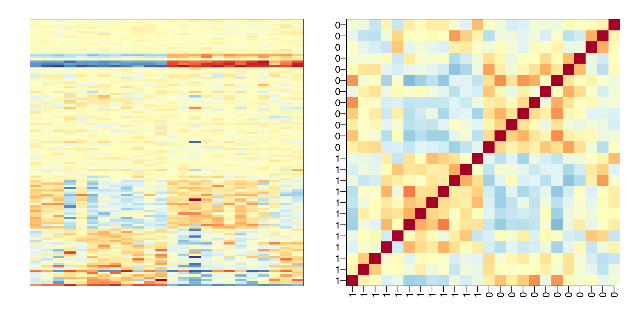
(#fig:correlation_image)Image of subset gene expression data (left) and image of correlations for this dataset (right).
We have seen how the approach that assumes month explains the batch and adjusts with linear models perform relatively well. However, there was still room for improvement. This is most likely due to the fact that month is only a surrogate for some hidden factor or factors that actually induces structure or between sample correlation.
10.8.0.1 What is a batch?
Here is a plot of dates for each sample, with color representing month:
times <-sampleInfo$date
mypar(1,1)
o=order(times)
plot(times[o],pch=21,bg=as.numeric(batch)[o],ylab="Date")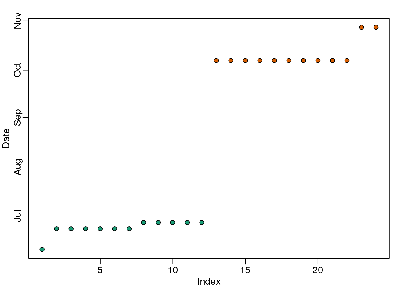
(#fig:what_is_batch)Dates with color denoting month.
We note that there is more than one day per month. Could day have an effect as well? We can use PCA and EDA to try to answer this question. Here is a plot of the first principal component ordered by date:
s <- svd(y)
mypar(1,1)
o<-order(times)
cols <- as.numeric( batch)
plot(s$v[o,1],pch=21,cex=1.25,bg=cols[o],ylab="First PC",xlab="Date order")
legend("topleft",c("Month 1","Month 2"),col=1:2,pch=16,box.lwd=0)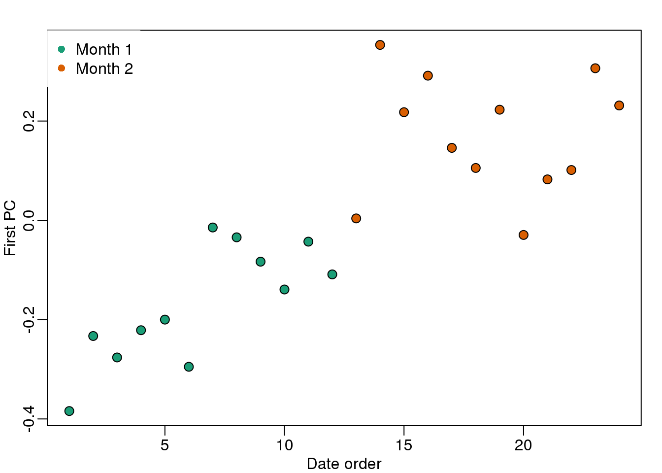
(#fig:PC1_versus_time)First PC plotted against order by date with colors representing month.
Day seems to be highly correlated with the first PC, which explains a high percentage of the variability:
mypar(1,1)
plot(s$d^2/sum(s$d^2),ylab="% variance explained",xlab="Principal component")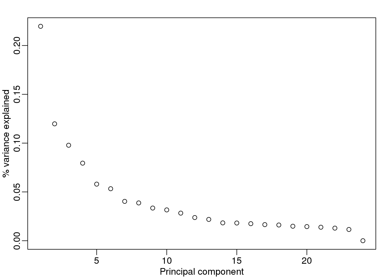
(#fig:variance_explained3)Variance explained.
Further exploration shows that the first six or so PC seem to be at least partially driven by date:
mypar(3,4)
for(i in 1:12){
  days <- gsub("2005-","",times)
  boxplot(split(s$v[,i],gsub("2005-","",days)))
}
(#fig:PCs_stratified_by_time)First 12 PCs stratified by dates.
So what happens if we simply remove the top six PC from the data and then perform a t-test?
D <- s$d; D[1:4]<-0 #take out first 2
cleandat <- sweep(s$u,2,D,"*")%*%t(s$v)
res <-rowttests(cleandat,factor(sex))
This does remove the batch effect, but it seems we have also removed much of the biological effect we are interested in. In fact, no genes have q-value <0.1 anymore.
library(qvalue)
mypar(1,2)
hist(res$p.value[which(!chr%in%c("chrX","chrY") )],main="",ylim=c(0,1300))

plot(res$dm,-log10(res$p.value))
points(res$dm[which(chr=="chrX")],-log10(res$p.value[which(chr=="chrX")]),col=1,pch=16)
points(res$dm[which(chr=="chrY")],-log10(res$p.value[which(chr=="chrY")]),col=2,pch=16,
       xlab="Effect size",ylab="-log10(p-value)")
legend("bottomright",c("chrX","chrY"),col=1:2,pch=16)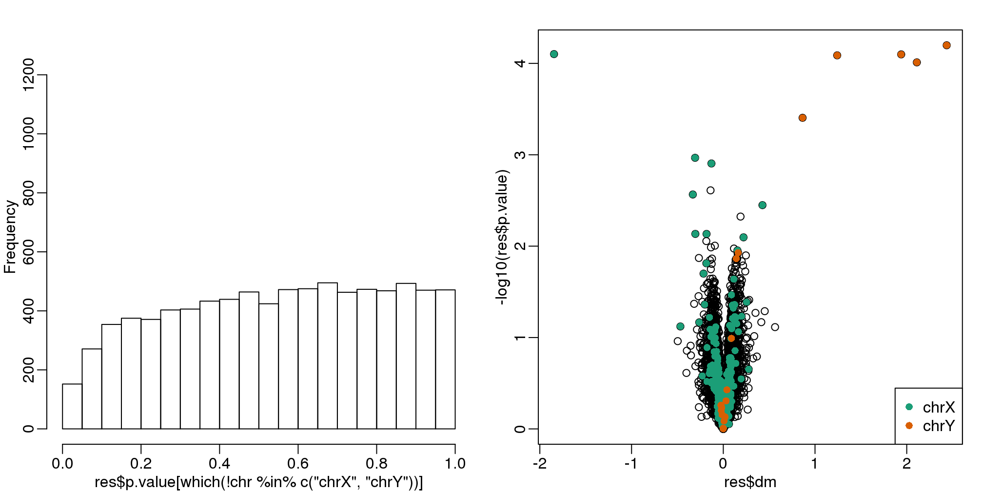
(#fig:pval_hist_and_volcano_after_removing_PCs)p-value histogram and volcano plot after blindly removing the first two PCs.
qvals <- qvalue(res$p.value)$qvalue
index <- which(qvals<0.1)

cat("Total genes with q-value < 0.1: ",length(index),"\n",
    "Number of selected genes on chrY: ", sum(chr[index]=="chrY",na.rm=TRUE),"\n",
    "Number of selected genes on chrX: ", sum(chr[index]=="chrX",na.rm=TRUE),sep="")
## Total genes with q-value < 0.1: 0
## Number of selected genes on chrY: 0
## Number of selected genes on chrX: 0In this case we seem to have over corrected since we now recover many fewer chromosome Y genes and the p-value histogram shows a dearth of small p-values that makes the distribution non-uniform. Because sex is probably correlated with some of the first PCs, this may be a case of “throwing out the baby with the bath water”.
10.8.0.2 Surrogate Variable Analysis
A solution to the problem of over-correcting and removing the variability associated with the outcome of interest is fit models with both the covariate of interest, as well as those believed to be batches. An example of an approach that does this is Surrogate Variable Analysis (SVA).
The basic idea of SVA is to first estimate the factors, but taking care not to include the outcome of interest. To do this, an interactive approach is used in which each row is given a weight that quantifies the probability of the gene being exclusively associated with the surrogate variables and not the outcome of interest. These weights are then used in the SVD calculation with higher weights given to rows not associated with the outcome of interest and associated with batches. Below is a demonstration of two iterations. The three images are the data multiplied by the weight (for a subset of genes), the weights, and the estimated first factor (code not shown).
## Number of significant surrogate variables is:  5
## Iteration (out of 1 ):1
## Number of significant surrogate variables is: 5
## Iteration (out of 2 ):1 2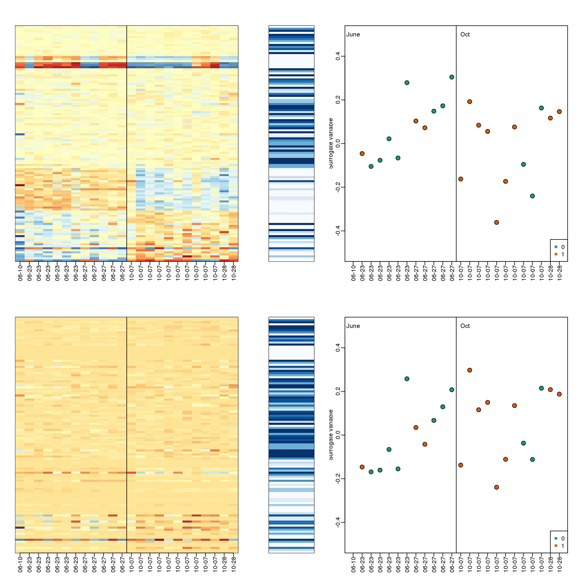
(#fig:illustration_of_sva)Illustration of iterative procedure used by SVA. Only two iterations are shown.
The algorithm iterates this procedure several times (controlled by B argument) and returns an estimate of the surrogate variables, which are analogous to the hidden factors of factor analysis. To actually run SVA, we run the sva function. In this case, SVA picks the number of surrogate values or factors for us.
library(limma)
svafit <- sva(geneExpression,mod)
## Number of significant surrogate variables is: 5
## Iteration (out of 5 ):1 2 3 4 5svaX<-model.matrix(~sex+svafit$sv)
lmfit <- lmFit(geneExpression,svaX)
tt<- lmfit$coef[,2]*sqrt(lmfit$df.residual)/(2*lmfit$sigma)There is an improvement over previous approaches:
res <- data.frame(dm= -lmfit$coef[,2],
                  p.value=2*(1-pt(abs(tt),lmfit$df.residual[1]) ) )
mypar(1,2)
hist(res$p.value[which(!chr%in%c("chrX","chrY") )],main="",ylim=c(0,1300))

plot(res$dm,-log10(res$p.value))
points(res$dm[which(chr=="chrX")],-log10(res$p.value[which(chr=="chrX")]),col=1,pch=16)
points(res$dm[which(chr=="chrY")],-log10(res$p.value[which(chr=="chrY")]),col=2,pch=16,
       xlab="Effect size",ylab="-log10(p-value)")
legend("bottomright",c("chrX","chrY"),col=1:2,pch=16)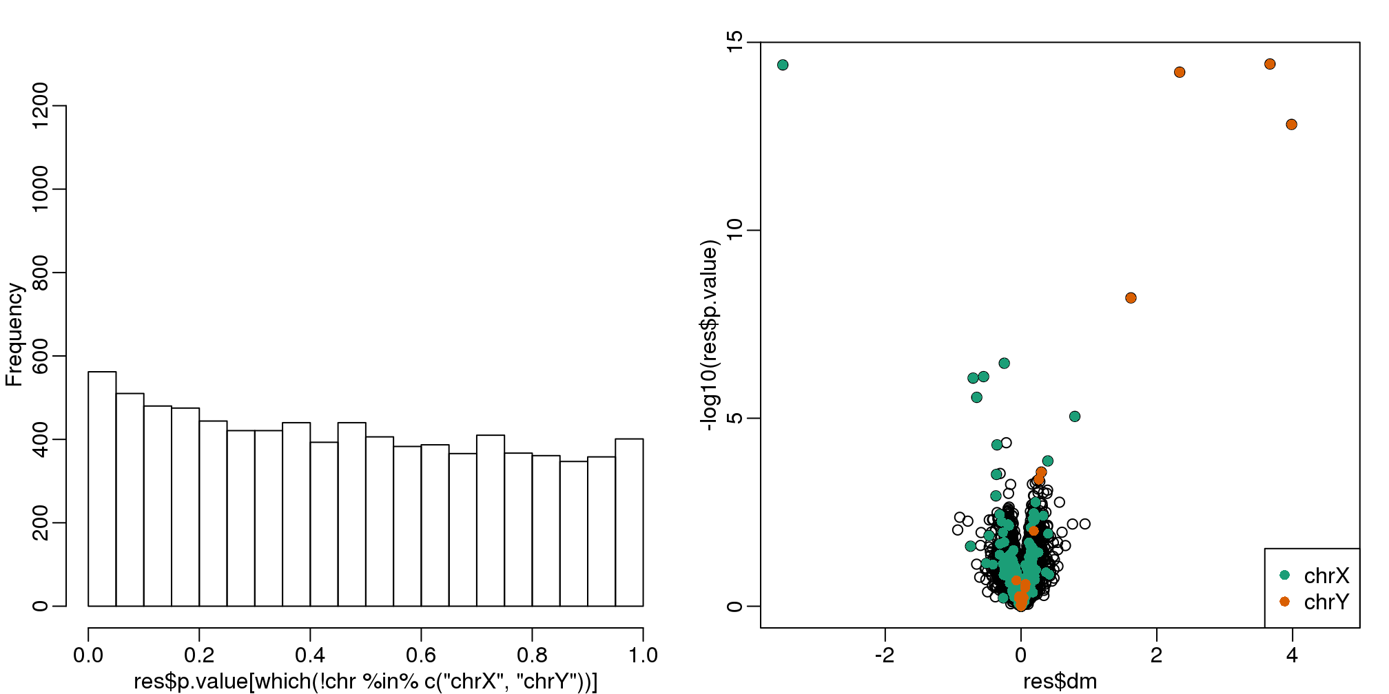
(#fig:pval_hist_and_volcano_sva)p-value histogram and volcano plot obtained with SVA.
qvals <- qvalue(res$p.value)$qvalue
index <- which(qvals<0.1)

cat("Total genes with q-value < 0.1: ",length(index),"\n",
    "Number of selected genes on chrY: ", sum(chr[index]=="chrY",na.rm=TRUE),"\n",
    "Number of selected genes on chrX: ", sum(chr[index]=="chrX",na.rm=TRUE),sep="")
## Total genes with q-value < 0.1: 14
## Number of selected genes on chrY: 5
## Number of selected genes on chrX: 8To visualize what SVA achieved, below is a visualization of the original dataset decomposed into sex effects, surrogate variables, and independent noise estimated by the algorithm (code not shown):
(#fig:different_sources_of_var)Original data split into three sources of variability estimated by SVA: sex-related signal, surrogate-variable induced structure, and independent error.