第 2 章 统计推断
2.1 简介
这一章主要介绍基本的统计概念,这些统计概念是我们理解P值和置信区间的前提。这些统计知识在生命科学文献中是无处不在的。下面我们以这篇文章作为例子:
注意这篇文章的摘要里面有如下的陈述:
“喂高脂饲料的老鼠在一周后其体重已经比较高了,这主要是由于高膳食摄入量和低代谢效率造成的。”
为了支持这一个结论,作者在结果部分提供了下面的结果:
“相对正常喂养的老鼠(\(+\) 0.2 \(\pm\) 0.1 g),喂养高脂饲料老鼠(\(+\) 1.6 \(\pm\) 0.1 g)的体重在一周后表现出体重的增加明显更多(P < 0.001)。”
P < 0.001的含义是什么? \(\pm\)包含了什么内容?接下来你会学习这些内容,同时你也会学到如何在R中计算这些值。首先你要了解随机变量。这里我们使用一个小鼠的数据(这个数据是由Karen Svenson,Gary Churchill和Dan Gatti提供的,这个项目的部分经费来自于P50 GM070683)。我们将会把这个数据导入R,然后通过这个数据来讲解随机变量和………
如果你已经下载了femaleMiceWeights这个数据,并存放在了你的当前工作目录中,你可以用一行R代码来读取这个数据:
dat <- read.csv("femaleMiceWeights.csv")你也可以不用下载,直接通过数据对应的网址来读取数据:
dir <- "https://raw.githubusercontent.com/genomicsclass/dagdata/master/inst/extdata/"
filename <- "femaleMiceWeights.csv"
url <- paste0(dir, filename)
dat <- read.csv(url)
2.1.1 认识数据
在这个数据中,我们感兴趣的是通过给小鼠提供高脂饲料几周后小鼠的体重是否增加的更多。24只从Jackson实验室订购的小鼠随机分成两组:对照组合高脂饲料组(HF:high fat)。在几周后,科学家会测量每个小数的体重。这里head向我们展示了数据的前六行。
head(dat) ## Diet Bodyweight
## 1 chow 21.51
## 2 chow 28.14
## 3 chow 24.04
## 4 chow 23.45
## 5 chow 23.68
## 6 chow 19.79 在RStudio中,你可以用View()函数来查看整个数据集:
View(dat)那么喂高脂饲料的小鼠(HF小鼠)是不是更重一些呢?第24只小鼠和第21只小鼠都属于HF小鼠。而第24只小鼠的体重是最轻的,为20.73克;第21只小鼠最重,为34.02克。仅从数值来看,即使在同一组小鼠中,我们能够看到变异(variability)的存在。如果结论是一组比另一组高,通常我们讲的是均值。
library(dplyr)
control <- filter(dat,Diet=="chow") %>% select(Bodyweight) %>% unlist
treatment <- filter(dat,Diet=="hf") %>% select(Bodyweight) %>% unlist
print( mean(treatment) )
## [1] 26.83print( mean(control) )## [1] 23.81obsdiff <- mean(treatment) - mean(control)
print(obsdiff)## [1] 3.021 从上面的R代码运行的结果,我们看到HF小鼠的体重均值为mean(treatment),而对照组的均值为mean(control)。两均值之间的差值为obsdiff。HF小鼠的体重相对对照组要重10%。这样我们的分析就这结束了,可以下结论了吗?为什么我们需要P值和置信区间呢?原因是这些均值是随机变量。它们可以是很多值。
如果我们重复这个实验。重新再订24只小鼠然后随机分成两组进行饲养,这组数据我们会得到一组不一样的均值。每次我们重复这个实验,我们会得到不同的值。我们成这样的数据类型:随机变量。
2.2 随机变量
让我们进一步的来认识随机变量。假设我们有所有对照组雌性小鼠的体重数据。在统计中,我们称这个数据为总体样本。试验中的24只小鼠是这个总体样本中抽取的样本。需要记住的是在实践中我们是没有办法得到总体样本数据的。这里我们有一个数据来说明这个概念。
第一步是从这里的连接中下载数据到对应的工作目录中,然后将数据读入R:
population <- read.csv("femaleControlsPopulation.csv")
##use unlist to turn it into a numeric vector
population <- unlist(population)
Now let’s sample 12 mice three times and see how the average changes.
现在让我们从这个数据中进行三次抽样,每次抽取12只小鼠,并计算每次抽样的均值:
control <- sample(population,12)
mean(control)
## [1] 23.81control <- sample(population,12)
mean(control)## [1] 23.77control <- sample(population,12)
mean(control)## [1] 24.19我们可以注意到这里的均值的变化。我们可以重复这个操作很多次,然后来学习随机变量的分布。
2.3 零假设
我们冲洗回到我们之前计算的均值差(obsdiff)。作为一个科研工作者,我们需要有怀疑精神。我们如何知道obsdiff是由于饲料差异引起的。如果我们给24只小鼠一样的饲料,结果会怎样呢?我们会看到这么大的差异吗?统计学家将这样的假设称为零假设。这里的“零”(英文为Null)是在提醒我们这里我们是怀疑论者:我们相信存在饲料差异不引起体重差异的可能性。
Because we have access to the population, we can actually observe as many values as we want of the difference of the averages when the diet has no effect. We can do this by randomly sampling 24 control mice, giving them the same diet, and then recording the difference in mean between two randomly split groups of 12 and 12. Here is this process written in R code:
##12 control mice
control <- sample(population,12)
##another 12 control mice that we act as if they were not
treatment <- sample(population,12)
print(mean(treatment) - mean(control))
## [1] 0.6375Now let’s do it 10,000 times. We will use a “for-loop”, an operation that lets us automate this (a simpler approach that, we will learn later, is to use replicate).
n <- 10000
null <- vector("numeric",n)
for (i in 1:n) {
  control <- sample(population,12)
  treatment <- sample(population,12)
  null[i] <- mean(treatment) - mean(control)
}
The values in null form what we call the null distribution. We will define this more formally below.
So what percent of the 10,000 are bigger than obsdiff?
mean(null >= obsdiff)## [1] 0.0151Only a small percent of the 10,000 simulations. As skeptics what do we conclude? When there is no diet effect, we see a difference as big as the one we observed only 1.5% of the time. This is what is known as a p-value, which we will define more formally later in the book.
2.4 Distributions
We have explained what we mean by null in the context of null hypothesis, but what exactly is a distribution? The simplest way to think of a distribution is as a compact description of many numbers. For example, suppose you have measured the heights of all men in a population. Imagine you need to describe these numbers to someone that has no idea what these heights are, such as an alien that has never visited Earth. Suppose all these heights are contained in the following dataset:
data(father.son,package="UsingR")
x <- father.son$fheight
One approach to summarizing these numbers is to simply list them all out for the alien to see. Here are 10 randomly selected heights of 1,078:
round(sample(x,10),1)## [1] 66.4 67.4 64.9 62.9 69.2 71.4 69.2 65.9 65.3 70.22.4.0.1 Cumulative Distribution Function
Scanning through these numbers, we start to get a rough idea of what the entire list looks like, but it is certainly inefficient. We can quickly improve on this approach by defining and visualizing a distribution. To define a distribution we compute, for all possible values of \(a\), the proportion of numbers in our list that are below \(a\). We use the following notation:
\[ F(a) \equiv \mbox{Pr}(x \leq a) \]
This is called the cumulative distribution function (CDF). When the CDF is derived from data, as opposed to theoretically, we also call it the empirical CDF (ECDF). The ECDF for the height data looks like this:
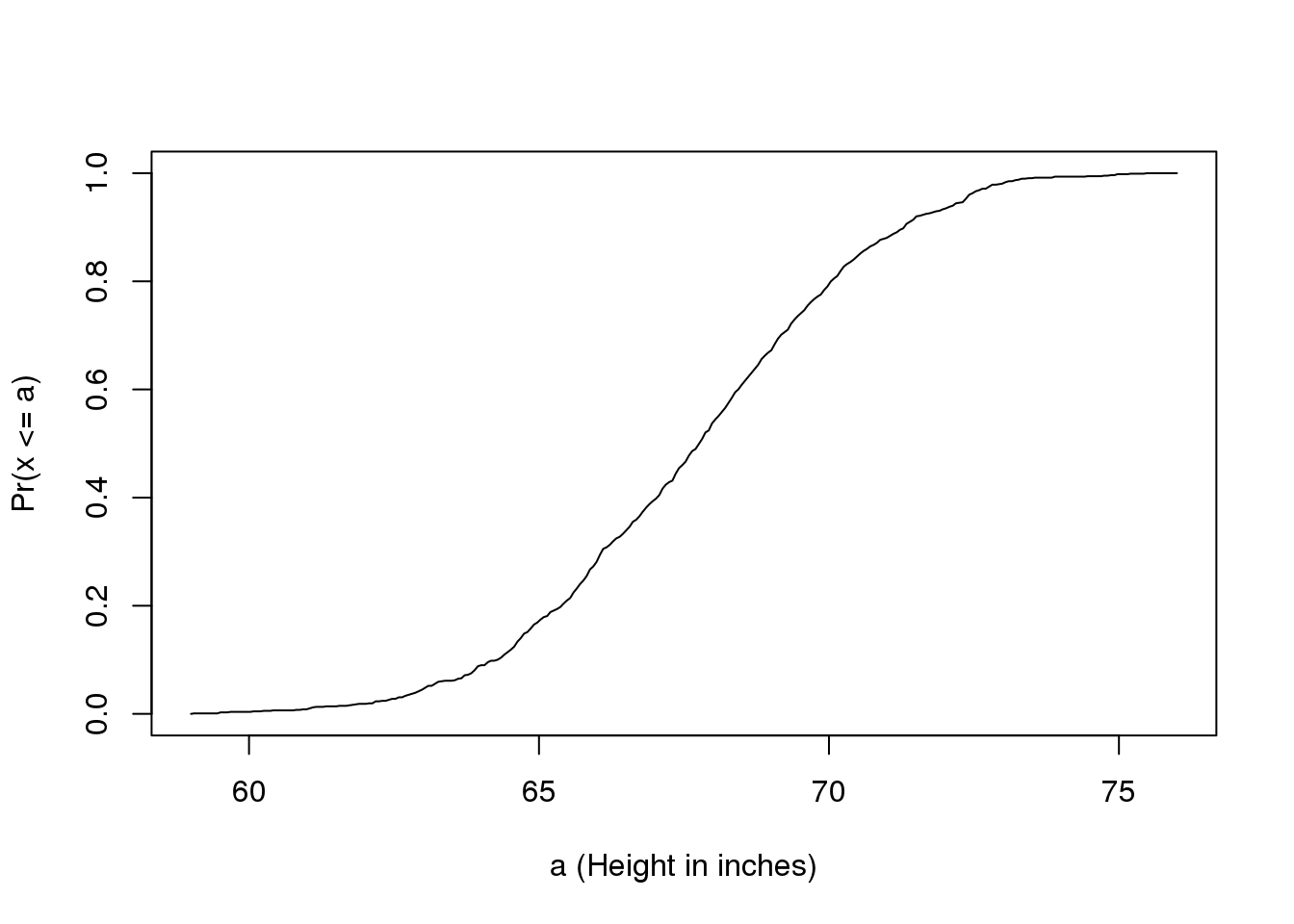
图 2.1: Empirical cummulative distribution function for height.
2.4.0.2 Histograms
Although the empirical CDF concept is widely discussed in statistics textbooks, the plot is actually not very popular in practice. The reason is that histograms give us the same information and are easier to interpret. Histograms show us the proportion of values in intervals:
\[ \mbox{Pr}(a \leq x \leq b) = F(b) - F(a) \]
Plotting these heights as bars is what we call a histogram. It is a more useful plot because we are usually more interested in intervals, such and such percent are between 70 inches and 71 inches, etc., rather than the percent less than a particular height. It is also easier to distinguish different types (families) of distributions by looking at histograms. Here is a histogram of heights:
hist(x)We can specify the bins and add better labels in the following way:
bins <- seq(smallest, largest)
hist(x,breaks=bins,xlab="Height (in inches)",main="Adult men heights")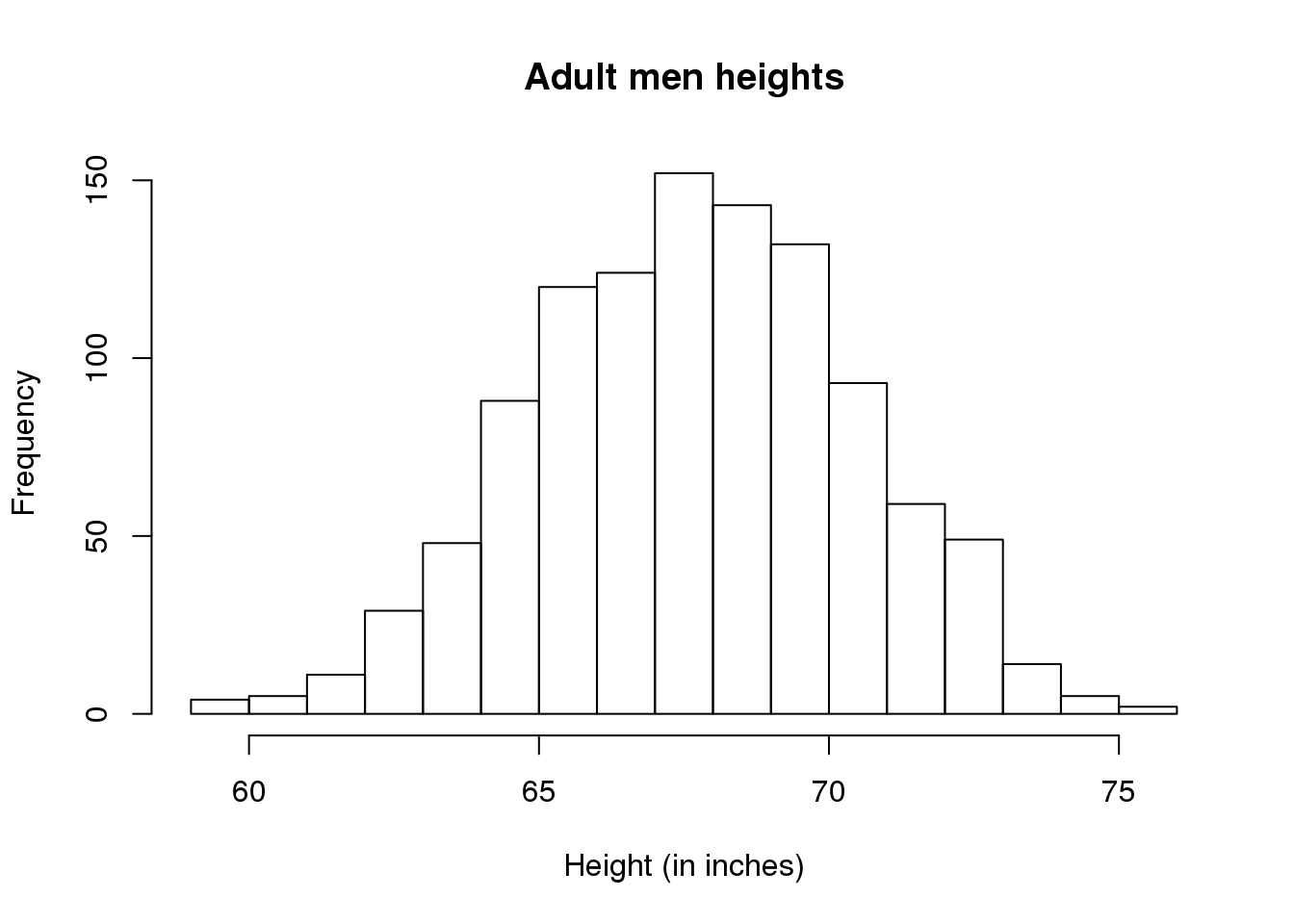
图 2.2: Histogram for heights.
Showing this plot to the alien is much more informative than showing numbers. With this simple plot, we can approximate the number of individuals in any given interval. For example, there are about 70 individuals over six feet (72 inches) tall.
2.5 Probability Distribution
Summarizing lists of numbers is one powerful use of distribution. An even more important use is describing the possible outcomes of a random variable. Unlike a fixed list of numbers, we don’t actually observe all possible outcomes of random variables, so instead of describing proportions, we describe probabilities. For instance, if we pick a random height from our list, then the probability of it falling between \(a\) and \(b\) is denoted with:
\[ \mbox{Pr}(a \leq X \leq b) = F(b) - F(a) \]
Note that the \(X\) is now capitalized to distinguish it as a random variable and that the equation above defines the probability distribution of the random variable. Knowing this distribution is incredibly useful in science. For example, in the case above, if we know the distribution of the difference in mean of mouse weights when the null hypothesis is true, referred to as the null distribution, we can compute the probability of observing a value as large as we did, referred to as a p-value. In a previous section we ran what is called a Monte Carlo simulation (we will provide more details on Monte Carlo simulation in a later section) and we obtained 10,000 outcomes of the random variable under the null hypothesis. Let’s repeat the loop above, but this time let’s add a point to the figure every time we re-run the experiment. If you run this code, you can see the null distribution forming as the observed values stack on top of each other.
n <- 100
library(rafalib)
nullplot(-5,5,1,30, xlab="Observed differences (grams)", ylab="Frequency")
totals <- vector("numeric",11)
for (i in 1:n) {
  control <- sample(population,12)
  treatment <- sample(population,12)
  nulldiff <- mean(treatment) - mean(control)
  j <- pmax(pmin(round(nulldiff)+6,11),1)
  totals[j] <- totals[j]+1
  text(j-6,totals[j],pch=15,round(nulldiff,1))
  ##if(i < 15) Sys.sleep(1) ##You can add this line to see values appear slowly
  }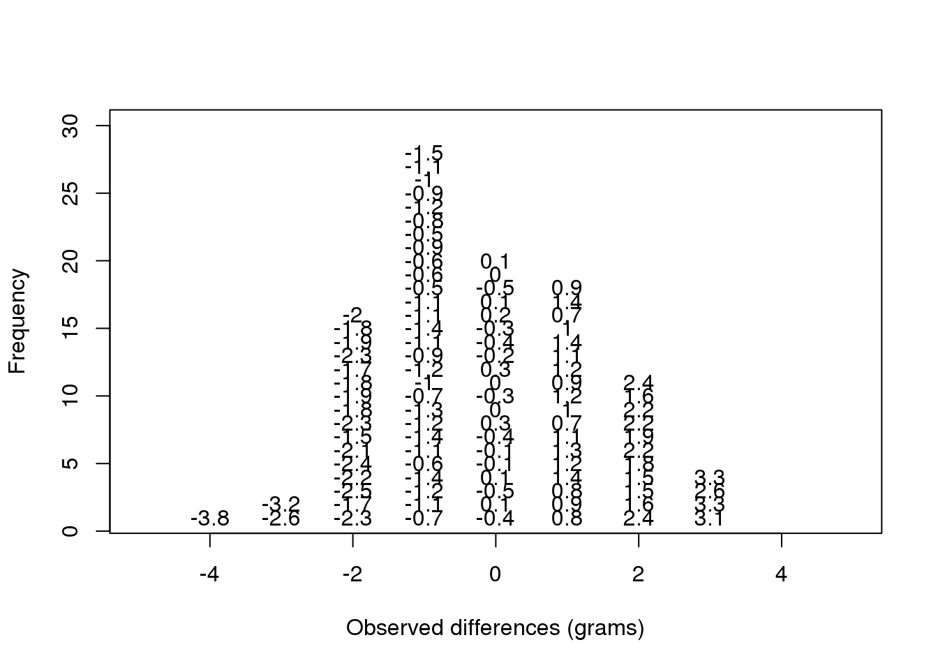
(#fig:null_distribution_illustration)Illustration of the null distribution.
The figure above amounts to a histogram. From a histogram of the null vector we calculated earlier, we can see that values as large as obsdiff are relatively rare:
hist(null, freq=TRUE)
abline(v=obsdiff, col="red", lwd=2)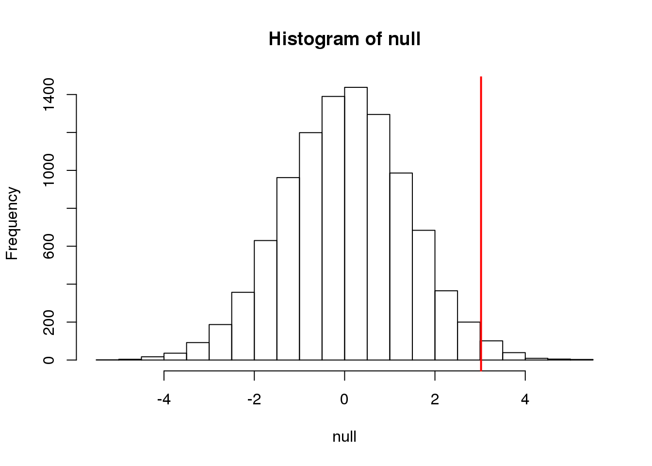
(#fig:null_and_obs)Null distribution with observed difference marked with vertical red line.
An important point to keep in mind here is that while we defined \(\mbox{Pr}(a)\) by counting cases, we will learn that, in some circumstances, mathematics gives us formulas for \(\mbox{Pr}(a)\) that save us the trouble of computing them as we did here. One example of this powerful approach uses the normal distribution approximation.
2.6 Normal Distribution
The probability distribution we see above approximates one that is very common in nature: the bell curve, also known as the normal distribution or Gaussian distribution. When the histogram of a list of numbers approximates the normal distribution, we can use a convenient mathematical formula to approximate the proportion of values or outcomes in any given interval:
\[ \mbox{Pr}(a < x < b) = \int_a^b \frac{1}{\sqrt{2\pi\sigma^2}} \exp{\left( \frac{-(x-\mu)^2}{2 \sigma^2} \right)} \, dx \]
While the formula may look intimidating, don’t worry, you will never actually have to type it out, as it is stored in a more convenient form (as pnorm in R which sets a to \(-\infty\), and takes b as an argument).
Here \(\mu\) and \(\sigma\) are referred to as the mean and the standard deviation of the population (we explain these in more detail in another section). If this normal approximation holds for our list, then the population mean and variance of our list can be used in the formula above. An example of this would be when we noted above that only 1.5% of values on the null distribution were above obsdiff. We can compute the proportion of values below a value x with pnorm(x,mu,sigma) without knowing all the values. The normal approximation works very well here:
1 - pnorm(obsdiff,mean(null),sd(null)) ## [1] 0.01468Later, we will learn that there is a mathematical explanation for this. A very useful characteristic of this approximation is that one only needs to know \(\mu\) and \(\sigma\) to describe the entire distribution. From this, we can compute the proportion of values in any interval.
2.6.0.1 Summary
So computing a p-value for the difference in diet for the mice was pretty easy, right? But why are we not done? To make the calculation, we did the equivalent of buying all the mice available from The Jackson Laboratory and performing our experiment repeatedly to define the null distribution. Yet this is not something we can do in practice. Statistical Inference is the mathematical theory that permits you to approximate this with only the data from your sample, i.e. the original 24 mice. We will focus on this in the following sections.
2.6.0.2 Setting the random seed
Before we continue, we briefly explain the following important line of code:
set.seed(1) Throughout this book, we use random number generators. This implies that many of the results presented can actually change by chance, including the correct answer to problems. One way to ensure that results do not change is by setting R’s random number generation seed. For more on the topic please read the help file:
?set.seed2.7 Populations, Samples and Estimates
Now that we have introduced the idea of a random variable, a null distribution, and a p-value, we are ready to describe the mathematical theory that permits us to compute p-values in practice. We will also learn about confidence intervals and power calculations.
2.7.0.1 Population parameters
A first step in statistical inference is to understand what population you are interested in. In the mouse weight example, we have two populations: female mice on control diets and female mice on high fat diets, with weight being the outcome of interest. We consider this population to be fixed, and the randomness comes from the sampling. One reason we have been using this dataset as an example is because we happen to have the weights of all the mice of this type. We download this file to our working directory and read in to R:
dat <- read.csv("mice_pheno.csv")We can then access the population values and determine, for example, how many we have. Here we compute the size of the control population:
library(dplyr)
controlPopulation <- filter(dat,Sex == "F" & Diet == "chow") %>%
  select(Bodyweight) %>% unlist
length(controlPopulation)
## [1] 225We usually denote these values as \(x_1,\dots,x_m\). In this case, \(m\) is the number computed above. We can do the same for the high fat diet population:
hfPopulation <- filter(dat,Sex == "F" & Diet == "hf") %>%
  select(Bodyweight) %>% unlist
length(hfPopulation)
## [1] 200and denote with \(y_1,\dots,y_n\).
We can then define summaries of interest for these populations, such as the mean and variance.
The mean:
\[\mu_X = \frac{1}{m}\sum_{i=1}^m x_i \mbox{ and } \mu_Y = \frac{1}{n} \sum_{i=1}^n y_i\]
The variance:
\[\sigma_X^2 = \frac{1}{m}\sum_{i=1}^m (x_i-\mu_X)^2 \mbox{ and } \sigma_Y^2 = \frac{1}{n} \sum_{i=1}^n (y_i-\mu_Y)^2\]
with the standard deviation being the square root of the variance. We refer to such quantities that can be obtained from the population as population parameters. The question we started out asking can now be written mathematically: is \(\mu_Y - \mu_X = 0\) ?
Although in our illustration we have all the values and can check if this is true, in practice we do not. For example, in practice it would be prohibitively expensive to buy all the mice in a population. Here we learn how taking a sample permits us to answer our questions. This is the essence of statistical inference.
2.7.0.2 Sample estimates
In the previous chapter, we obtained samples of 12 mice from each population. We represent data from samples with capital letters to indicate that they are random. This is common practice in statistics, although it is not always followed. So the samples are \(X_1,\dots,X_M\) and \(Y_1,\dots,Y_N\) and, in this case, \(N=M=12\). In contrast and as we saw above, when we list out the values of the population, which are set and not random, we use lower-case letters.
Since we want to know if \(\mu_Y - \mu_X\) is 0, we consider the sample version: \(\bar{Y}-\bar{X}\) with:
\[ \bar{X}=\frac{1}{M} \sum_{i=1}^M X_i \mbox{ and }\bar{Y}=\frac{1}{N} \sum_{i=1}^N Y_i. \]
Note that this difference of averages is also a random variable. Previously, we learned about the behavior of random variables with an exercise that involved repeatedly sampling from the original distribution. Of course, this is not an exercise that we can execute in practice. In this particular case it would involve buying 24 mice over and over again. Here we described the mathematical theory that mathematically relates \(\bar{X}\) to \(\mu_X\) and \(\bar{Y}\) to \(\mu_Y\), that will in turn help us understand the relationship between \(\bar{Y}-\bar{X}\) and \(\mu_Y - \mu_X\). Specifically, we will describe how the Central Limit Theorem permits us to use an approximation to answer this question, as well as motivate the widely used t-distribution.
2.7.1 Population, Samples, and Estimates Exercises
Exercises
For these exercises, we will be using the following dataset:
library(downloader)
url <- "https://raw.githubusercontent.com/genomicsclass/dagdata/master/inst/extdata/mice_pheno.csv"
filename <- basename(url)
download(url, destfile=filename)
dat <- read.csv(filename)
We will remove the lines that contain missing values:
dat <- na.omit( dat )Use
dplyrto create a vectorxwith the body weight of all males on the control (chow) diet. What is this population’s average?Now use the
rafalibpackage and use thepopsdfunction to compute the population standard deviation.Set the seed at 1. Take a random sample $X of size 25 from
x. What is the sample average?Use
dplyrto create a vectorywith the body weight of all males on the high fat (hf) diet. What is this population’s average?Now use the
rafalibpackage and use thepopsdfunction to compute the population standard deviation.Set the seed at 1. Take a random sample $Y of size 25 from
y. What is the sample average?What is the difference in absolute value between \(\bar{y}−\bar{x}\) and \(\bar{X}-\bar{Y}\)?
Repeat the above for females. Make sure to set the seed to 1 before each
samplecall. What is the difference in absolute value between \(\bar{y}−\bar{x}\) and \(\bar{X}-\bar{Y}\)?For the females, our sample estimates were closer to the population difference than with males. What is a possible explanation for this?
A) The population variance of the females is smaller than that of the males; thus, the sample variable has less variability. B) Statistical estimates are more precise for females. * C) The sample size was larger for females. * D) The sample size was smaller for females.
2.8 Central Limit Theorem and t-distribution
Below we will discuss the Central Limit Theorem (CLT) and the t-distribution, both of which help us make important calculations related to probabilities. Both are frequently used in science to test statistical hypotheses. To use these, we have to make different assumptions from those for the CLT and the t-distribution. However, if the assumptions are true, then we are able to calculate the exact probabilities of events through the use of mathematical formula.
2.8.0.1 Central Limit Theorem
The CLT is one of the most frequently used mathematical results in science. It tells us that when the sample size is large, the average \(\bar{Y}\) of a random sample follows a normal distribution centered at the population average \(\mu_Y\) and with standard deviation equal to the population standard deviation \(\sigma_Y\), divided by the square root of the sample size \(N\). We refer to the standard deviation of the distribution of a random variable as the random variable’s standard error.
Please note that if we subtract a constant from a random variable, the mean of the new random variable shifts by that constant. Mathematically, if \(X\) is a random variable with mean \(\mu\) and \(a\) is a constant, the mean of \(X - a\) is \(\mu-a\). A similarly intuitive result holds for multiplication and the standard deviation (SD). If \(X\) is a random variable with mean \(\mu\) and SD \(\sigma\), and \(a\) is a constant, then the mean and SD of \(aX\) are \(a \mu\) and \(\mid a \mid \sigma\) respectively. To see how intuitive this is, imagine that we subtract 10 grams from each of the mice weights. The average weight should also drop by that much. Similarly, if we change the units from grams to milligrams by multiplying by 1000, then the spread of the numbers becomes larger.
This implies that if we take many samples of size \(N\), then the quantity:
\[ \frac{\bar{Y} - \mu}{\sigma_Y/\sqrt{N}} \]
is approximated with a normal distribution centered at 0 and with standard deviation 1.
Now we are interested in the difference between two sample averages. Here again a mathematical result helps. If we have two random variables \(X\) and \(Y\) with means \(\mu_X\) and \(\mu_Y\) and variance \(\sigma_X\) and \(\sigma_Y\) respectively, then we have the following result: the mean of the sum \(Y + X\) is the sum of the means \(\mu_Y + \mu_X\). Using one of the facts we mentioned earlier, this implies that the mean of \(Y - X = Y + aX\) with \(a = -1\) , which implies that the mean of \(Y - X\) is \(\mu_Y - \mu_X\). This is intuitive. However, the next result is perhaps not as intuitive. If \(X\) and \(Y\) are independent of each other, as they are in our mouse example, then the variance (SD squared) of \(Y + X\) is the sum of the variances \(\sigma_Y^2 + \sigma_X^2\). This implies that variance of the difference \(Y - X\) is the variance of \(Y + aX\) with \(a = -1\) which is \(\sigma^2_Y + a^2 \sigma_X^2 = \sigma^2_Y + \sigma_X^2\). So the variance of the difference is also the sum of the variances. If this seems like a counterintuitive result, remember that if \(X\) and \(Y\) are independent of each other, the sign does not really matter. It can be considered random: if \(X\) is normal with certain variance, for example, so is \(-X\). Finally, another useful result is that the sum of normal variables is again normal.
All this math is very helpful for the purposes of our study because we have two sample averages and are interested in the difference. Because both are normal, the difference is normal as well, and the variance (the standard deviation squared) is the sum of the two variances. Under the null hypothesis that there is no difference between the population averages, the difference between the sample averages \(\bar{Y}-\bar{X}\), with \(\bar{X}\) and \(\bar{Y}\) the sample average for the two diets respectively, is approximated by a normal distribution centered at 0 (there is no difference) and with standard deviation \(\sqrt{\sigma_X^2 +\sigma_Y^2}/\sqrt{N}\).
This suggests that this ratio:
\[ \frac{\bar{Y}-\bar{X}}{\sqrt{\frac{\sigma_X^2}{M} + \frac{\sigma_Y^2}{N}}} \]
is approximated by a normal distribution centered at 0 and standard deviation 1. Using this approximation makes computing p-values simple because we know the proportion of the distribution under any value. For example, only 5% of these values are larger than 2 (in absolute value):
pnorm(-2) + (1 - pnorm(2))## [1] 0.0455We don’t need to buy more mice, 12 and 12 suffice.
However, we can’t claim victory just yet because we don’t know the population standard deviations: \(\sigma_X\) and \(\sigma_Y\). These are unknown population parameters, but we can get around this by using the sample standard deviations, call them \(s_X\) and \(s_Y\). These are defined as:
\[ s_X^2 = \frac{1}{M-1} \sum_{i=1}^M (X_i - \bar{X})^2 \mbox{ and } s_Y^2 = \frac{1}{N-1} \sum_{i=1}^N (Y_i - \bar{Y})^2 \]
Note that we are dividing by \(M-1\) and \(N-1\), instead of by \(M\) and \(N\). There is a theoretical reason for doing this which we do not explain here. But to get an intuition, think of the case when you just have 2 numbers. The average distance to the mean is basically 1/2 the difference between the two numbers. So you really just have information from one number. This is somewhat of a minor point. The main point is that \(s_X\) and \(s_Y\) serve as estimates of \(\sigma_X\) and \(\sigma_Y\)
So we can redefine our ratio as
\[ \sqrt{N} \frac{\bar{Y}-\bar{X}}{\sqrt{s_X^2 +s_Y^2}} \]
if \(M=N\) or in general,
\[ \frac{\bar{Y}-\bar{X}}{\sqrt{\frac{s_X^2}{M} + \frac{s_Y^2}{N}}} \]
The CLT tells us that when \(M\) and \(N\) are large, this random variable is normally distributed with mean 0 and SD 1. Thus we can compute p-values using the function pnorm.
2.8.0.2 The t-distribution
The CLT relies on large samples, what we refer to as asymptotic results. When the CLT does not apply, there is another option that does not rely on asymptotic results. When the original population from which a random variable, say \(Y\), is sampled is normally distributed with mean 0, then we can calculate the distribution of:
\[ \sqrt{N} \frac{\bar{Y}}{s_Y} \]
This is the ratio of two random variables so it is not necessarily normal. The fact that the denominator can be small by chance increases the probability of observing large values. William Sealy Gosset, an employee of the Guinness brewing company, deciphered the distribution of this random variable and published a paper under the pseudonym “Student”. The distribution is therefore called Student’s t-distribution. Later we will learn more about how this result is used.
Here we will use the mice phenotype data as an example. We start by creating two vectors, one for the control population and one for the high-fat diet population:
library(dplyr)
dat <- read.csv("mice_pheno.csv") #We downloaded this file in a previous section
controlPopulation <- filter(dat,Sex == "F" & Diet == "chow") %>%
  select(Bodyweight) %>% unlist
hfPopulation <- filter(dat,Sex == "F" & Diet == "hf") %>%
  select(Bodyweight) %>% unlist
It is important to keep in mind that what we are assuming to be normal here is the distribution of \(y_1,y_2,\dots,y_n\), not the random variable \(\bar{Y}\). Although we can’t do this in practice, in this illustrative example, we get to see this distribution for both controls and high fat diet mice:
library(rafalib)
mypar(1,2)
hist(hfPopulation)
hist(controlPopulation)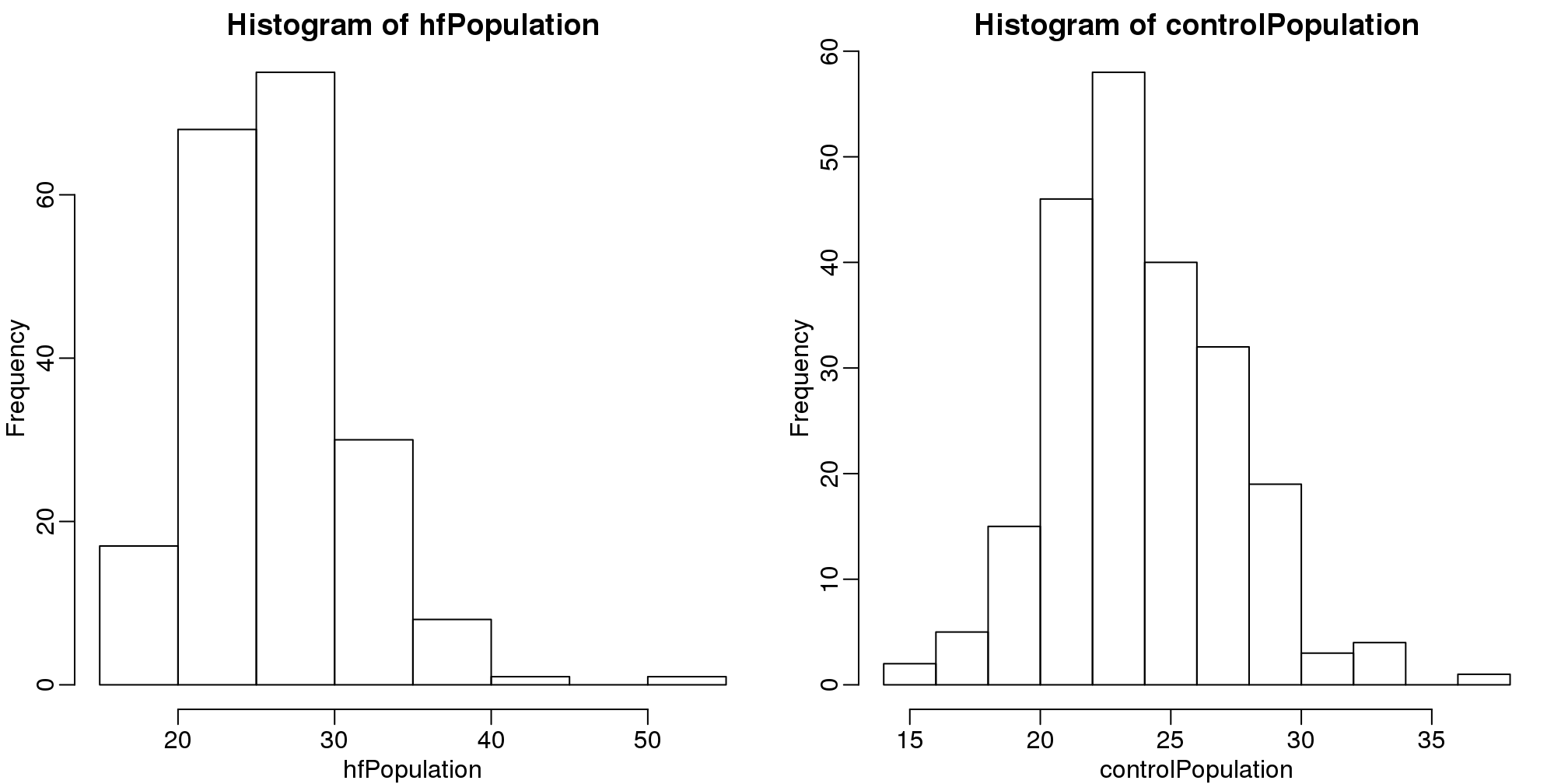
(#fig:population_histograms)Histograms of all weights for both populations.
We can use qq-plots to confirm that the distributions are relatively close to being normally distributed. We will explore these plots in more depth in a later section, but the important thing to know is that it compares data (on the y-axis) against a theoretical distribution (on the x-axis). If the points fall on the identity line, then the data is close to the theoretical distribution.
mypar(1,2)
qqnorm(hfPopulation)
qqline(hfPopulation)
qqnorm(controlPopulation)
qqline(controlPopulation)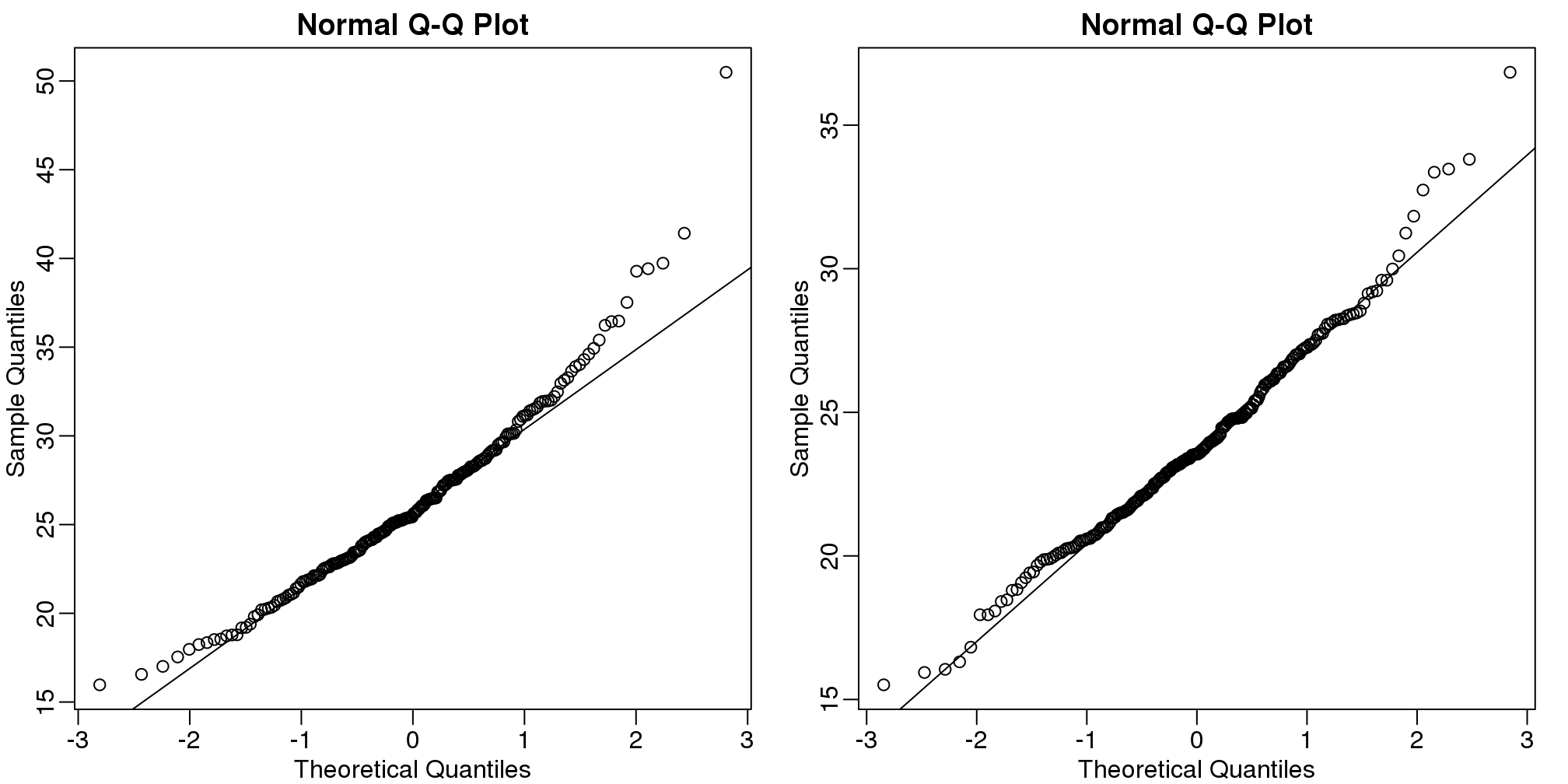
(#fig:population_qqplots)Quantile-quantile plots of all weights for both populations.
The larger the sample, the more forgiving the result is to the weakness of this approximation. In the next section, we will see that for this particular dataset the t-distribution works well even for sample sizes as small as 3.
2.9 Central Limit Theorem in Practice
Let’s use our data to see how well the central limit theorem approximates sample averages from our data. We will leverage our entire population dataset to compare the results we obtain by actually sampling from the distribution to what the CLT predicts.
dat <- read.csv("mice_pheno.csv") #file was previously downloaded
head(dat)
## Sex Diet Bodyweight
## 1 F hf 31.94
## 2 F hf 32.48
## 3 F hf 22.82
## 4 F hf 19.92
## 5 F hf 32.22
## 6 F hf 27.50Start by selecting only female mice since males and females have different weights. We will select three mice from each population.
library(dplyr)
controlPopulation <- filter(dat,Sex == "F" & Diet == "chow") %>%
  select(Bodyweight) %>% unlist
hfPopulation <- filter(dat,Sex == "F" & Diet == "hf") %>%
  select(Bodyweight) %>% unlist
We can compute the population parameters of interest using the mean function.
mu_hf <- mean(hfPopulation)
mu_control <- mean(controlPopulation)
print(mu_hf - mu_control)
## [1] 2.376We can compute the population standard deviations of, say, a vector \(x\) as well. However, we do not use the R function sd because this function actually does not compute the population standard deviation \(\sigma_x\). Instead, sd assumes the main argument is a random sample, say \(X\), and provides an estimate of \(\sigma_x\), defined by \(s_X\) above. As shown in the equations above the actual final answer differs because one divides by the sample size and the other by the sample size minus one. We can see that with R code:
x <- controlPopulation
N <- length(x)
populationvar <- mean((x-mean(x))^2)
identical(var(x), populationvar)
## [1] FALSEidentical(var(x)*(N-1)/N, populationvar)## [1] TRUESo to be mathematically correct, we do not use sd or var. Instead, we use the popvar and popsd function in rafalib:
library(rafalib)
sd_hf <- popsd(hfPopulation)
sd_control <- popsd(controlPopulation)
Remember that in practice we do not get to compute these population parameters. These are values we never see. In general, we want to estimate them from samples.
N <- 12
hf <- sample(hfPopulation, 12)
control <- sample(controlPopulation, 12)
As we described, the CLT tells us that for large \(N\), each of these is approximately normal with average population mean and standard error population variance divided by \(N\). We mentioned that a rule of thumb is that \(N\) should be 30 or more. However, that is just a rule of thumb since the preciseness of the approximation depends on the population distribution. Here we can actually check the approximation and we do that for various values of \(N\).
Now we use sapply and replicate instead of for loops, which makes for cleaner code (we do not have to pre-allocate a vector, R takes care of this for us):
Ns <- c(3,12,25,50)
B <- 10000 #number of simulations
res <-  sapply(Ns,function(n) {
  replicate(B,mean(sample(hfPopulation,n))-mean(sample(controlPopulation,n)))
})
Now we can use qq-plots to see how well CLT approximations works for these. If in fact the normal distribution is a good approximation, the points should fall on a straight line when compared to normal quantiles. The more it deviates, the worse the approximation. In the title, we also show the average and SD of the observed distribution, which demonstrates how the SD decreases with \(\sqrt{N}\) as predicted.
mypar(2,2)
for (i in seq(along=Ns)) {
  titleavg <- signif(mean(res[,i]),3)
  titlesd <- signif(popsd(res[,i]),3)
  title <- paste0("N=",Ns[i]," Avg=",titleavg," SD=",titlesd)
  qqnorm(res[,i],main=title)
  qqline(res[,i],col=2)
}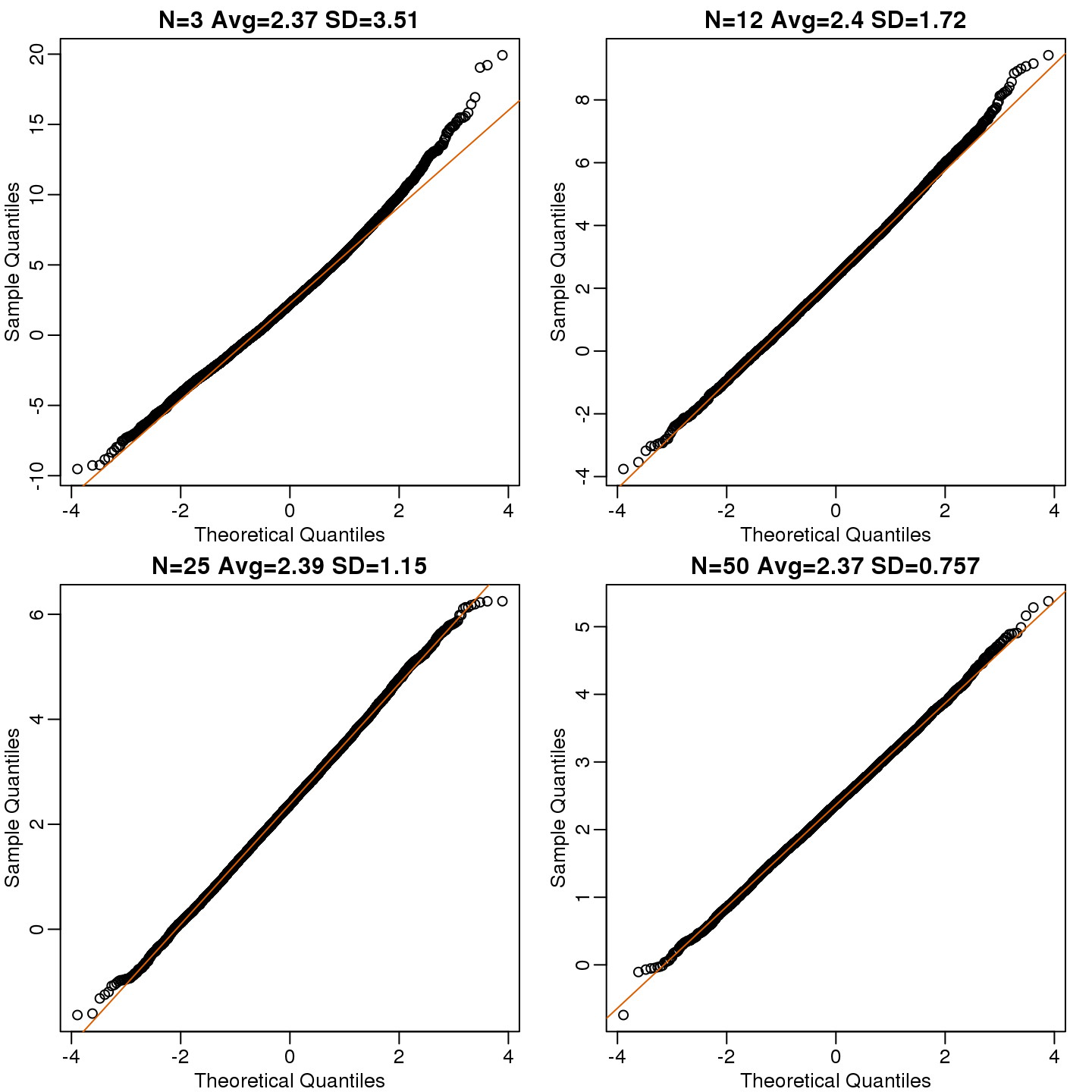
(#fig:effect_size_qqplot)Quantile versus quantile plot of simulated differences versus theoretical normal distribution for four different sample sizes.
Here we see a pretty good fit even for 3. Why is this? Because the population itself is relatively close to normally distributed, the averages are close to normal as well (the sum of normals is also a normal). In practice, we actually calculate a ratio: we divide by the estimated standard deviation. Here is where the sample size starts to matter more.
Ns <- c(3,12,25,50)
B <- 10000 #number of simulations
##function to compute a t-stat
computetstat <- function(n) {
  y <- sample(hfPopulation,n)
  x <- sample(controlPopulation,n)
  (mean(y)-mean(x))/sqrt(var(y)/n+var(x)/n)
}
res <-  sapply(Ns,function(n) {
  replicate(B,computetstat(n))
})
mypar(2,2)
for (i in seq(along=Ns)) {
  qqnorm(res[,i],main=Ns[i])
  qqline(res[,i],col=2)
}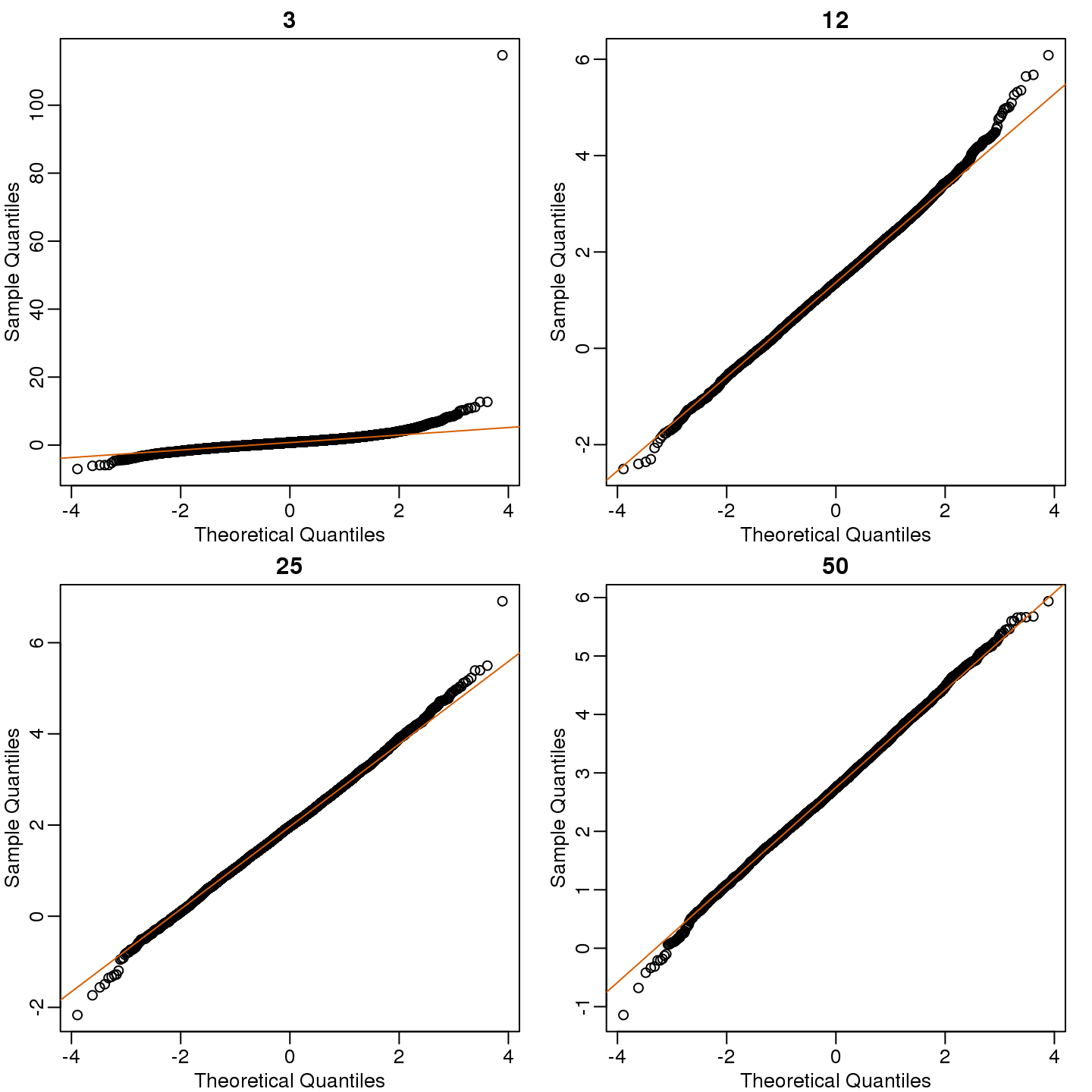
(#fig:t_test_qqplot)Quantile versus quantile plot of simulated ratios versus theoretical normal distribution for four different sample sizes.
So we see that for \(N=3\), the CLT does not provide a usable approximation. For \(N=12\), there is a slight deviation at the higher values, although the approximation appears useful. For 25 and 50, the approximation is spot on.
This simulation only proves that \(N=12\) is large enough in this case, not in general. As mentioned above, we will not be able to perform this simulation in most situations. We only use the simulation to illustrate the concepts behind the CLT and its limitations. In future sections, we will describe the approaches we actually use in practice.
2.10 t-tests in Practice
2.10.0.1 Introduction
We will now demonstrate how to obtain a p-value in practice. We begin by loading experimental data and walking you through the steps used to form a t-statistic and compute a p-value. We can perform this task with just a few lines of code (go to the end of this section to see them). However, to understand the concepts, we will construct a t-statistic from “scratch”.
2.10.0.2 Read in and prepare data
We start by reading in the data. A first important step is to identify which rows are associated with treatment and control, and to compute the difference in mean.
library(dplyr)
dat <- read.csv("femaleMiceWeights.csv") #previously downloaded

control <- filter(dat,Diet=="chow") %>% select(Bodyweight) %>% unlist
treatment <- filter(dat,Diet=="hf") %>% select(Bodyweight) %>% unlist

diff <- mean(treatment) - mean(control)
print(diff)
## [1] 3.021We are asked to report a p-value. What do we do? We learned that diff, referred to as the observed effect size, is a random variable. We also learned that under the null hypothesis, the mean of the distribution of diff is 0. What about the standard error? We also learned that the standard error of this random variable is the population standard deviation divided by the square root of the sample size:
\[ SE(\bar{X}) = \sigma / \sqrt{N}\]
We use the sample standard deviation as an estimate of the population standard deviation. In R, we simply use the sd function and the SE is:
sd(control)/sqrt(length(control))## [1] 0.8725This is the SE of the sample average, but we actually want the SE of diff. We saw how statistical theory tells us that the variance of the difference of two random variables is the sum of its variances, so we compute the variance and take the square root:
se <- sqrt(
  var(treatment)/length(treatment) +
  var(control)/length(control)
  )
Statistical theory tells us that if we divide a random variable by its SE, we get a new random variable with an SE of 1.
tstat <- diff/se This ratio is what we call the t-statistic. It’s the ratio of two random variables and thus a random variable. Once we know the distribution of this random variable, we can then easily compute a p-value.
As explained in the previous section, the CLT tells us that for large sample sizes, both sample averages mean(treatment) and mean(control) are normal. Statistical theory tells us that the difference of two normally distributed random variables is again normal, so CLT tells us that tstat is approximately normal with mean 0 (the null hypothesis) and SD 1 (we divided by its SE).
So now to calculate a p-value all we need to do is ask: how often does a normally distributed random variable exceed diff? R has a built-in function, pnorm, to answer this specific question. pnorm(a) returns the probability that a random variable following the standard normal distribution falls below a. To obtain the probability that it is larger than a, we simply use 1-pnorm(a). We want to know the probability of seeing something as extreme as diff: either smaller (more negative) than -abs(diff) or larger than abs(diff). We call these two regions “tails” and calculate their size:
righttail <- 1 - pnorm(abs(tstat))
lefttail <- pnorm(-abs(tstat))
pval <- lefttail + righttail
print(pval)
## [1] 0.03986In this case, the p-value is smaller than 0.05 and using the conventional cutoff of 0.05, we would call the difference statistically significant.
Now there is a problem. CLT works for large samples, but is 12 large enough? A rule of thumb for CLT is that 30 is a large enough sample size (but this is just a rule of thumb). The p-value we computed is only a valid approximation if the assumptions hold, which do not seem to be the case here. However, there is another option other than using CLT.
2.11 The t-distribution in Practice
As described earlier, statistical theory offers another useful result. If the distribution of the population is normal, then we can work out the exact distribution of the t-statistic without the need for the CLT. This is a big “if” given that, with small samples, it is hard to check if the population is normal. But for something like weight, we suspect that the population distribution is likely well approximated by normal and that we can use this approximation. Furthermore, we can look at a qq-plot for the samples. This shows that the approximation is at least close:
library(rafalib)
mypar(1,2)

qqnorm(treatment)
qqline(treatment,col=2)

qqnorm(control)
qqline(control,col=2)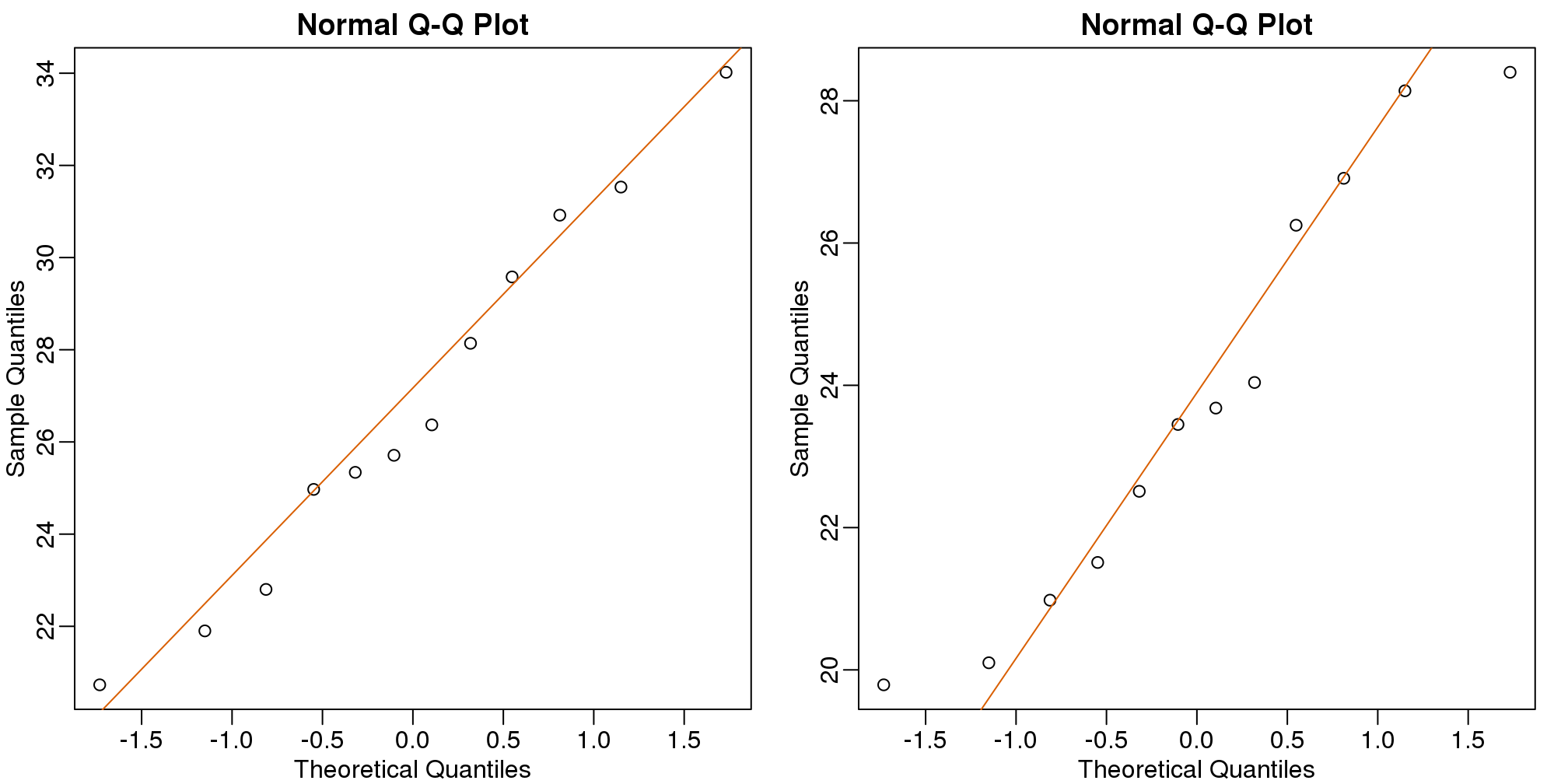
(#fig:data_qqplot)Quantile-quantile plots for sample against theoretical normal distribution.
If we use this approximation, then statistical theory tells us that the distribution of the random variable tstat follows a t-distribution. This is a much more complicated distribution than the normal. The t-distribution has a location parameter like the normal and another parameter called degrees of freedom. R has a nice function that actually computes everything for us.
t.test(treatment, control)##
## Welch Two Sample t-test
##
## data: treatment and control
## t = 2.1, df = 20, p-value = 0.05
## alternative hypothesis: true difference in means is not equal to 0
## 95 percent confidence interval:
## -0.04297 6.08463
## sample estimates:
## mean of x mean of y
## 26.83 23.81To see just the p-value, we can use the $ extractor:
result <- t.test(treatment,control)
result$p.value
## [1] 0.053The p-value is slightly bigger now. This is to be expected because our CLT approximation considered the denominator of tstat practically fixed (with large samples it practically is), while the t-distribution approximation takes into account that the denominator (the standard error of the difference) is a random variable. The smaller the sample size, the more the denominator varies.
It may be confusing that one approximation gave us one p-value and another gave us another, because we expect there to be just one answer. However, this is not uncommon in data analysis. We used different assumptions, different approximations, and therefore we obtained different results.
Later, in the power calculation section, we will describe type I and type II errors. As a preview, we will point out that the test based on the CLT approximation is more likely to incorrectly reject the null hypothesis (a false positive), while the t-distribution is more likely to incorrectly accept the null hypothesis (false negative).
2.11.0.1 Running the t-test in practice
Now that we have gone over the concepts, we can show the relatively simple code that one would use to actually compute a t-test:
library(dplyr)
dat <- read.csv("mice_pheno.csv")
control <- filter(dat,Diet=="chow") %>% select(Bodyweight)
treatment <- filter(dat,Diet=="hf") %>% select(Bodyweight)
t.test(treatment,control)
##
## Welch Two Sample t-test
##
## data: treatment and control
## t = 7.2, df = 740, p-value = 2e-12
## alternative hypothesis: true difference in means is not equal to 0
## 95 percent confidence interval:
## 2.232 3.907
## sample estimates:
## mean of x mean of y
## 30.48 27.41The arguments to t.test can be of type data.frame and thus we do not need to unlist them into numeric objects.
2.12 Confidence Intervals
We have described how to compute p-values which are ubiquitous in the life sciences. However, we do not recommend reporting p-values as the only statistical summary of your results. The reason is simple: statistical significance does not guarantee scientific significance. With large enough sample sizes, one might detect a statistically significance difference in weight of, say, 1 microgram. But is this an important finding? Would we say a diet results in higher weight if the increase is less than a fraction of a percent? The problem with reporting only p-values is that you will not provide a very important piece of information: the effect size. Recall that the effect size is the observed difference. Sometimes the effect size is divided by the mean of the control group and so expressed as a percent increase.
A much more attractive alternative is to report confidence intervals. A confidence interval includes information about your estimated effect size and the uncertainty associated with this estimate. Here we use the mice data to illustrate the concept behind confidence intervals.
2.12.0.1 Confidence Interval for Population Mean
Before we show how to construct a confidence interval for the difference between the two groups, we will show how to construct a confidence interval for the population mean of control female mice. Then we will return to the group difference after we’ve learned how to build confidence intervals in the simple case. We start by reading in the data and selecting the appropriate rows:
dat <- read.csv("mice_pheno.csv")
chowPopulation <- dat[dat$Sex=="F" & dat$Diet=="chow",3]
The population average \(\mu_X\) is our parameter of interest here:
mu_chow <- mean(chowPopulation)
print(mu_chow)
## [1] 23.89We are interested in estimating this parameter. In practice, we do not get to see the entire population so, as we did for p-values, we demonstrate how we can use samples to do this. Let’s start with a sample of size 30:
N <- 30
chow <- sample(chowPopulation,N)
print(mean(chow))
## [1] 23.35We know this is a random variable, so the sample average will not be a perfect estimate. In fact, because in this illustrative example we know the value of the parameter, we can see that they are not exactly the same. A confidence interval is a statistical way of reporting our finding, the sample average, in a way that explicitly summarizes the variability of our random variable.
With a sample size of 30, we will use the CLT. The CLT tells us that \(\bar{X}\) or mean(chow) follows a normal distribution with mean \(\mu_X\) or mean(chowPopulation) and standard error approximately \(s_X/\sqrt{N}\) or:
se <- sd(chow)/sqrt(N)
print(se)
## [1] 0.47822.12.0.2 Defining the Interval
A 95% confidence interval (we can use percentages other than 95%) is a random interval with a 95% probability of falling on the parameter we are estimating. Keep in mind that saying 95% of random intervals will fall on the true value (our definition above) is not the same as saying there is a 95% chance that the true value falls in our interval. To construct it, we note that the CLT tells us that \(\sqrt{N} (\bar{X}-\mu_X) / s_X\) follows a normal distribution with mean 0 and SD 1. This implies that the probability of this event:
\[ -2 \leq \sqrt{N} (\bar{X}-\mu_X)/s_X \leq 2 \]
which written in R code is:
pnorm(2) - pnorm(-2)## [1] 0.9545…is about 95% (to get closer use qnorm(1-0.05/2) instead of 2). Now do some basic algebra to clear out everything and leave \(\mu_X\) alone in the middle and you get that the following event:
\[ \bar{X}-2 s_X/\sqrt{N} \leq \mu_X \leq \bar{X}+2s_X/\sqrt{N} \]
has a probability of 95%.
Be aware that it is the edges of the interval \(\bar{X} \pm 2 s_X / \sqrt{N}\), not \(\mu_X\), that are random. Again, the definition of the confidence interval is that 95% of random intervals will contain the true, fixed value \(\mu_X\). For a specific interval that has been calculated, the probability is either 0 or 1 that it contains the fixed population mean \(\mu_X\).
Let’s demonstrate this logic through simulation. We can construct this interval with R relatively easily:
Q <- qnorm(1- 0.05/2)
interval <- c(mean(chow)-Q*se, mean(chow)+Q*se )
interval
## [1] 22.41 24.29interval[1] < mu_chow & interval[2] > mu_chow## [1] TRUEwhich happens to cover \(\mu_X\) or mean(chowPopulation). However, we can take another sample and we might not be as lucky. In fact, the theory tells us that we will cover \(\mu_X\) 95% of the time. Because we have access to the population data, we can confirm this by taking several new samples:
library(rafalib)
B <- 250
mypar()
plot(mean(chowPopulation)+c(-7,7),c(1,1),type="n",
     xlab="weight",ylab="interval",ylim=c(1,B))
abline(v=mean(chowPopulation))
for (i in 1:B) {
  chow <- sample(chowPopulation,N)
  se <- sd(chow)/sqrt(N)
  interval <- c(mean(chow)-Q*se, mean(chow)+Q*se)
  covered <-
    mean(chowPopulation) <= interval[2] & mean(chowPopulation) >= interval[1]
  color <- ifelse(covered,1,2)
  lines(interval, c(i,i),col=color)
}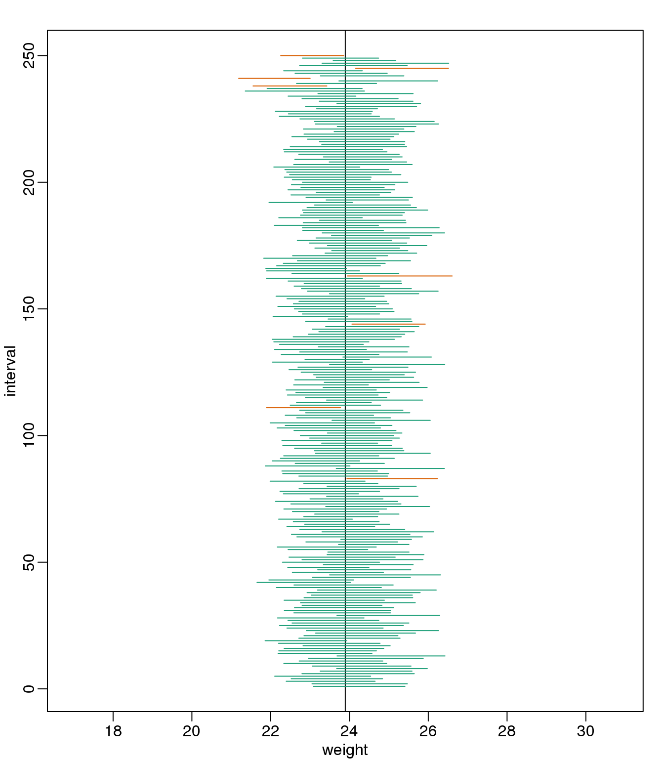
(#fig:confidence_interval_n30)We show 250 random realizations of 95% confidence intervals. The color denotes if the interval fell on the parameter or not.
You can run this repeatedly to see what happens. You will see that in about 5% of the cases, we fail to cover \(\mu_X\).
2.12.0.3 Small Sample Size and the CLT
For \(N=30\), the CLT works very well. However, if \(N=5\), do these confidence intervals work as well? We used the CLT to create our intervals, and with \(N=5\) it may not be as useful an approximation. We can confirm this with a simulation:
mypar()
plot(mean(chowPopulation)+c(-7,7),c(1,1),type="n",
     xlab="weight",ylab="interval",ylim=c(1,B))
abline(v=mean(chowPopulation))
Q <- qnorm(1- 0.05/2)
N <- 5
for (i in 1:B) {
  chow <- sample(chowPopulation,N)
  se <- sd(chow)/sqrt(N)
  interval <- c(mean(chow)-Q*se, mean(chow)+Q*se)
  covered <- mean(chowPopulation) <= interval[2] & mean(chowPopulation) >= interval[1]
  color <- ifelse(covered,1,2)
  lines(interval, c(i,i),col=color)
}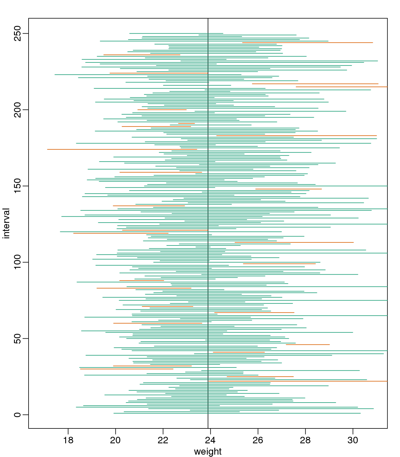
(#fig:confidence_interval_n5)We show 250 random realizations of 95% confidence intervals, but now for a smaller sample size. The confidence interval is based on the CLT approximation. The color denotes if the interval fell on the parameter or not.
Despite the intervals being larger (we are dividing by \(\sqrt{5}\) instead of \(\sqrt{30}\) ), we see many more intervals not covering \(\mu_X\). This is because the CLT is incorrectly telling us that the distribution of the mean(chow) is approximately normal with standard deviation 1 when, in fact, it has a larger standard deviation and a fatter tail (the parts of the distribution going to \(\pm \infty\)). This mistake affects us in the calculation of Q, which assumes a normal distribution and uses qnorm. The t-distribution might be more appropriate. All we have to do is re-run the above, but change how we calculate Q to use qt instead of qnorm.
mypar()
plot(mean(chowPopulation) + c(-7,7), c(1,1), type="n",
     xlab="weight", ylab="interval", ylim=c(1,B))
abline(v=mean(chowPopulation))
##Q <- qnorm(1- 0.05/2) ##no longer normal so use:
Q <- qt(1- 0.05/2, df=4)
N <- 5
for (i in 1:B) {
  chow <- sample(chowPopulation, N)
  se <- sd(chow)/sqrt(N)
  interval <- c(mean(chow)-Q*se, mean(chow)+Q*se )
  covered <- mean(chowPopulation) <= interval[2] & mean(chowPopulation) >= interval[1]
  color <- ifelse(covered,1,2)
  lines(interval, c(i,i),col=color)
}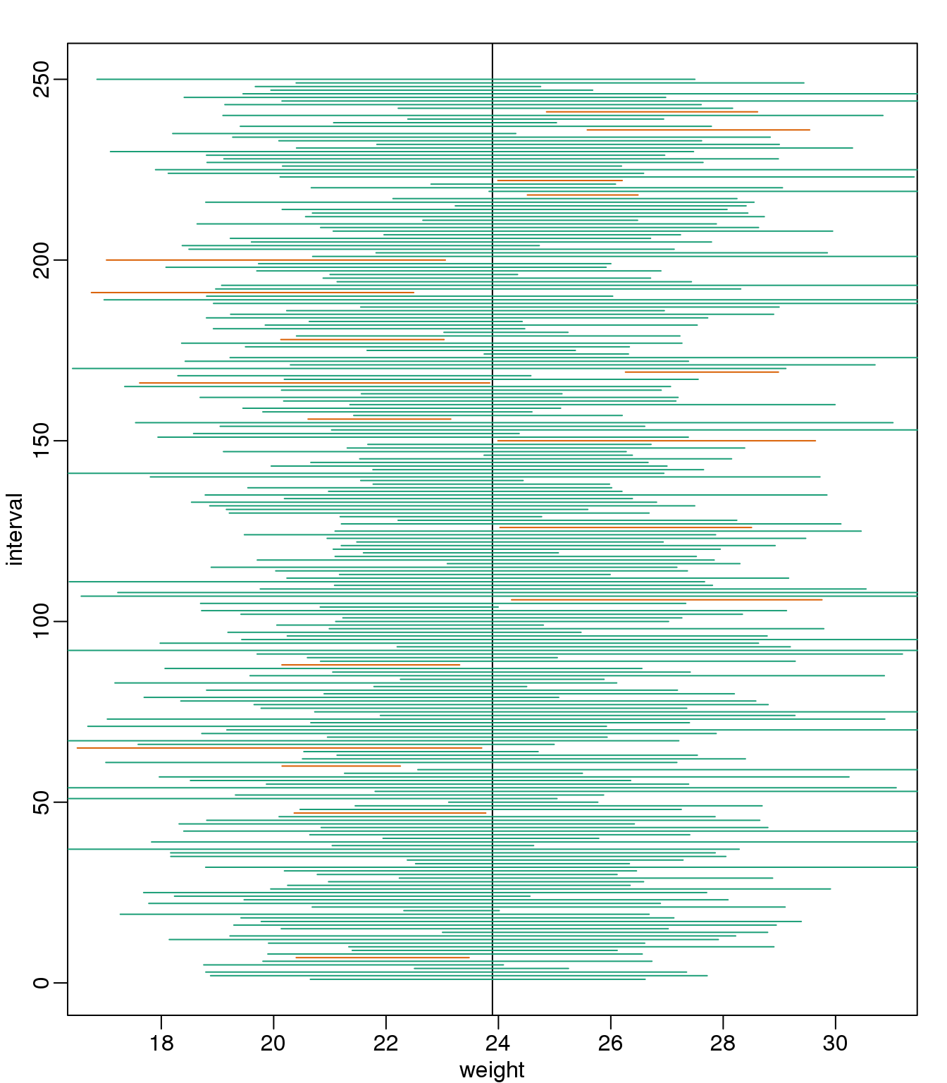
(#fig:confidence_interval_tdist_n5)We show 250 random realizations of 95% confidence intervals, but now for a smaller sample size. The confidence is now based on the t-distribution approximation. The color denotes if the interval fell on the parameter or not.
Now the intervals are made bigger. This is because the t-distribution has fatter tails and therefore:
qt(1- 0.05/2, df=4)## [1] 2.776is bigger than…
qnorm(1- 0.05/2)## [1] 1.96…which makes the intervals larger and hence cover \(\mu_X\) more frequently; in fact, about 95% of the time.
2.12.0.4 Connection Between Confidence Intervals and p-values
We recommend that in practice confidence intervals be reported instead of p-values. If for some reason you are required to provide p-values, or required that your results are significant at the 0.05 of 0.01 levels, confidence intervals do provide this information.
If we are talking about a t-test p-value, we are asking if differences as extreme as the one we observe, \(\bar{Y} - \bar{X}\), are likely when the difference between the population averages is actually equal to zero. So we can form a confidence interval with the observed difference. Instead of writing \(\bar{Y} - \bar{X}\) repeatedly, let’s define this difference as a new variable \(d \equiv \bar{Y} - \bar{X}\) .
Suppose you use CLT and report \(d \pm 2 s_d/\sqrt{N}\), with \(s_d = \sqrt{s_X^2+s_Y^2}\), as a 95% confidence interval for the difference and this interval does not include 0 (a false positive). Because the interval does not include 0, this implies that either \(D - 2 s_d/\sqrt{N} > 0\) or \(d + 2 s_d/\sqrt{N} < 0\). This suggests that either \(\sqrt{N}d/s_d > 2\) or \(\sqrt{N}d/s_d < 2\). This then implies that the t-statistic is more extreme than 2, which in turn suggests that the p-value must be smaller than 0.05 (approximately, for a more exact calculation use qnorm(.05/2) instead of 2). The same calculation can be made if we use the t-distribution instead of CLT (with qt(.05/2, df=2*N-2)). In summary, if a 95% or 99% confidence interval does not include 0, then the p-value must be smaller than 0.05 or 0.01 respectively.
Note that the confidence interval for the difference \(d\) is provided by the t.test function:
t.test(treatment,control)$conf.int## [1] -0.04297 6.08463
## attr(,"conf.level")
## [1] 0.95In this case, the 95% confidence interval does include 0 and we observe that the p-value is larger than 0.05 as predicted. If we change this to a 90% confidence interval, then:
t.test(treatment,control,conf.level=0.9)$conf.int## [1] 0.4872 5.5545
## attr(,"conf.level")
## [1] 0.90 is no longer in the confidence interval (which is expected because the p-value is smaller than 0.10).
2.13 Power Calculations
2.13.0.1 Introduction
We have used the example of the effects of two different diets on the weight of mice. Since in this illustrative example we have access to the population, we know that in fact there is a substantial (about 10%) difference between the average weights of the two populations:
library(dplyr)
dat <- read.csv("mice_pheno.csv") #Previously downloaded

controlPopulation <- filter(dat,Sex == "F" & Diet == "chow") %>%
  select(Bodyweight) %>% unlist

hfPopulation <- filter(dat,Sex == "F" & Diet == "hf") %>%
  select(Bodyweight) %>% unlist

mu_hf <- mean(hfPopulation)
mu_control <- mean(controlPopulation)
print(mu_hf - mu_control)
## [1] 2.376print((mu_hf - mu_control)/mu_control * 100) #percent increase## [1] 9.942We have also seen that, in some cases, when we take a sample and perform a t-test, we don’t always get a p-value smaller than 0.05. For example, here is a case where we take a sample of 5 mice and don’t achieve statistical significance at the 0.05 level:
set.seed(1)
N <- 5
hf <- sample(hfPopulation,N)
control <- sample(controlPopulation,N)
t.test(hf,control)$p.value
## [1] 0.141Did we make a mistake? By not rejecting the null hypothesis, are we saying the diet has no effect? The answer to this question is no. All we can say is that we did not reject the null hypothesis. But this does not necessarily imply that the null is true. The problem is that, in this particular instance, we don’t have enough power, a term we are now going to define. If you are doing scientific research, it is very likely that you will have to do a power calculation at some point. In many cases, it is an ethical obligation as it can help you avoid sacrificing mice unnecessarily or limiting the number of human subjects exposed to potential risk in a study. Here we explain what statistical power means.
2.13.0.2 Types of Error
Whenever we perform a statistical test, we are aware that we may make a mistake. This is why our p-values are not 0. Under the null, there is always a positive, perhaps very small, but still positive chance that we will reject the null when it is true. If the p-value is 0.05, it will happen 1 out of 20 times. This error is called type I error by statisticians.
A type I error is defined as rejecting the null when we should not. This is also referred to as a false positive. So why do we then use 0.05? Shouldn’t we use 0.000001 to be really sure? The reason we don’t use infinitesimal cut-offs to avoid type I errors at all cost is that there is another error we can commit: to not reject the null when we should. This is called a type II error or a false negative. The R code analysis above shows an example of a false negative: we did not reject the null hypothesis (at the 0.05 level) and, because we happen to know and peeked at the true population means, we know there is in fact a difference. Had we used a p-value cutoff of 0.25, we would not have made this mistake. However, in general, are we comfortable with a type I error rate of 1 in 4? Usually we are not.
2.13.0.3 The 0.05 and 0.01 Cut-offs Are Arbitrary
Most journals and regulatory agencies frequently insist that results be significant at the 0.01 or 0.05 levels. Of course there is nothing special about these numbers other than the fact that some of the first papers on p-values used these values as examples. Part of the goal of this book is to give readers a good understanding of what p-values and confidence intervals are so that these choices can be judged in an informed way. Unfortunately, in science, these cut-offs are applied somewhat mindlessly, but that topic is part of a complicated debate.
2.13.0.4 Power Calculation
Power is the probability of rejecting the null when the null is false. Of course “when the null is false” is a complicated statement because it can be false in many ways. \(\Delta \equiv \mu_Y - \mu_X\) could be anything and the power actually depends on this parameter. It also depends on the standard error of your estimates which in turn depends on the sample size and the population standard deviations. In practice, we don’t know these so we usually report power for several plausible values of \(\Delta\), \(\sigma_X\), \(\sigma_Y\) and various sample sizes. Statistical theory gives us formulas to calculate power. The pwr package performs these calculations for you. Here we will illustrate the concepts behind power by coding up simulations in R.
Suppose our sample size is:
N <- 12and we will reject the null hypothesis at:
alpha <- 0.05What is our power with this particular data? We will compute this probability by re-running the exercise many times and calculating the proportion of times the null hypothesis is rejected. Specifically, we will run:
B <- 2000simulations. The simulation is as follows: we take a sample of size \(N\) from both control and treatment groups, we perform a t-test comparing these two, and report if the p-value is less than alpha or not. We write a function that does this:
reject <- function(N, alpha=0.05){
   hf <- sample(hfPopulation,N)
   control <- sample(controlPopulation,N)
   pval <- t.test(hf,control)$p.value
   pval < alpha
}
Here is an example of one simulation for a sample size of 12. The call to reject answers the question “Did we reject?”
reject(12)## [1] FALSENow we can use the replicate function to do this B times.
rejections <- replicate(B,reject(N))Our power is just the proportion of times we correctly reject. So with \(N=12\) our power is only:
mean(rejections)## [1] 0.2145This explains why the t-test was not rejecting when we knew the null was false. With a sample size of just 12, our power is about 23%. To guard against false positives at the 0.05 level, we had set the threshold at a high enough level that resulted in many type II errors.
Let’s see how power improves with N. We will use the function sapply, which applies a function to each of the elements of a vector. We want to repeat the above for the following sample size:
Ns <- seq(5, 50, 5)So we use apply like this:
power <- sapply(Ns,function(N){
  rejections <- replicate(B, reject(N))
  mean(rejections)
  })
For each of the three simulations, the above code returns the proportion of times we reject. Not surprisingly power increases with N:
plot(Ns, power, type="b")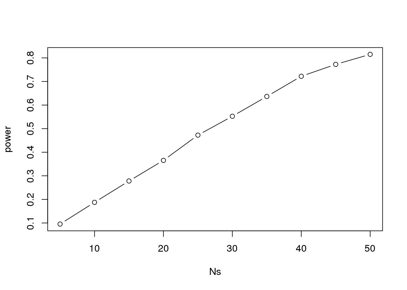
(#fig:power_versus_sample_size)Power plotted against sample size.
Similarly, if we change the level alpha at which we reject, power changes. The smaller I want the chance of type I error to be, the less power I will have. Another way of saying this is that we trade off between the two types of error. We can see this by writing similar code, but keeping \(N\) fixed and considering several values of alpha:
N <- 30
alphas <- c(0.1,0.05,0.01,0.001,0.0001)
power <- sapply(alphas,function(alpha){
  rejections <- replicate(B,reject(N,alpha=alpha))
  mean(rejections)
})
plot(alphas, power, xlab="alpha", type="b", log="x")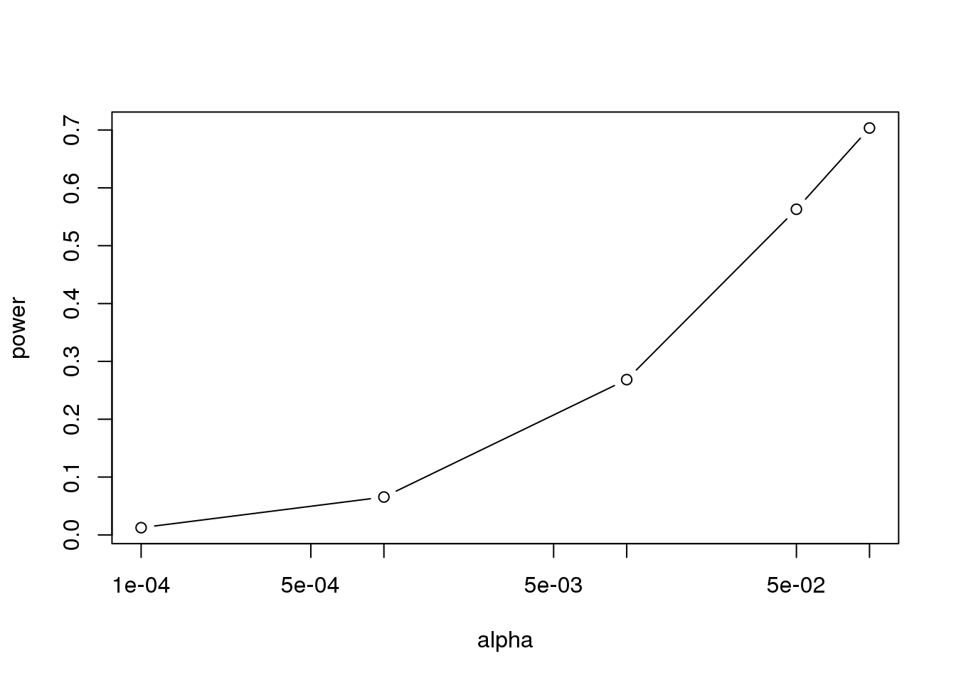
(#fig:power_versus_alpha)Power plotted against cut-off.
Note that the x-axis in this last plot is in the log scale.
There is no “right” power or “right” alpha level, but it is important that you understand what each means.
To see this clearly, you could create a plot with curves of power versus N. Show several curves in the same plot with color representing alpha level.
2.13.0.5 p-values Are Arbitrary under the Alternative Hypothesis
Another consequence of what we have learned about power is that p-values are somewhat arbitrary when the null hypothesis is not true and therefore the alternative hypothesis is true (the difference between the population means is not zero). When the alternative hypothesis is true, we can make a p-value as small as we want simply by increasing the sample size (supposing that we have an infinite population to sample from). We can show this property of p-values by drawing larger and larger samples from our population and calculating p-values. This works because, in our case, we know that the alternative hypothesis is true, since we have access to the populations and can calculate the difference in their means.
First write a function that returns a p-value for a given sample size \(N\):
calculatePvalue <- function(N) {
   hf <- sample(hfPopulation,N)
   control <- sample(controlPopulation,N)
   t.test(hf,control)$p.value
}
We have a limit here of 200 for the high-fat diet population, but we can see the effect well before we get to 200. For each sample size, we will calculate a few p-values. We can do this by repeating each value of \(N\) a few times.
Ns <- seq(10,200,by=10)
Ns_rep <- rep(Ns, each=10)
Again we use sapply to run our simulations:
pvalues <- sapply(Ns_rep, calculatePvalue)Now we can plot the 10 p-values we generated for each sample size:
plot(Ns_rep, pvalues, log="y", xlab="sample size",
     ylab="p-values")
abline(h=c(.01, .05), col="red", lwd=2)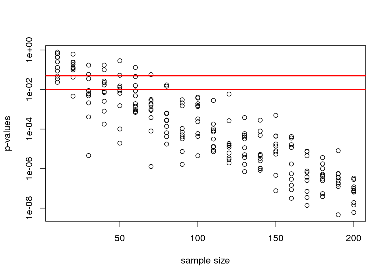
(#fig:pvals_decrease)p-values from random samples at varying sample size. The actual value of the p-values decreases as we increase sample size whenever the alternative hypothesis is true.
Note that the y-axis is log scale and that the p-values show a decreasing trend all the way to \(10^{-8}\) as the sample size gets larger. The standard cutoffs of 0.01 and 0.05 are indicated with horizontal red lines.
It is important to remember that p-values are not more interesting as they become very very small. Once we have convinced ourselves to reject the null hypothesis at a threshold we find reasonable, having an even smaller p-value just means that we sampled more mice than was necessary. Having a larger sample size does help to increase the precision of our estimate of the difference \(\Delta\), but the fact that the p-value becomes very very small is just a natural consequence of the mathematics of the test. The p-values get smaller and smaller with increasing sample size because the numerator of the t-statistic has \(\sqrt{N}\) (for equal sized groups, and a similar effect occurs when \(M \neq N\)). Therefore, if \(\Delta\) is non-zero, the t-statistic will increase with \(N\).
Therefore, a better statistic to report is the effect size with a confidence interval or some statistic which gives the reader a sense of the change in a meaningful scale. We can report the effect size as a percent by dividing the difference and the confidence interval by the control population mean:
N <- 12
hf <- sample(hfPopulation, N)
control <- sample(controlPopulation, N)
diff <- mean(hf) - mean(control)
diff / mean(control) * 100
## [1] 1.869t.test(hf, control)$conf.int / mean(control) * 100## [1] -20.95 24.68
## attr(,"conf.level")
## [1] 0.95In addition, we can report a statistic called Cohen’s d, which is the difference between the groups divided by the pooled standard deviation of the two groups.
sd_pool <- sqrt(((N-1)*var(hf) + (N-1)*var(control))/(2*N - 2))
diff / sd_pool
## [1] 0.0714This tells us how many standard deviations of the data the mean of the high-fat diet group is from the control group. Under the alternative hypothesis, unlike the t-statistic which is guaranteed to increase, the effect size and Cohen’s d will become more precise.
2.14 Monte Carlo Simulation
Computers can be used to generate pseudo-random numbers. For practical purposes these pseudo-random numbers can be used to imitate random variables from the real world. This permits us to examine properties of random variables using a computer instead of theoretical or analytical derivations. One very useful aspect of this concept is that we can create simulated data to test out ideas or competing methods, without actually having to perform laboratory experiments.
Simulations can also be used to check theoretical or analytical results. Also, many of the theoretical results we use in statistics are based on asymptotics: they hold when the sample size goes to infinity. In practice, we never have an infinite number of samples so we may want to know how well the theory works with our actual sample size. Sometimes we can answer this question analytically, but not always. Simulations are extremely useful in these cases.
As an example, let’s use a Monte Carlo simulation to compare the CLT to the t-distribution approximation for different sample sizes.
library(dplyr)
dat <- read.csv("mice_pheno.csv")
controlPopulation <- filter(dat,Sex == "F" & Diet == "chow") %>%
  select(Bodyweight) %>% unlist
We will build a function that automatically generates a t-statistic under the null hypothesis for a sample size of n.
ttestgenerator <- function(n) {
  #note that here we have a false "high fat" group where we actually
  #sample from the chow or control population.
  #This is because we are modeling the null.
  cases <- sample(controlPopulation,n)
  controls <- sample(controlPopulation,n)
  tstat <- (mean(cases)-mean(controls)) /
      sqrt( var(cases)/n + var(controls)/n )
  return(tstat)
  }
ttests <- replicate(1000, ttestgenerator(10))
With 1,000 Monte Carlo simulated occurrences of this random variable, we can now get a glimpse of its distribution:
hist(ttests)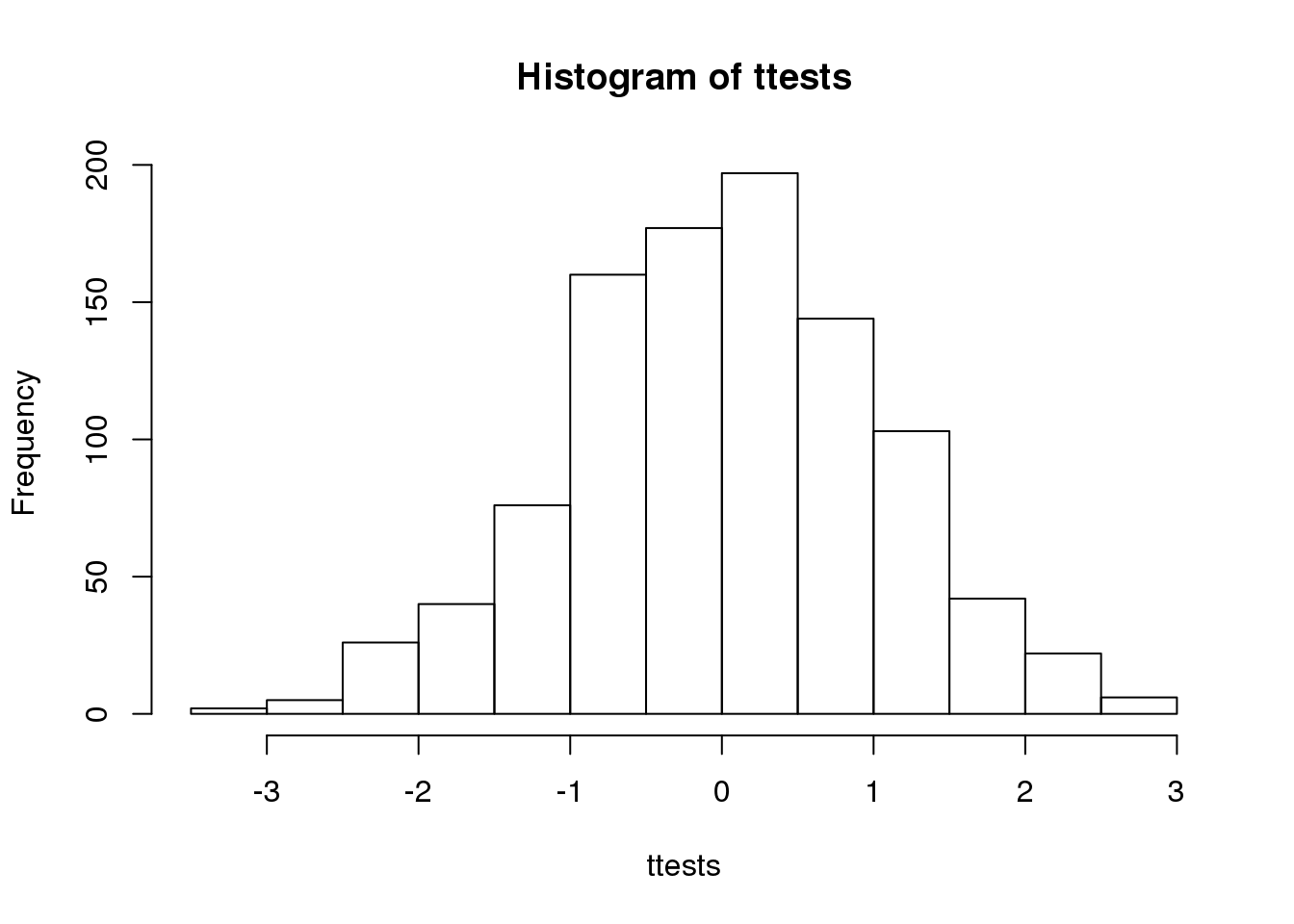
(#fig:ttest_hist)Histogram of 1000 Monte Carlo simulated t-statistics.
So is the distribution of this t-statistic well approximated by the normal distribution? In the next chapter, we will formally introduce quantile-quantile plots, which provide a useful visual inspection of how well one distribution approximates another. As we will explain later, if points fall on the identity line, it means the approximation is a good one.
qqnorm(ttests)
abline(0,1)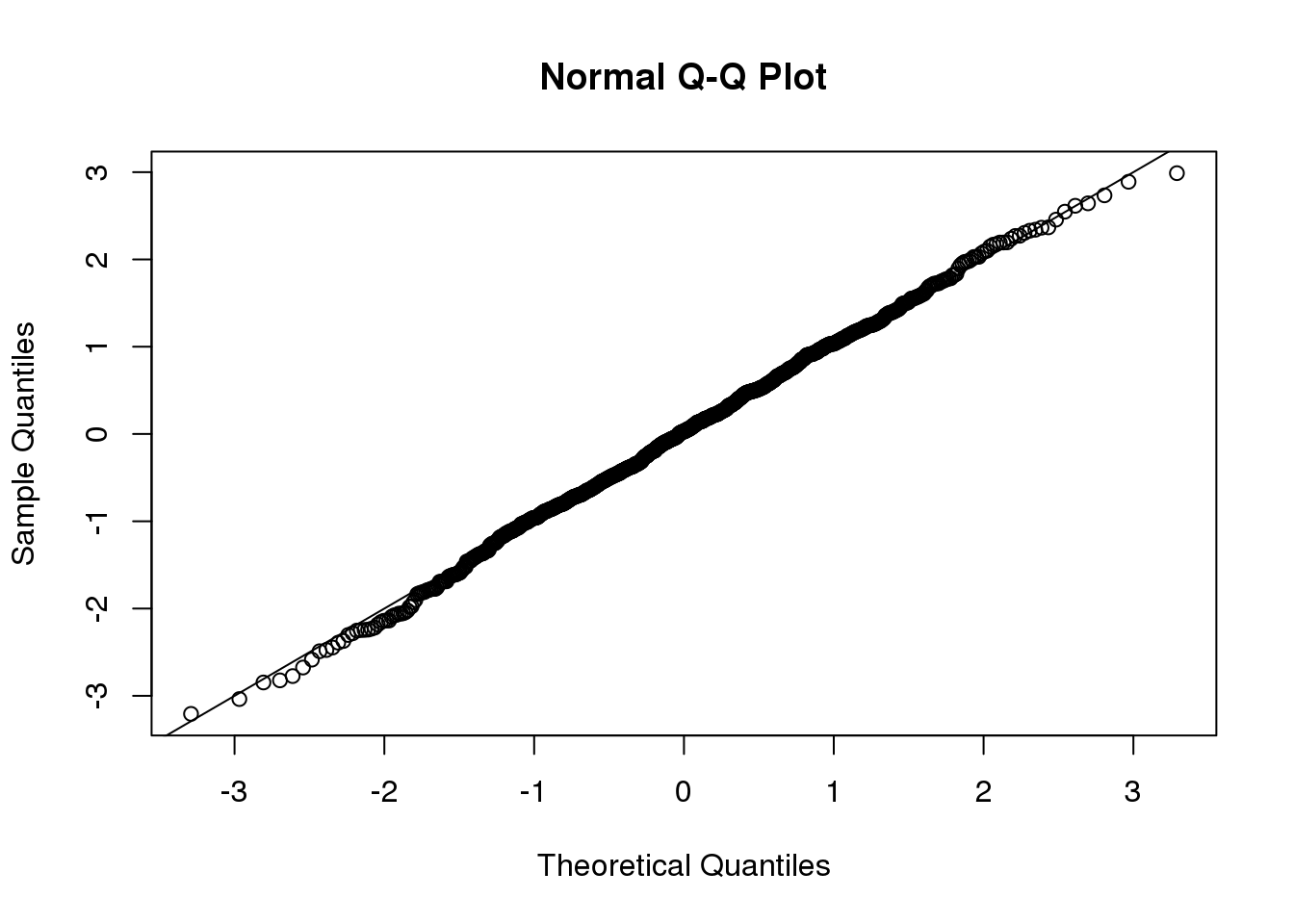
(#fig:ttest_qqplot)Quantile-quantile plot comparing 1000 Monte Carlo simulated t-statistics to theoretical normal distribution.
This looks like a very good approximation. For this particular population, a sample size of 10 was large enough to use the CLT approximation. How about 3?
ttests <- replicate(1000, ttestgenerator(3))
qqnorm(ttests)
abline(0,1)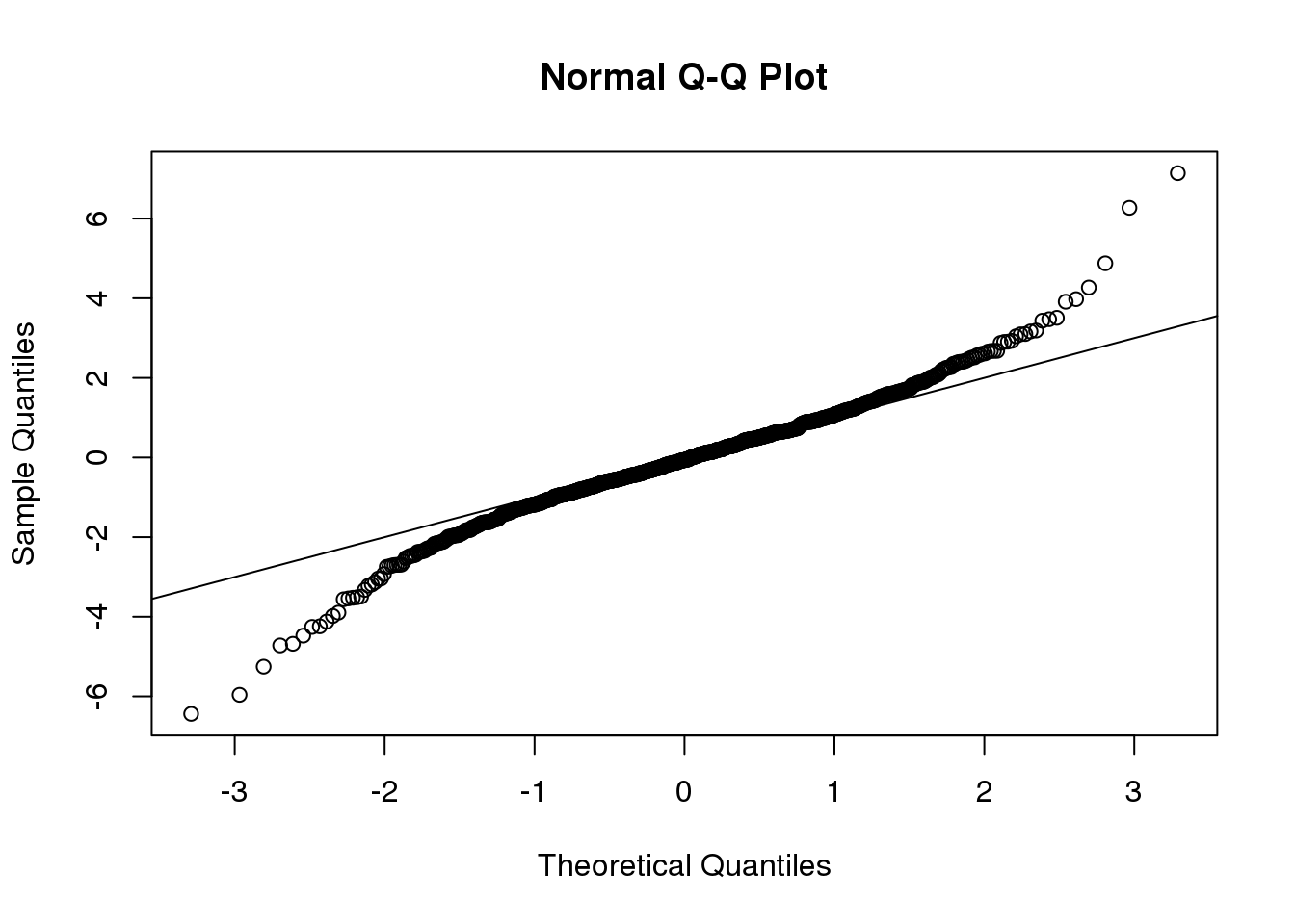
(#fig:ttest_df3_qqplot)Quantile-quantile plot comparing 1000 Monte Carlo simulated t-statistics with three degrees of freedom to theoretical normal distribution.
Now we see that the large quantiles, referred to by statisticians as the tails, are larger than expected (below the line on the left side of the plot and above the line on the right side of the plot). In the previous module, we explained that when the sample size is not large enough and the population values follow a normal distribution, then the t-distribution is a better approximation. Our simulation results seem to confirm this:
ps <- (seq(0,999)+0.5)/1000
qqplot(qt(ps,df=2*3-2),ttests,xlim=c(-6,6),ylim=c(-6,6))
abline(0,1)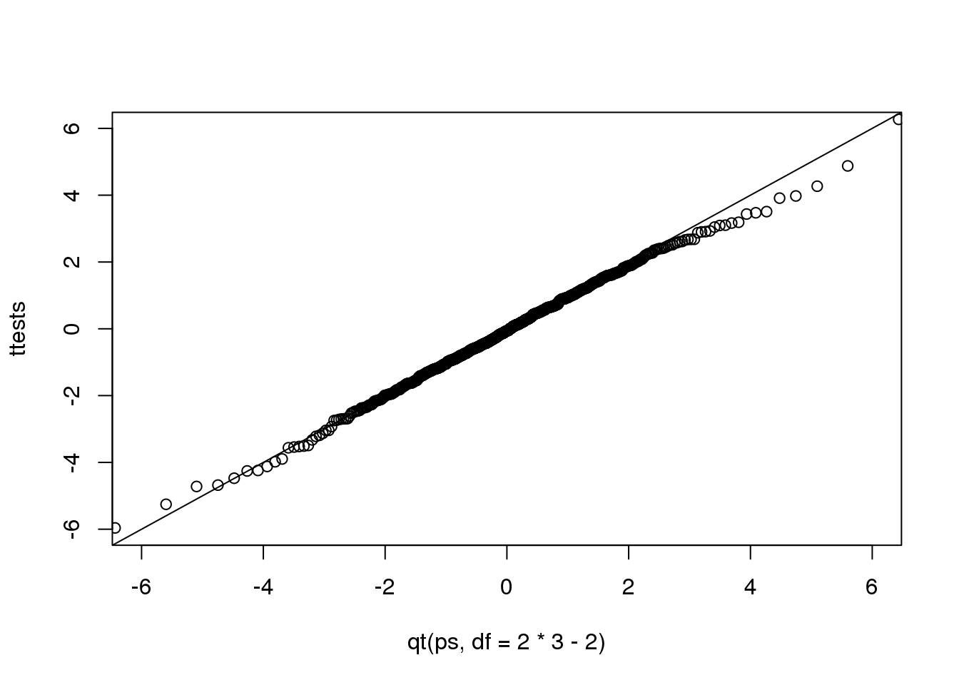
(#fig:ttest_v_tdist_qqplot)Quantile-quantile plot comparing 1000 Monte Carlo simulated t-statistics with three degrees of freedom to theoretical t-distribution.
The t-distribution is a much better approximation in this case, but it is still not perfect. This is due to the fact that the original data is not that well approximated by the normal distribution.
qqnorm(controlPopulation)
qqline(controlPopulation)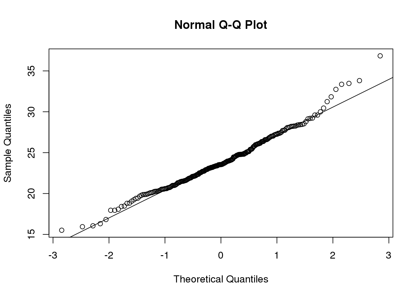
(#fig:dat_qqplot)Quantile-quantile of original data compared to theoretical quantile distribution.
2.15 Parametric Simulations for the Observations
The technique we used to motivate random variables and the null distribution was a type of Monte Carlo simulation. We had access to population data and generated samples at random. In practice, we do not have access to the entire population. The reason for using the approach here was for educational purposes. However, when we want to use Monte Carlo simulations in practice, it is much more typical to assume a parametric distribution and generate a population from this, which is called a parametric simulation. This means that we take parameters estimated from the real data (here the mean and the standard deviation), and plug these into a model (here the normal distribution). This is actually the most common form of Monte Carlo simulation.
For the case of weights, we could use our knowledge that mice typically weigh 24 grams with a SD of about 3.5 grams, and that the distribution is approximately normal, to generate population data:
controls<- rnorm(5000, mean=24, sd=3.5) After we generate the data, we can then repeat the exercise above. We no longer have to use the sample function since we can re-generate random normal numbers. The ttestgenerator function therefore can be written as follows:
ttestgenerator <- function(n, mean=24, sd=3.5) {
  cases <- rnorm(n,mean,sd)
  controls <- rnorm(n,mean,sd)
  tstat <- (mean(cases)-mean(controls)) /
      sqrt( var(cases)/n + var(controls)/n )
  return(tstat)
  }
2.16 Permutation Tests
Suppose we have a situation in which none of the standard mathematical statistical approximations apply. We have computed a summary statistic, such as the difference in mean, but do not have a useful approximation, such as that provided by the CLT. In practice, we do not have access to all values in the population so we can’t perform a simulation as done above. Permutation tests can be useful in these scenarios.
We are back to the scenario where we only have 10 measurements for each group.
dat=read.csv("femaleMiceWeights.csv")

library(dplyr)

control <- filter(dat,Diet=="chow") %>% select(Bodyweight) %>% unlist
treatment <- filter(dat,Diet=="hf") %>% select(Bodyweight) %>% unlist
obsdiff <- mean(treatment)-mean(control)
In previous sections, we showed parametric approaches that helped determine if the observed difference was significant. Permutation tests take advantage of the fact that if we randomly shuffle the cases and control labels, then the null is true. So we shuffle the cases and control labels and assume that the ensuing distribution approximates the null distribution. Here is how we generate a null distribution by shuffling the data 1,000 times:
N <- 12
avgdiff <- replicate(1000, {
    all <- sample(c(control,treatment))
    newcontrols <- all[1:N]
    newtreatments <- all[(N+1):(2*N)]
  return(mean(newtreatments) - mean(newcontrols))
})
hist(avgdiff)
abline(v=obsdiff, col="red", lwd=2)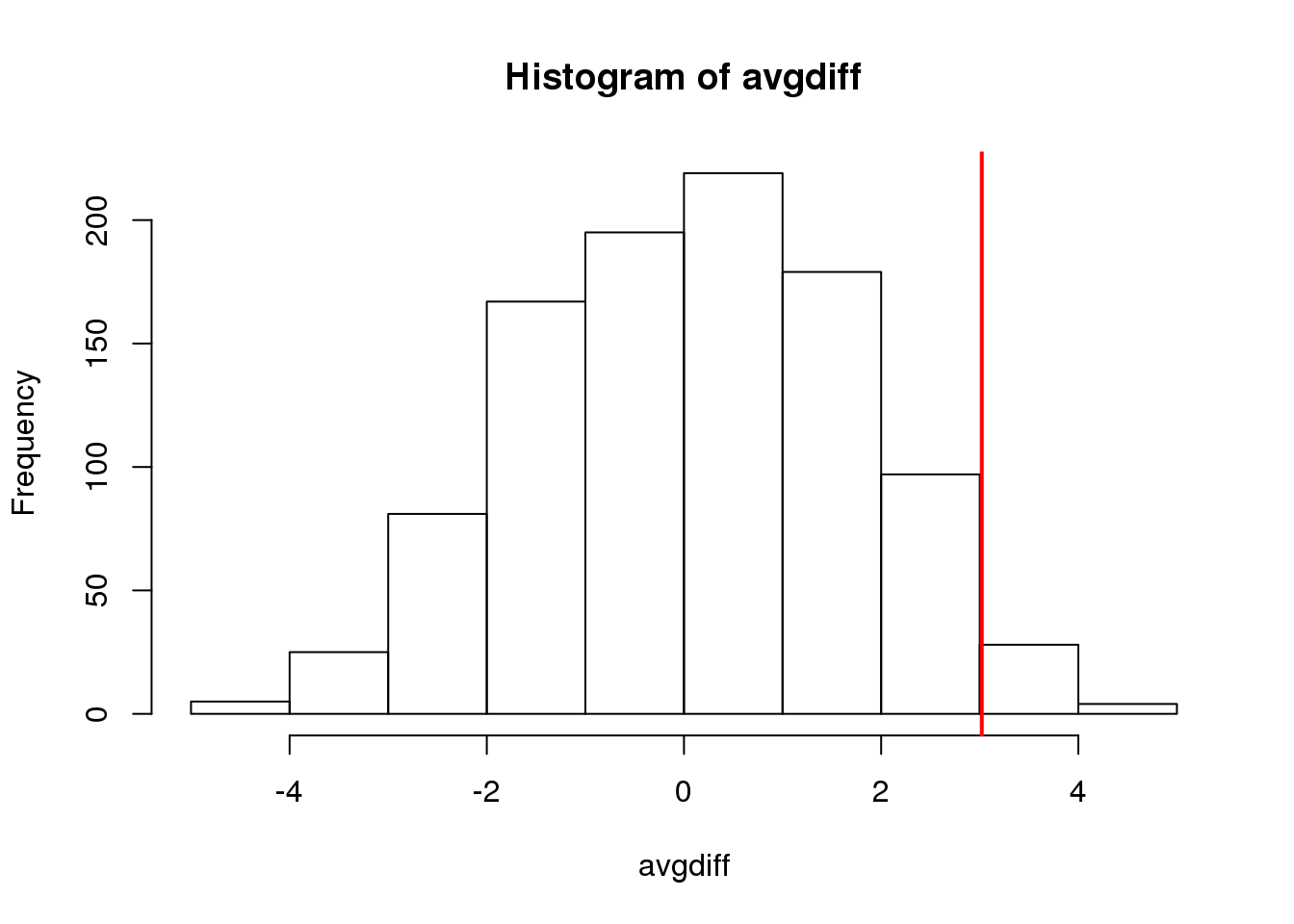
(#fig:diff_hist)Histogram of difference between averages from permutations. Vertical line shows the observed difference.
How many of the null means are bigger than the observed value? That proportion would be the p-value for the null. We add a 1 to the numerator and denominator to account for misestimation of the p-value (for more details see Phipson and Smyth, Permutation P-values should never be zero).
#the proportion of permutations with larger difference
(sum(abs(avgdiff) > abs(obsdiff)) + 1) / (length(avgdiff) + 1)
## [1] 0.06294Now let’s repeat this experiment for a smaller dataset. We create a smaller dataset by sampling:
N <- 5
control <- sample(control,N)
treatment <- sample(treatment,N)
obsdiff <- mean(treatment)- mean(control)
and repeat the exercise:
avgdiff <- replicate(1000, {
    all <- sample(c(control,treatment))
    newcontrols <- all[1:N]
    newtreatments <- all[(N+1):(2*N)]
  return(mean(newtreatments) - mean(newcontrols))
})
hist(avgdiff)
abline(v=obsdiff, col="red", lwd=2)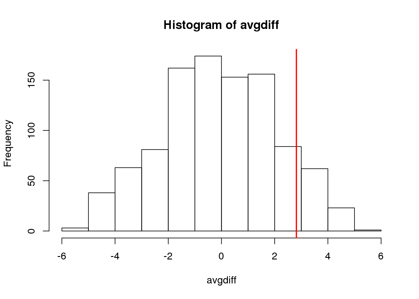
(#fig:diff_hist_N50)Histogram of difference between averages from permutations for smaller sample size. Vertical line shows the observed difference.
Now the observed difference is not significant using this approach. Keep in mind that there is no theoretical guarantee that the null distribution estimated from permutations approximates the actual null distribution. For example, if there is a real difference between the populations, some of the permutations will be unbalanced and will contain some samples that explain this difference. This implies that the null distribution created with permutations will have larger tails than the actual null distribution. This is why permutations result in conservative p-values. For this reason, when we have few samples, we can’t do permutations.
Note also that permutation tests still have assumptions: samples are assumed to be independent and “exchangeable”. If there is hidden structure in your data, then permutation tests can result in estimated null distributions that underestimate the size of tails because the permutations may destroy the existing structure in the original data.
2.17 Association Tests
The statistical tests we have covered up to now leave out a substantial portion of life science projects. Specifically, we are referring to data that is binary, categorical and ordinal. To give a very specific example, consider genetic data where you have two groups of genotypes (AA/Aa or aa) for cases and controls for a given disease. The statistical question is if genotype and disease are associated. As in the examples we have been studying previously, we have two populations (AA/Aa and aa) and then numeric data for each, where disease status can be coded as 0 or 1. So why can’t we perform a t-test? Note that the data is either 0 (control) or 1 (cases). It is pretty clear that this data is not normally distributed so the t-distribution approximation is certainly out of the question. We could use CLT if the sample size is large enough; otherwise, we can use association tests.
2.17.0.1 Lady Tasting Tea
One of the most famous examples of hypothesis testing was performed by R.A. Fisher. An acquaintance of Fisher’s claimed that she could tell if milk was added before or after tea was poured. Fisher gave her four pairs of cups of tea: one with milk poured first, the other after. The order was randomized. Say she picked 3 out of 4 correctly, do we believe she has a special ability? Hypothesis testing helps answer this question by quantifying what happens by chance. This example is called the “Lady Tasting Tea” experiment (and, as it turns out, Fisher’s friend was a scientist herself, Muriel Bristol).
The basic question we ask is: if the tester is actually guessing, what are the chances that she gets 3 or more correct? Just as we have done before, we can compute a probability under the null hypothesis that she is guessing 4 of each. If we assume this null hypothesis, we can think of this particular example as picking 4 balls out of an urn with 4 green (correct answer) and 4 red (incorrect answer) balls.
Under the null hypothesis that she is simply guessing, each ball has the same chance of being picked. We can then use combinatorics to figure out each probability. The probability of picking 3 is \({4 \choose 3} {4 \choose 1} / {8 \choose 4} = 16/70\). The probability of picking all 4 correct is \({4 \choose 4} {4 \choose 0}/{8 \choose 4}= 1/70\). Thus, the chance of observing a 3 or something more extreme, under the null hypothesis, is \(\approx 0.24\). This is the p-value. The procedure that produced this p-value is called Fisher’s exact test and it uses the hypergeometric distribution.
2.17.0.2 Two By Two Tables
The data from the experiment above can be summarized by a two by two table:
tab <- matrix(c(3,1,1,3),2,2)
rownames(tab)<-c("Poured Before","Poured After")
colnames(tab)<-c("Guessed before","Guessed after")
tab
## Guessed before Guessed after
## Poured Before 3 1
## Poured After 1 3The function fisher.test performs the calculations above and can be obtained like this:
fisher.test(tab,alternative="greater")##
## Fisher's Exact Test for Count Data
##
## data: tab
## p-value = 0.2
## alternative hypothesis: true odds ratio is greater than 1
## 95 percent confidence interval:
## 0.3136 Inf
## sample estimates:
## odds ratio
## 6.4082.17.0.3 Chi-square Test
Genome-wide association studies (GWAS) have become ubiquitous in biology. One of the main statistical summaries used in these studies are Manhattan plots. The y-axis of a Manhattan plot typically represents the negative of log (base 10) of the p-values obtained for association tests applied at millions of single nucleotide polymorphisms (SNP). The x-axis is typically organized by chromosome (chromosome 1 to 22, X, Y, etc.). These p-values are obtained in a similar way to the test performed on the tea taster. However, in that example the number of green and red balls is experimentally fixed and the number of answers given for each category is also fixed. Another way to say this is that the sum of the rows and the sum of the columns are fixed. This defines constraints on the possible ways we can fill the two by two table and also permits us to use the hypergeometric distribution. In general, this is not the case. Nonetheless, there is another approach, the Chi-squared test, which is described below.
Imagine we have 250 individuals, where some of them have a given disease and the rest do not. We observe that 20% of the individuals that are homozygous for the minor allele (aa) have the disease compared to 10% of the rest. Would we see this again if we picked another 250 individuals?
Let’s create a dataset with these percentages:
disease=factor(c(rep(0,180),rep(1,20),rep(0,40),rep(1,10)),
               labels=c("control","cases"))
genotype=factor(c(rep("AA/Aa",200),rep("aa",50)),
                levels=c("AA/Aa","aa"))
dat <- data.frame(disease, genotype)
dat <- dat[sample(nrow(dat)),] #shuffle them up
head(dat)
## disease genotype
## 67 control AA/Aa
## 93 control AA/Aa
## 143 control AA/Aa
## 225 control aa
## 50 control AA/Aa
## 221 control aaTo create the appropriate two by two table, we will use the function table. This function tabulates the frequency of each level in a factor. For example:
table(genotype)## genotype
## AA/Aa aa
## 200 50table(disease)## disease
## control cases
## 220 30If you provide the function with two factors, it will tabulate all possible pairs and thus create the two by two table:
tab <- table(genotype,disease)
tab
## disease
## genotype control cases
## AA/Aa 180 20
## aa 40 10Note that you can feed table \(n\) factors and it will tabulate all \(n\)-tables.
The typical statistics we use to summarize these results is the odds ratio (OR). We compute the odds of having the disease if you are an “aa”: 10/40, the odds of having the disease if you are an “AA/Aa”: 20/180, and take the ratio: \((10/40) / (20/180)\)
(tab[2,2]/tab[2,1]) / (tab[1,2]/tab[1,1])## [1] 2.25To compute a p-value, we don’t use the OR directly. We instead assume that there is no association between genotype and disease, and then compute what we expect to see in each cell of the table (note: this use of the word “cell” refers to elements in a matrix or table and has nothing to do with biological cells). Under the null hypothesis, the group with 200 individuals and the group with 50 individuals were each randomly assigned the disease with the same probability. If this is the case, then the probability of disease is:
p=mean(disease=="cases")
p
## [1] 0.12The expected table is therefore:
expected <- rbind(c(1-p,p)*sum(genotype=="AA/Aa"),
                  c(1-p,p)*sum(genotype=="aa"))
dimnames(expected)<-dimnames(tab)
expected
## disease
## genotype control cases
## AA/Aa 176 24
## aa 44 6The Chi-square test uses an asymptotic result (similar to the CLT) related to the sums of independent binary outcomes. Using this approximation, we can compute the probability of seeing a deviation from the expected table as big as the one we saw. The p-value for this table is:
chisq.test(tab)$p.value## [1] 0.088572.17.0.4 Large Samples, Small p-values
As mentioned earlier, reporting only p-values is not an appropriate way to report the results of your experiment. Many genetic association studies seem to overemphasize p-values. They have large sample sizes and report impressively small p-values. Yet when one looks closely at the results, we realize odds ratios are quite modest: barely bigger than 1. In this case the difference of having genotype AA/Aa or aa might not change an individual’s risk for a disease in an amount which is practically significant, in that one might not change one’s behavior based on the small increase in risk.
There is not a one-to-one relationship between the odds ratio and the p-value. To demonstrate, we recalculate the p-value keeping all the proportions identical, but increasing the sample size by 10, which reduces the p-value substantially (as we saw with the t-test under the alternative hypothesis):
tab<-tab*10
chisq.test(tab)$p.value
## [1] 1.22e-092.17.0.5 Confidence Intervals for the Odds Ratio
Computing confidence intervals for the OR is not mathematically straightforward. Unlike other statistics, for which we can derive useful approximations of their distributions, the OR is not only a ratio, but a ratio of ratios. Therefore, there is no simple way of using, for example, the CLT.
One approach is to use the theory of generalized linear models which provides estimates of the log odds ratio, rather than the OR itself, that can be shown to be asymptotically normal. Here we provide R code without presenting the theoretical details (for further details please see a reference on generalized linear models such as Wikipedia or McCullagh and Nelder, 1989):
fit <- glm(disease~genotype,family="binomial",data=dat)
coeftab<- summary(fit)$coef
coeftab
## Estimate Std. Error z value Pr(>|z|)
## (Intercept) -2.1972 0.2357 -9.323 1.133e-20
## genotypeaa 0.8109 0.4249 1.908 5.633e-02The second row of the table shown above gives you the estimate and SE of the log odds ratio. Mathematical theory tells us that this estimate is approximately normally distributed. We can therefore form a confidence interval and then exponentiate to provide a confidence interval for the OR.
ci <- coeftab[2,1] + c(-2,2)*coeftab[2,2]
exp(ci)
## [1] 0.9619 5.2632The confidence includes 1, which is consistent with the p-value being bigger than 0.05. Note that the p-value shown here is based on a different approximation to the one used by the Chi-square test, which is why they differ.