第 3 章 探索性数据分析
“The greatest value of a picture is when it forces us to notice what we never expected to see.” -John W. Tukey
在生命科学领域,偏差,系统误差和未知的变异是非常常见的。这些问题常常会导致有问题的数据分析以及错误的结论。数据处理的方法,例如t.test函数,不会去检查实验是否失败。当你将失败实验的结果作为输入信息提供给这些数据处理方法时,你依然会得到一个结果。这个结果可能会导致你得到错误的结论。同时,只从输出的结果是非常难甚至不可能发现错误的。
图形化展示数据是检测这些问题的一个非常有效的方法。这里我们称之为_探索性数据分析_(Exploratory data analysis:EDA)。数据分析中许多重要的方法最初都是从EDA的结果中得到启发而产生的。此外,EDA可以帮助你得到许多重要的生物学观点和结论,而这些发现并不是你通过一连串的假设检验能够得到的。贯穿本书,我们会通过图形化展示来帮助我们进行数据分析。这里我们使用身高的数据来介绍EDA。
我们已经介绍了一些用于单变量的数据的EDA方法,即直方图和QQ图。这里我们进一步介绍QQ图和一些其他的EDA,以及用于成对数据的汇总统计。我们也会推荐一些常用的作图类型。
3.1 QQ图
我们可以利用QQ图来来观察我们的数据是否符合某一个分布(例如是否符合正态分布)。分位值是百分位值的特殊………………….
### This comment line is added by xie186. definingHeights1 was "definingHeights"
library(rafalib)
data(father.son,package="UsingR") ##available from CRAN
x <- father.son$fheight
and for the normal distribution:
ps <- ( seq(0,99) + 0.5 )/100
qs <- quantile(x, ps)
normalqs <- qnorm(ps, mean(x), popsd(x))
plot(normalqs,qs,xlab="Normal percentiles",ylab="Height percentiles")
abline(0,1) ##identity line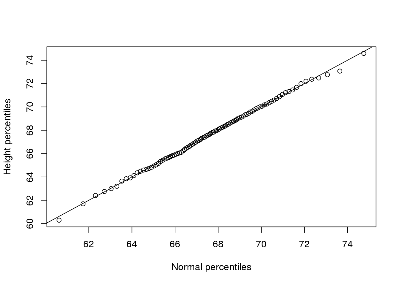
(#fig:qqplot_example1)First example of qqplot. Here we compute the theoretical quantiles ourselves.
注意看这些这两组数值(normalqs和qs)是非常接近的(这个图比之前我们手动做的图有更多的数据,所以tail-behavior也更明显)。
qqnorm(x)
qqline(x) 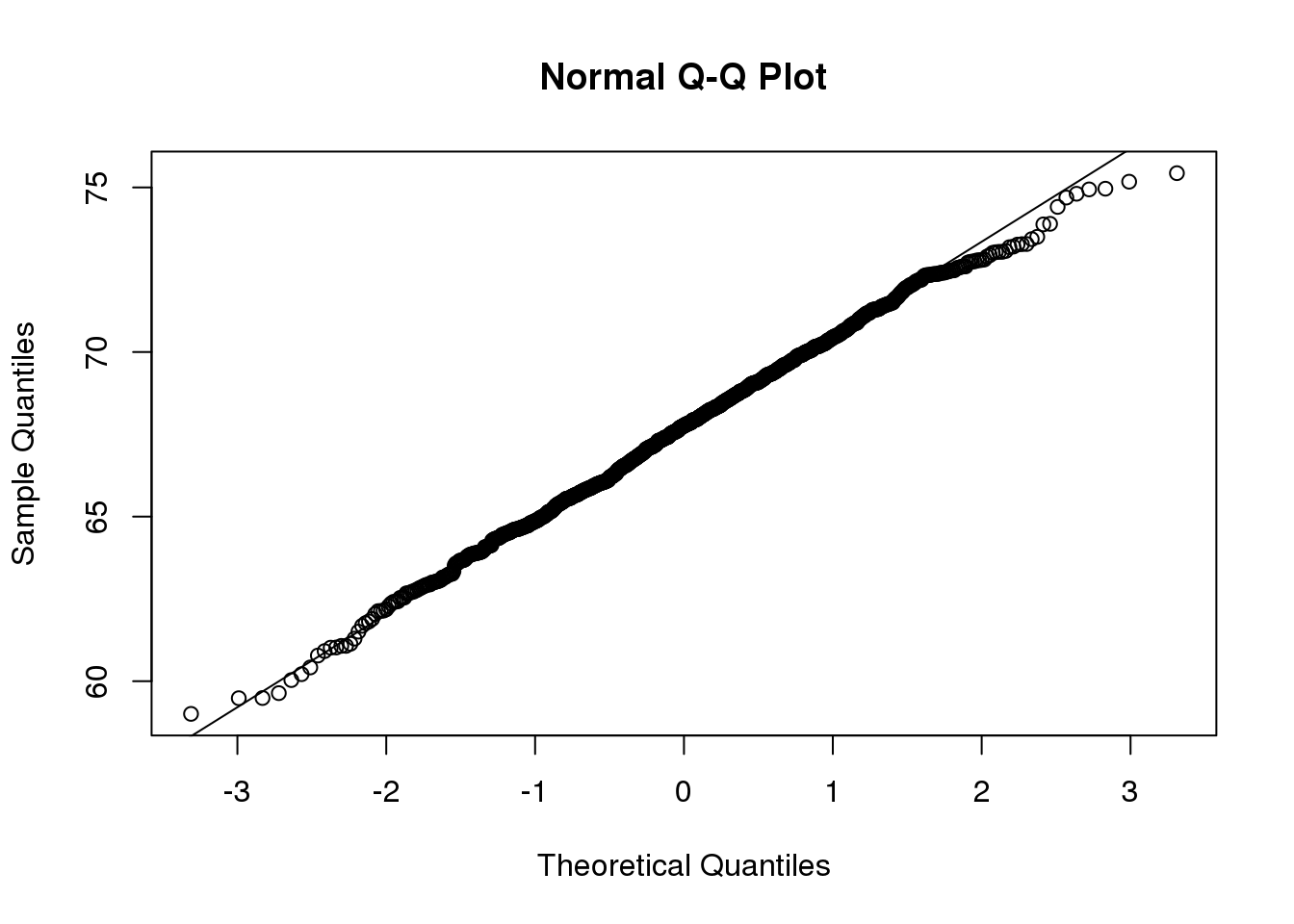
(#fig:qqplot_example2)Second example of qqplot. Here we use the function qqnorm which computes the theoretical normal quantiles automatically.
n <-1000
x <- rnorm(n)
qqnorm(x)
qqline(x)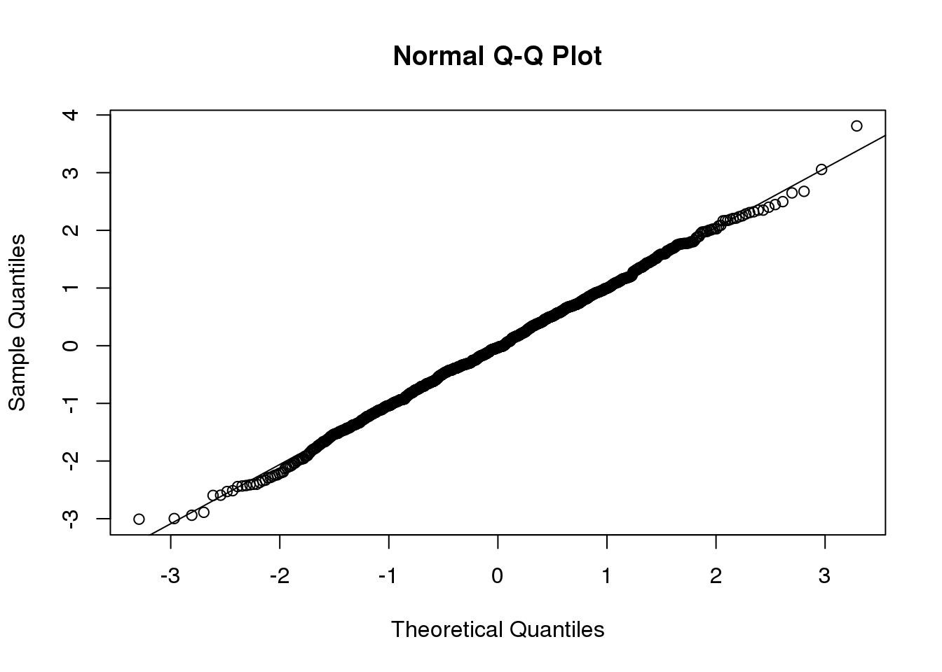
(#fig:qqnorm_example)Example of the qqnorm function. Here we apply it to numbers generated to follow a normal distribution.
dfs <- c(3,6,12,30)
mypar(2,2)
for(df in dfs){
  x <- rt(1000,df)
  qqnorm(x,xlab="t quantiles",main=paste0("d.f=",df),ylim=c(-6,6))
  qqline(x)
}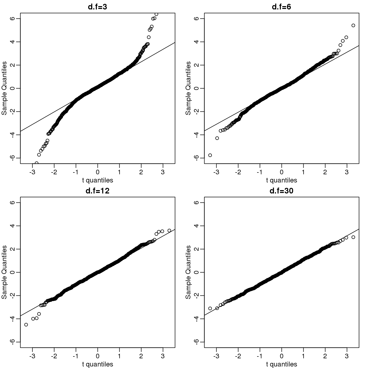
(#fig:qqnorm_of_t)We generate t-distributed data for four degrees of freedom and make qqplots against normal theoretical quantiles.
3.2 箱线图
数据并不是总是服从正态分布的。收入是一个常见的例子。在这些例子中,均值和标准差并不一定有意义,因为你不能仅从这两个数值来判断数据的分布。上面讲到的属性是正态分布特有的。比如,199个美国CEO在2000年的直接薪酬并不符合正态分布。
data(exec.pay,package="UsingR")
mypar(1,2)
hist(exec.pay)
qqnorm(exec.pay)
qqline(exec.pay)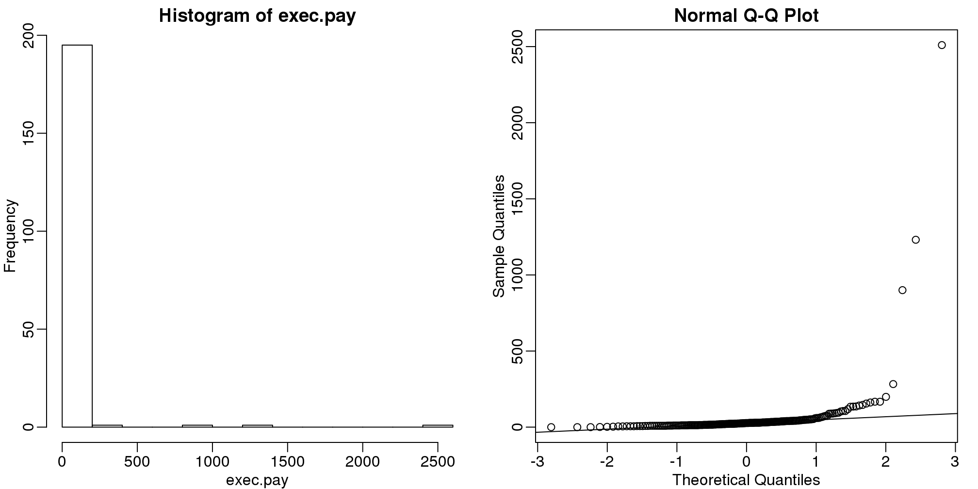
图 3.1: Histogram and QQ-plot of executive pay.
除了qq图之外,另一个实践中比较常用的方法是计算三个百分位值:25%,50%(中位值)和75%。箱线图中会展示这三个百分位值,箱线图中阈值范围是中位值$$1.5倍的75%与25%百分位值的差值。在这个范围之外的值由点表示,有时这些值也被称为_异常值_。
boxplot(exec.pay, ylab="10,000s of dollars", ylim=c(0,400))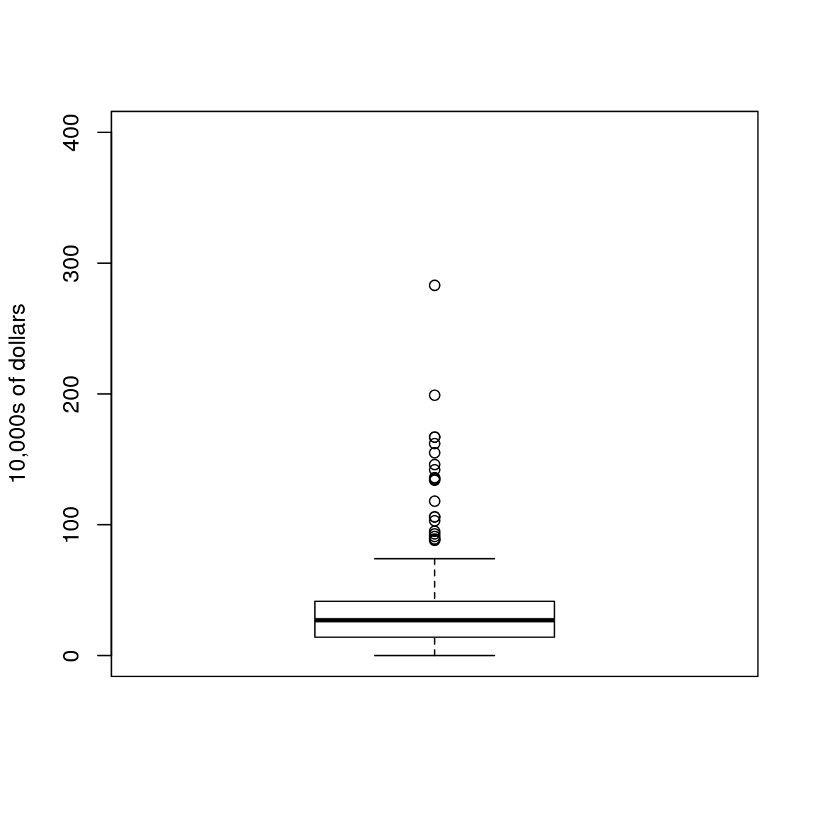
图 3.2: Simple boxplot of executive pay.
这里我们只展示了一个箱线图,然而,箱线图的其中一个很重要的优势是通过将这些图放在一起,我们可以很容易地在一个图中展示很多分布。
3.3 散点图和相关性
上面介绍的方法都是单因子变量相关的分析。在生物医学领域,研究两个或两个以上变量的关系是很常见的。一个很经典的例子是 Francis Galton使用的研究遗传学的父子身高数据。如果我们想总结这些数据,我们可以使用两个均值和两个标准差,因为这两个数据均服从正态分布。但是这个总结并不能展示一个很重要的特征。
data(father.son,package="UsingR")
x=father.son$fheight
y=father.son$sheight
plot(x,y, xlab="Father's height in inches",
     ylab="Son's height in inches",
     main=paste("correlation =",signif(cor(x,y),2)))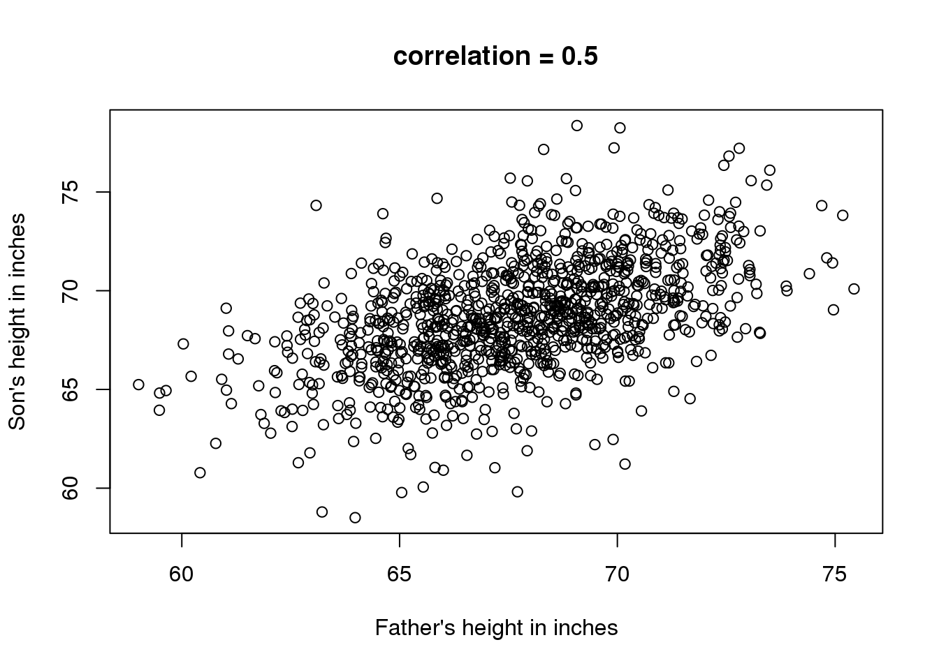
图 3.3: Heights of father and son pairs plotted against each other.
散点图中我们可以看到一个很明显的趋势:父亲的身高越高,儿子的身高就越高。描述这种趋势我们通常使用相关系数,这个例子中相关系数为0.5。这个数……………
3.4 数据分层
假设有人问一个随机选择的儿子的身高。我们知道身高的均值(68.7英寸,大约174.50厘米),这些值差不多大小的值在我们的数据中占了很大的比例(见箱线图),所以我们很有可能猜这个值。但是如果有人告诉你他的父亲的身高是72英寸(182.88cm),你还会猜儿子的身高是68.7英寸吗?
父亲的身高是72英寸比均值要高。严格的说,这位父亲的身高比所有父亲身高均值还要高出1.75个标准差,所以我们是否应该预测这位父亲的儿子的身高也要比均值高出1.75个标准差呢?结果表明,如果这样的预测过高的估计了其儿子的身高。为了说明这一点,我们来看看所有身高为72英寸的父亲的儿子的身高。我们通过对父亲身高_分层_(Stratification)来达到这个目的。
groups <- split(y,round(x))
boxplot(groups)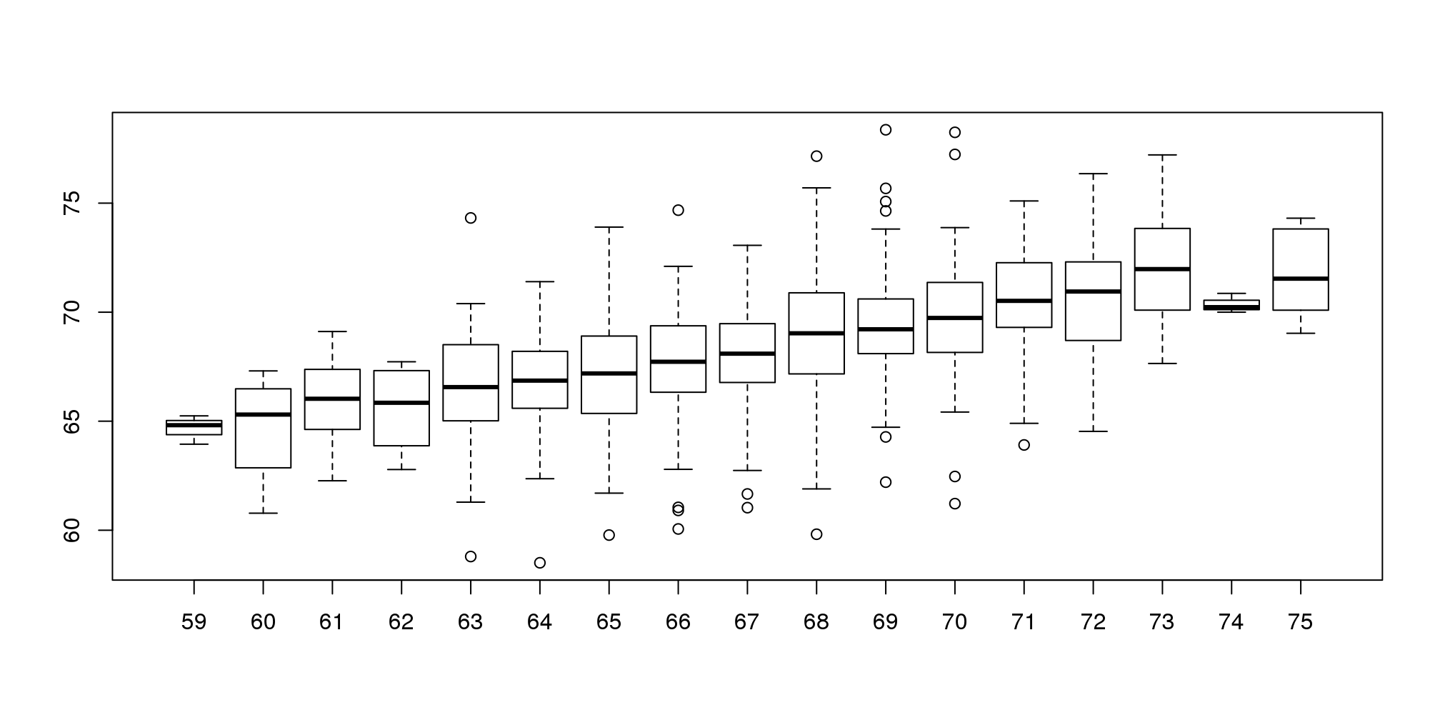
图 3.4: Boxplot of son heights stratified by father heights.
print(mean(y[ round(x) == 72]))## [1] 70.68分层后我们对每一组作箱线图。72英寸这一组中儿子的身高均值为70.7英寸。我们同时也看到每一组数据的中位值看起来形成一条直线(记住箱线图中间的一条线是中位值而不是均值)。这条线和回归线(regression line)相似,这条线的斜率与相关性有关,接下来我们会介绍这些内容。
3.5 二维正态分布
在生命科学领域中,相关性是一个广泛使用的汇总统计值。然而,很多人却错误的使用,或者错误的理解相关性。为了正确的解释和理解相关性,我们首先要理解二维正态分布。
假设我们有一对随机变量\((X,Y)\),如果这对变量中\(X\)小于a并且\(Y\)小于b的比例满足下面的公式,那么这对变量就可以近似为二维正态分布。
\[ \mbox{Pr}(X<a,Y<b) = \]
\[ \int_{-\infty}^{a} \int_{-\infty}^{b} \frac{1}{2\pi\sigma_x\sigma_y\sqrt{1-\rho^2}} \exp{ \left( \frac{1}{2(1-\rho^2)} \left[\left(\frac{x-\mu_x}{\sigma_x}\right)^2 - 2\rho\left(\frac{x-\mu_x}{\sigma_x}\right)\left(\frac{y-\mu_y}{\sigma_y}\right)+ \left(\frac{y-\mu_y}{\sigma_y}\right)^2 \right] \right) } \]
这个公式看起来很复杂,但是背后的概念是很直观的。我们给定一个值\(x\),然后查看\((X,Y)\)中\(X=x\)的数据。通常我们称这种操作为_条件作用_(conditioning)。我们在给定\(X\)的条件下取出\(Y\)。如果一对随机变量服从二维正态分布,那么在\(X=x\)条件下,不管\(x\)是多少,\(Y\)服从正态分布。我们来看看身高数据是否满足这些条件。这里我们展示四组数据。
groups <- split(y,round(x))
mypar(2,2)
for(i in c(5,8,11,14)){
  qqnorm(groups[[i]],main=paste0("X=",names(groups)[i]," strata"),
         ylim=range(y),xlim=c(-2.5,2.5))
  qqline(groups[[i]])
}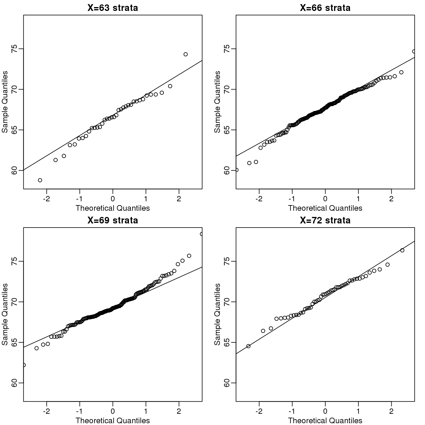
(#fig:qqnorm_of_strata)qqplots of son heights for four strata defined by father heights.
现在让我们回到相关性的定义上来。从数学统计学上来讲,如果连个随机变量符合二维正态分布,那么对于任意\(x\),对应的\(Y\)的均值公式为:
\[ \mu_Y + \rho \frac{X-\mu_X}{\sigma_X}\sigma_Y \]
Note that this is a line with slope \(\rho \frac{\sigma_Y}{\sigma_X}\). This is referred to as the regression line. If the SDs are the same, then the slope of the regression line is the correlation \(\rho\). Therefore, if we standardize \(X\) and \(Y\), the correlation is the slope of the regression line.
Another way to see this is to form a prediction \(\hat{Y}\): for every SD away from the mean in \(x\), we predict \(\rho\) SDs away for \(Y\):
\[ \frac{\hat{Y} - \mu_Y}{\sigma_Y} = \rho \frac{x-\mu_X}{\sigma_X} \]
If there is perfect correlation, we predict the same number of SDs. If there is 0 correlation, then we don’t use \(x\) at all. For values between 0 and 1, the prediction is somewhere in between. For negative values, we simply predict in the opposite direction.
To confirm that the above approximations hold in this case, let’s compare the mean of each strata to the identity line and the regression line:
x=( x-mean(x) )/sd(x)
y=( y-mean(y) )/sd(y)
means=tapply(y, round(x*4)/4, mean)
fatherheights=as.numeric(names(means))
mypar(1,1)
plot(fatherheights, means, ylab="average of strata of son heights", ylim=range(fatherheights))
abline(0, cor(x,y))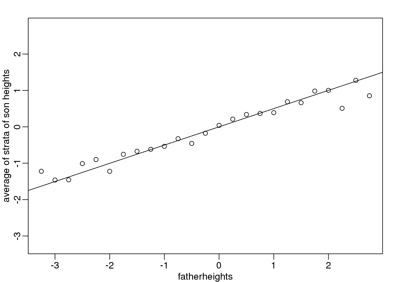
图 3.5: Average son height of each strata plotted against father heights defining the strata
3.5.0.1 Variance explained
The standard deviation of the conditional distribution described above is:
\[ \sqrt{1-\rho^2} \sigma_Y \]
This is where statements like \(X\) explains \(\rho^2 \times 100\) % of the variation in \(Y\): the variance of \(Y\) is \(\sigma^2\) and, once we condition, it goes down to \((1-\rho^2) \sigma^2_Y\) . It is important to remember that the “variance explained” statement only makes sense when the data is approximated by a bivariate normal distribution.
3.6 这些图需要避免使用!
好的数据图形化展示的目的是准确清晰的展示数据。根据的Karl Broman的讲座,下面的准则总是会导致比较差的数据展示效果:
- Obscure what you do show (with chart junk).
- Use pseudo-3D and color gratuitously.
- Make a pie chart (preferably in color and 3D).
- Use a poorly chosen scale.
- Ignore significant figures.
3.6.0.1 Pie charts
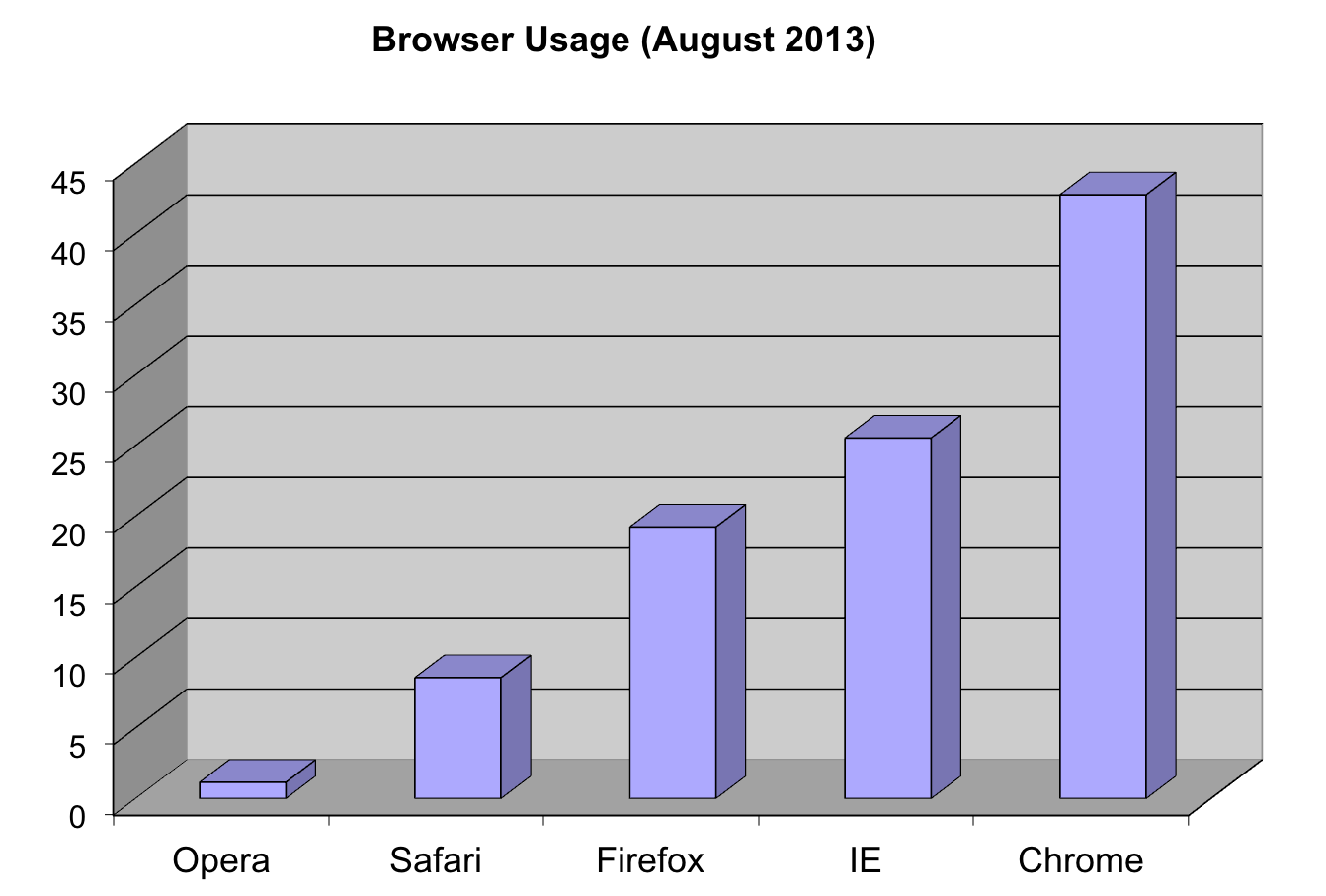
这里我们以浏览器的喜好数据
pie(browsers,main="Browser Usage (August 2013)")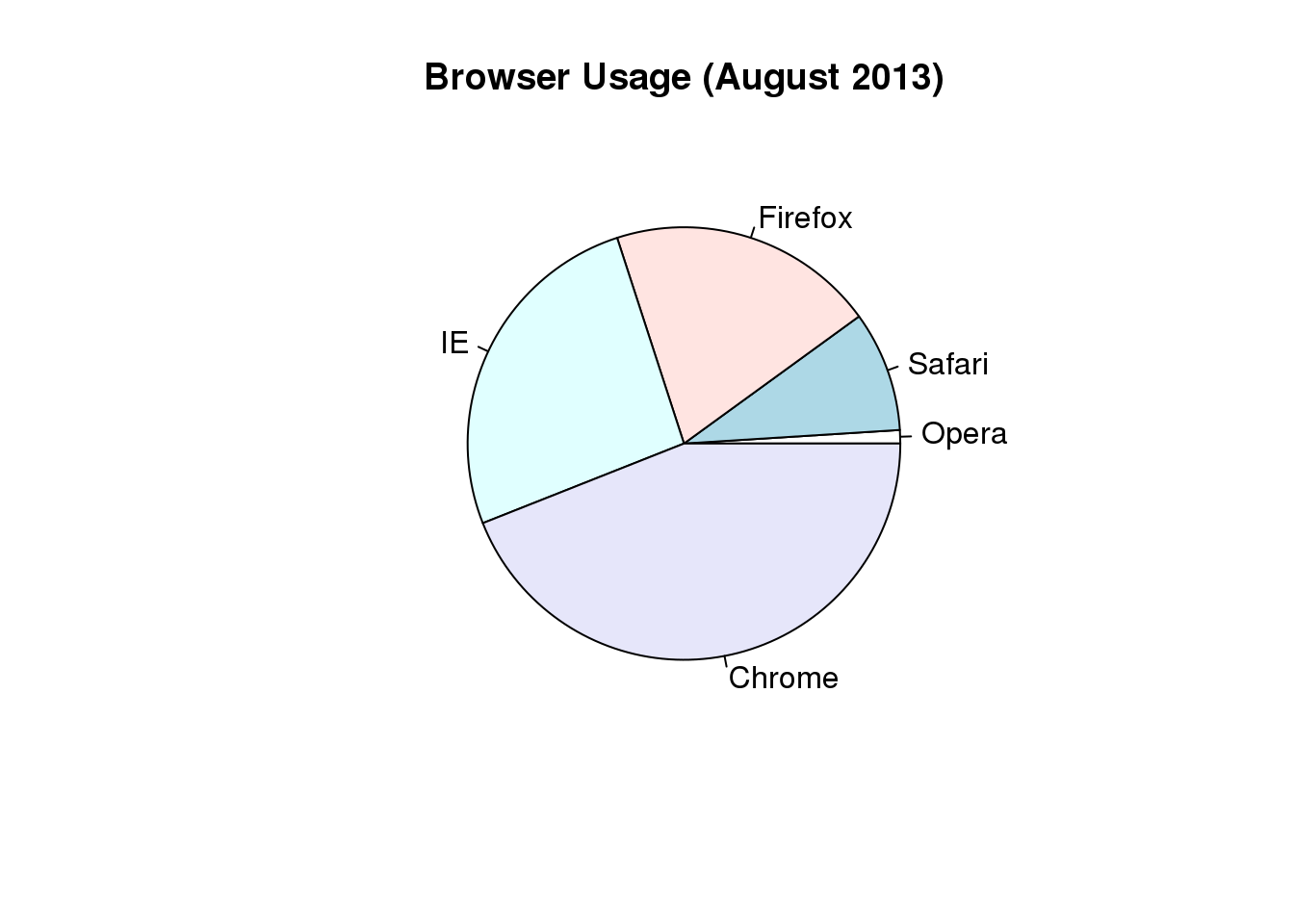
图 3.6: Pie chart of browser usage.
Nonetheless, as stated by the help file for the pie function:
“Pie charts are a very bad way of displaying information. The eye is good at judging linear measures and bad at judging relative areas. A bar chart or dot chart is a preferable way of displaying this type of data.”
To see this, look at the figure above and try to determine the percentages just from looking at the plot. Unless the percentages are close to 25%, 50% or 75%, this is not so easy. Simply showing the numbers is not only clear, but also saves on printing costs.
browsers## Opera Safari Firefox IE Chrome
## 1 9 20 26 44If you do want to plot them, then a barplot is appropriate. Here we add horizontal lines at every multiple of 10 and then redraw the bars:
barplot(browsers, main="Browser Usage (August 2013)", ylim=c(0,55))
abline(h=1:5 * 10)
barplot(browsers, add=TRUE)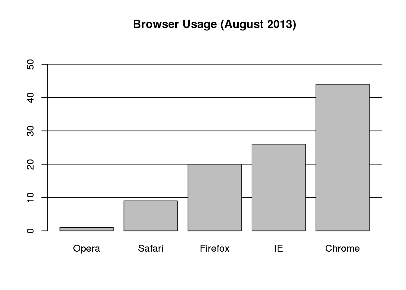
图 3.7: Barplot of browser usage.
Notice that we can now pretty easily determine the percentages by following a horizontal line to the x-axis. Do avoid a 3D version since it obfuscates the plot, making it more difficult to find the percentages by eye.
3D version.
Even worse than pie charts are donut plots.

Donut plot.
The reason is that by removing the center, we remove one of the visual cues for determining the different areas: the angles. There is no reason to ever use a donut plot to display data.
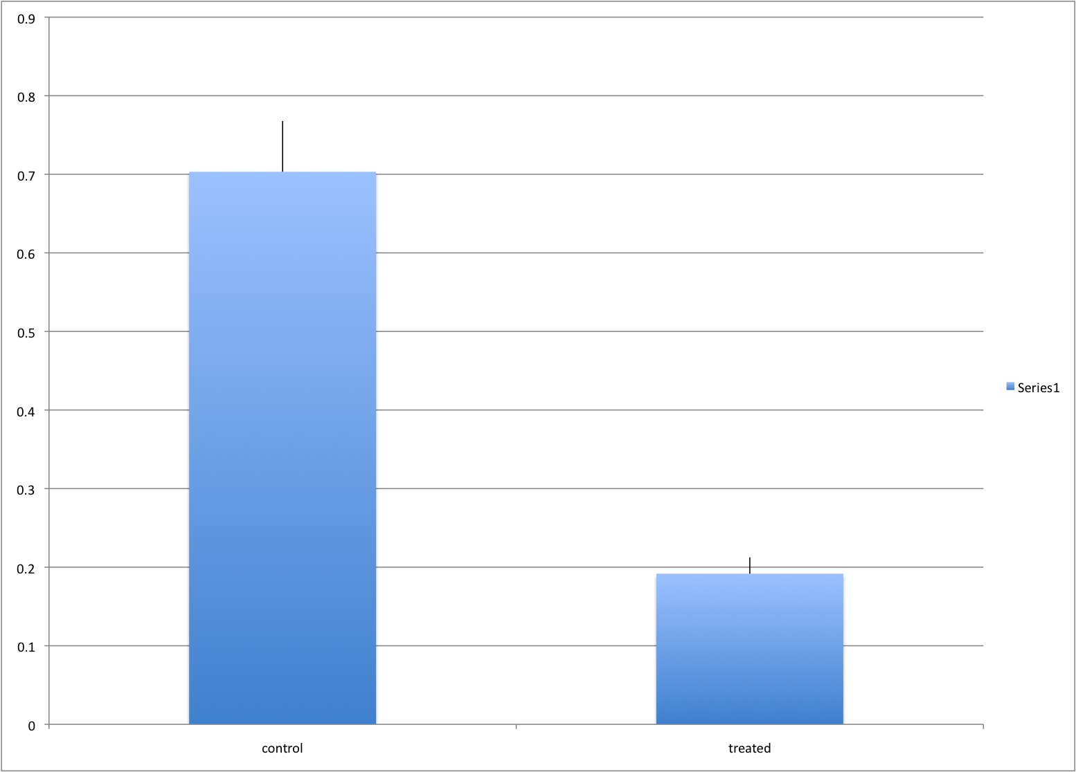
3.6.0.2 Barplots as data summaries
While barplots are useful for showing percentages, they are incorrectly used to display data from two groups being compared. Specifically, barplots are created with height equal to the group means; an antenna is added at the top to represent standard errors. This plot is simply showing two numbers per group and the plot adds nothing:
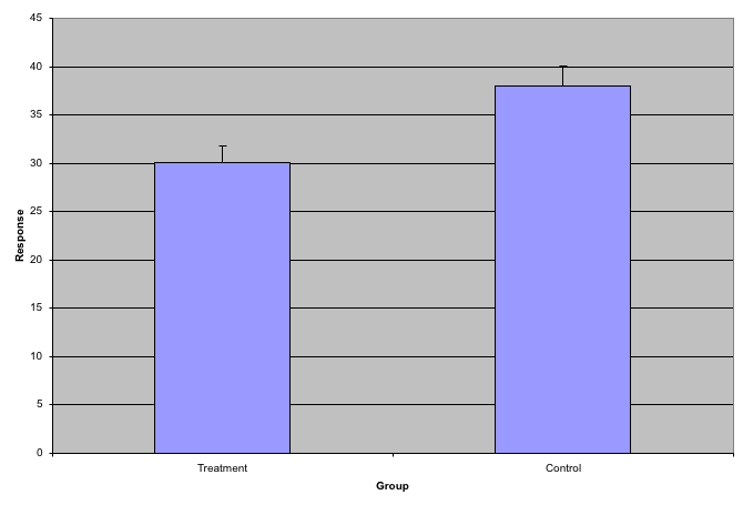
Bad bar plots.
Much more informative is to summarize with a boxplot. If the number of points is small enough, we might as well add them to the plot. When the number of points is too large for us to see them, just showing a boxplot is preferable. We can even set range=0 in boxplot to avoid drawing many outliers when the data is in the range of millions.
Let’s recreate these barplots as boxplots. First let’s download the data:
library(downloader)
filename <- "fig1.RData"
url <- "https://github.com/kbroman/Talk_Graphs/raw/master/R/fig1.RData"
if (!file.exists(filename)) download(url,filename)
load(filename)
Now we can simply show the points and make simple boxplots:
library(rafalib)
mypar()
dat <- list(Treatment=x,Control=y)
boxplot(dat,xlab="Group",ylab="Response",cex=0)
stripchart(dat,vertical=TRUE,method="jitter",pch=16,add=TRUE,col=1)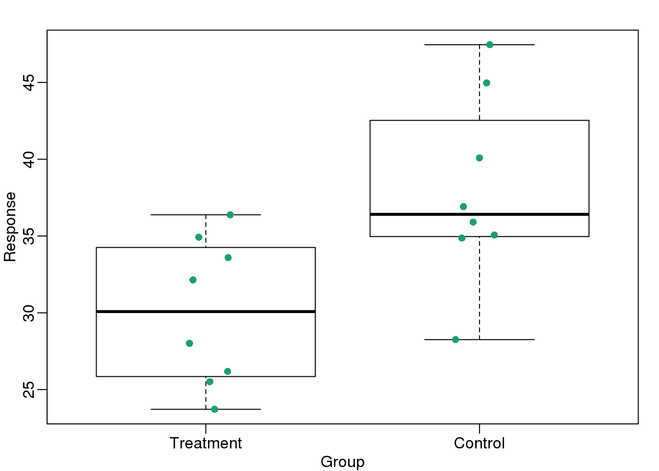
图 3.8: Treatment data and control data shown with a boxplot.
Notice how much more we see here: the center, spread, range, and the points themselves. In the barplot, we only see the mean and the SE, and the SE has more to do with sample size than with the spread of the data.
This problem is magnified when our data has outliers or very large tails. In the plot below, there appears to be very large and consistent differences between the two groups:
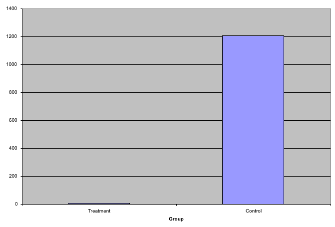
Bar plots with outliers.
However, a quick look at the data demonstrates that this difference is mostly driven by just two points. A version showing the data in the log-scale is much more informative.
Start by downloading data:
library(downloader)
url <- "https://github.com/kbroman/Talk_Graphs/raw/master/R/fig3.RData"
filename <- "fig3.RData"
if (!file.exists(filename)) download(url, filename)
load(filename)
Now we can show data and boxplots in original scale and log-scale.
library(rafalib)
mypar(1,2)
dat <- list(Treatment=x,Control=y)

boxplot(dat,xlab="Group",ylab="Response",cex=0)
stripchart(dat,vertical=TRUE,method="jitter",pch=16,add=TRUE,col=1)

boxplot(dat,xlab="Group",ylab="Response",log="y",cex=0)
stripchart(dat,vertical=TRUE,method="jitter",pch=16,add=TRUE,col=1)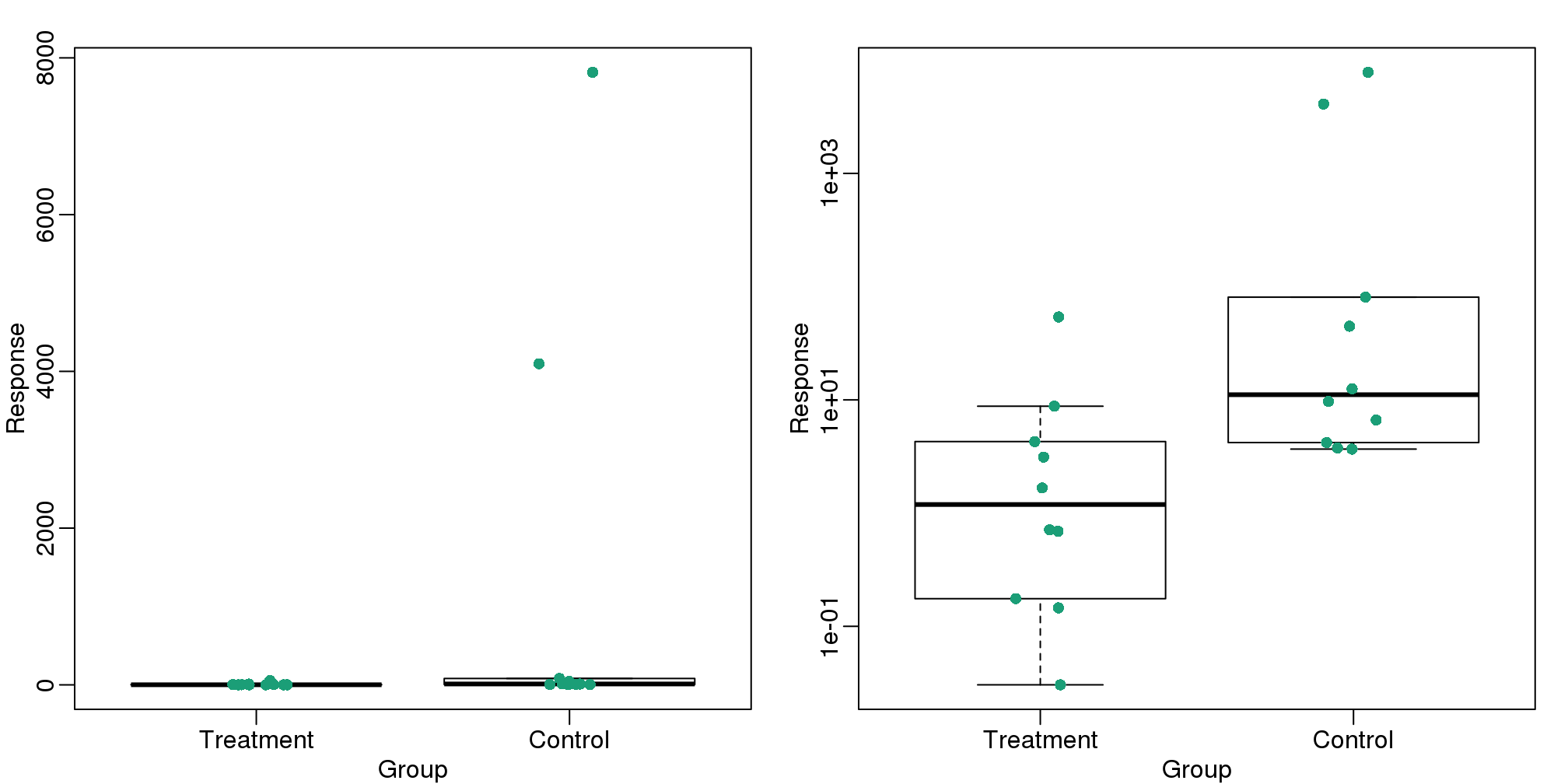
(#fig:importance_of_log)Data and boxplots for original data (left) and in log scale (right).
3.6.0.3 Show the scatter plot
The purpose of many statistical analyses is to determine relationships between two variables. Sample correlations are typically reported and sometimes plots are displayed to show this. However, showing just the regression line is one way to display your data badly since it hides the scatter. Surprisingly, plots such as the following are commonly seen.
Again start by loading data:
url <- "https://github.com/kbroman/Talk_Graphs/raw/master/R/fig4.RData"
filename <- "fig4.RData"
if (!file.exists(filename)) download(url, filename)
load(filename)mypar(1,2)
plot(x,y,lwd=2,type="n")
fit <- lm(y~x)
abline(fit$coef,lwd=2)
b <- round(fit$coef,4)
text(78, 200, paste("y =", b[1], "+", b[2], "x"), adj=c(0,0.5))
rho <- round(cor(x,y),4)
text(78, 187,expression(paste(rho," = 0.8567")),adj=c(0,0.5))
plot(x,y,lwd=2)
fit <- lm(y~x)
abline(fit$coef,lwd=2)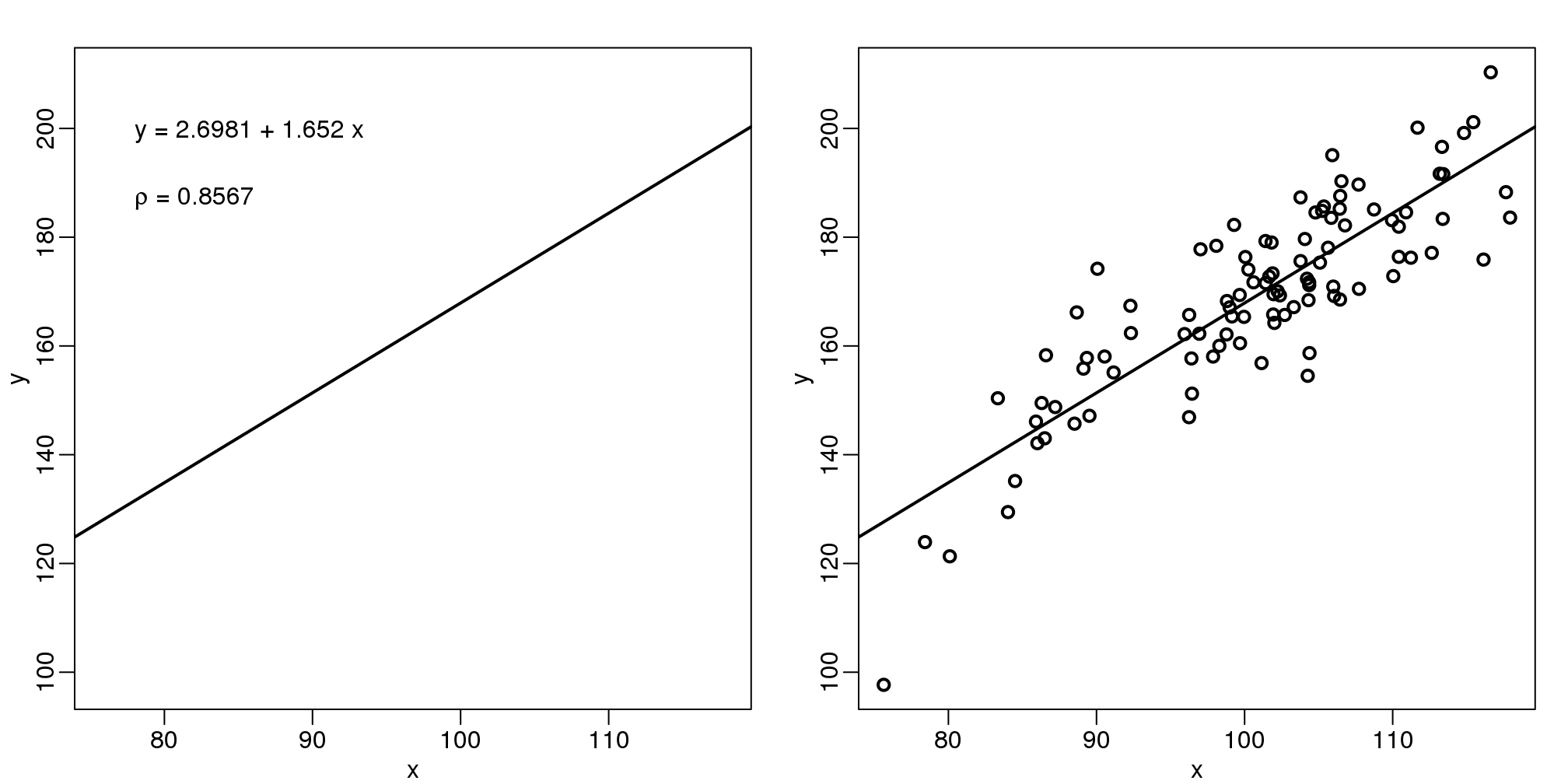
图 3.9: The plot on the left shows a regression line that was fitted to the data shown on the right. It is much more informative to show all the data.
When there are large amounts of points, the scatter can be shown by binning in two dimensions and coloring the bins by the number of points in the bin. An example of this is the hexbin function in the hexbin package.
3.6.0.4 High correlation does not imply replication
When new technologies or laboratory techniques are introduced, we are often shown scatter plots and correlations from replicated samples. High correlations are used to demonstrate that the new technique is reproducible. Correlation, however, can be very misleading. Below is a scatter plot showing data from replicated samples run on a high throughput technology. This technology outputs 12,626 simultaneous measurements.
In the plot on the left, we see the original data which shows very high correlation. Yet the data follows a distribution with very fat tails. Furthermore, 95% of the data is below the green line. The plot on the right is in the log scale:
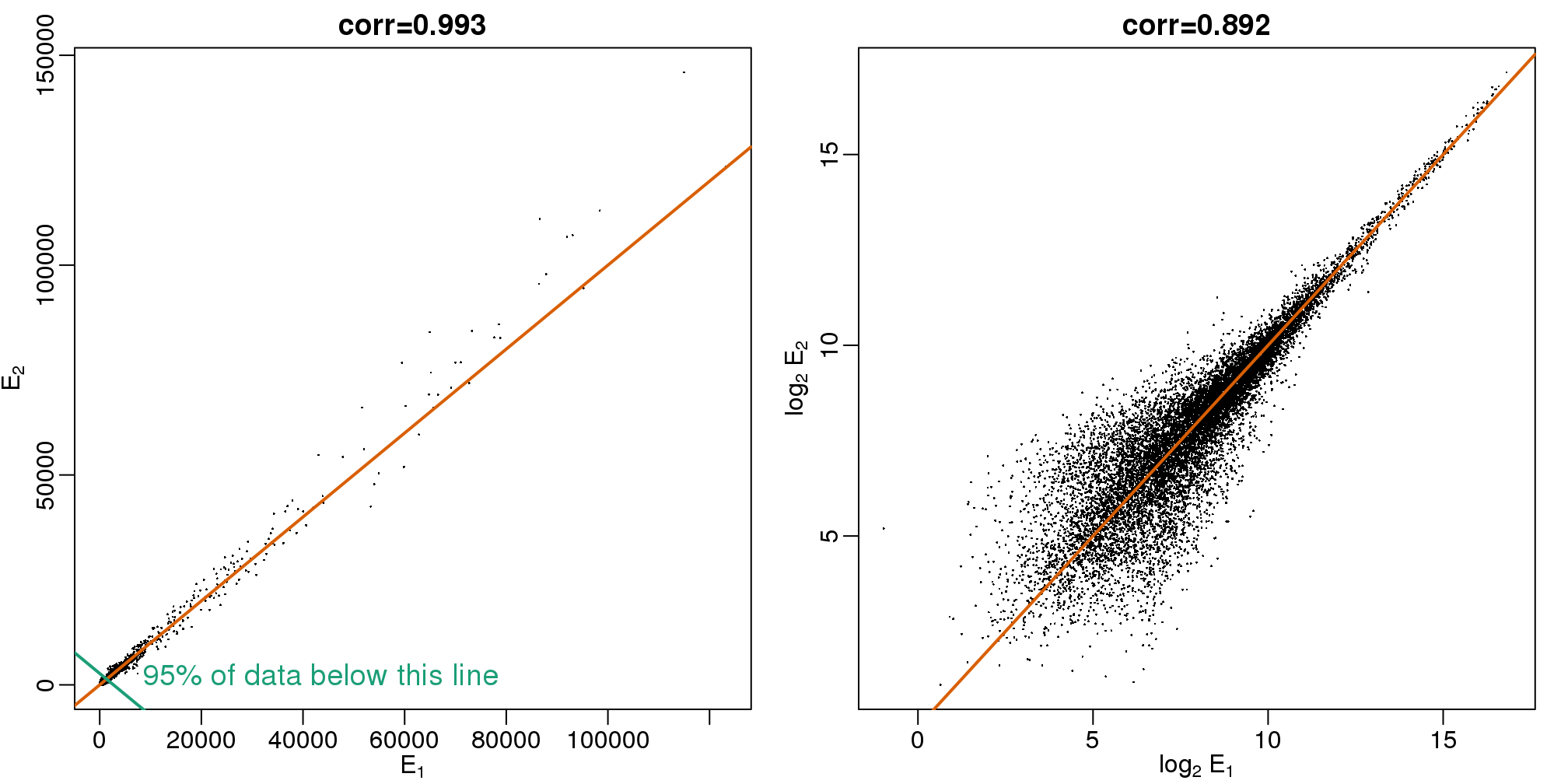
图 3.10: Gene expression data from two replicated samples. Left is in original scale and right is in log scale.
Note that we do not show the code here as it is rather complex but we explain how to make MA plots in a later chapter.
Although the correlation is reduced in the log-scale, it is very close to 1 in both cases. Does this mean these data are reproduced? To examine how well the second vector reproduces the first, we need to study the differences. We therefore should plot that instead. In this plot, we plot the difference (in the log scale) versus the average:
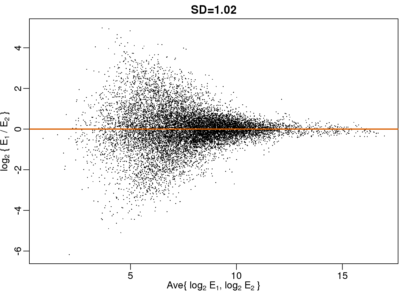
图 3.11: MA plot of the same data shown above shows that data is not replicated very well despite a high correlation.
These are referred to as Bland-Altman plots, or MA plots in the genomics literature, and we will talk more about them later. “MA” stands for “minus” and “average” because in this plot, the y-axis is the difference between two samples on the log scale (the log ratio is the difference of the logs), and the x-axis is the average of the samples on the log scale. In this plot, we see that the typical difference in the log (base 2) scale between two replicated measures is about 1. This means that when measurements should be the same, we will, on average, observe 2 fold difference. We can now compare this variability to the differences we want to detect and decide if this technology is precise enough for our purposes.
3.6.0.5 Barplots for paired data
A common task in data analysis is the comparison of two groups. When the dataset is small and data are paired, such as the outcomes before and after a treatment, two-color barplots are unfortunately often used to display the results.
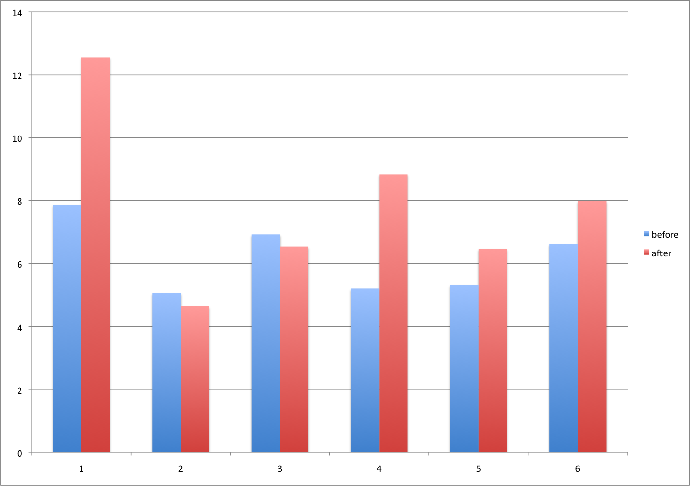
Barplot for two variables.
There are better ways of showing these data to illustrate that there is an increase after treatment. One is to simply make a scatter plot, which shows that most points are above the identity line. Another alternative is to plot the differences against the before values.
set.seed(12201970)
before <- runif(6, 5, 8)
after <- rnorm(6, before*1.05, 2)
li <- range(c(before, after))
ymx <- max(abs(after-before))

mypar(1,2)
plot(before, after, xlab="Before", ylab="After",
     ylim=li, xlim=li)
abline(0,1, lty=2, col=1)

plot(before, after-before, xlab="Before", ylim=c(-ymx, ymx),
     ylab="Change (After - Before)", lwd=2)
abline(h=0, lty=2, col=1)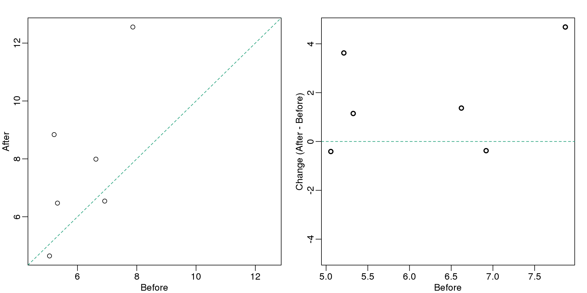
图 3.12: For two variables a scatter plot or a ‘rotated’ plot similar to an MA plot is much more informative.
Line plots are not a bad choice, although I find them harder to follow than the previous two. Boxplots show you the increase, but lose the paired information.
z <- rep(c(0,1), rep(6,2))
mypar(1,2)
plot(z, c(before, after),
     xaxt="n", ylab="Response",
     xlab="", xlim=c(-0.5, 1.5))
axis(side=1, at=c(0,1), c("Before","After"))
segments(rep(0,6), before, rep(1,6), after, col=1)

boxplot(before,after,names=c("Before","After"),ylab="Response")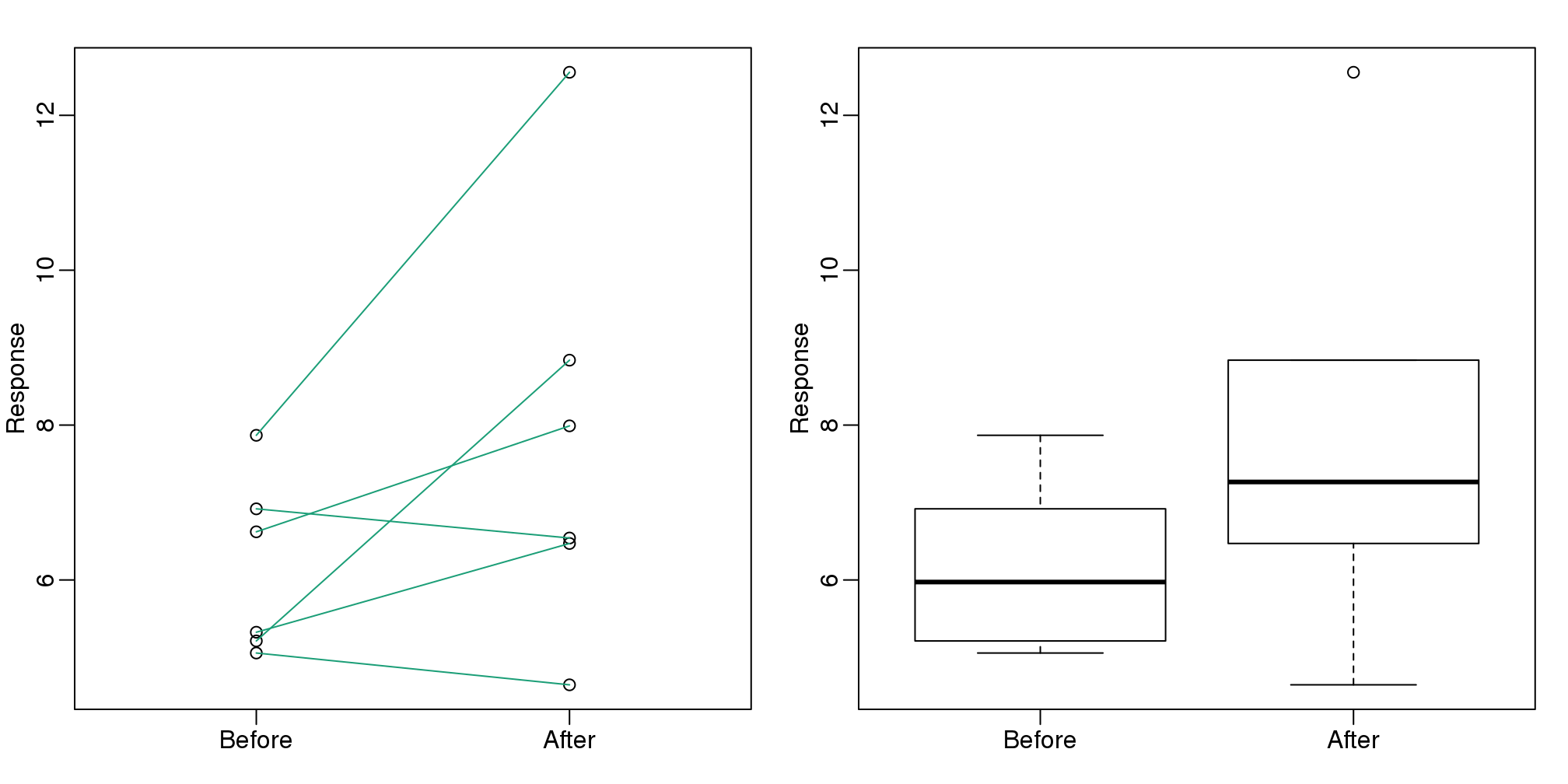
图 3.13: Another alternative is a line plot. If we don’t care about pairings, then the boxplot is appropriate.
3.6.0.6 Gratuitous 3D
The figure below shows three curves. Pseudo 3D is used, but it is not clear why. Maybe to separate the three curves? Notice how difficult it is to determine the values of the curves at any given point:
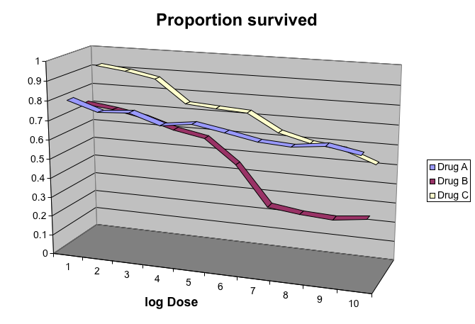
Gratuitous 3-D.
This plot can be made better by simply using color to distinguish the three lines:
##First read data
url <- "https://github.com/kbroman/Talk_Graphs/raw/master/R/fig8dat.csv"
x <- read.csv(url)

##Now make alternative plot
plot(x[,1],x[,2],xlab="log Dose",ylab="Proportion survived",ylim=c(0,1),
     type="l",lwd=2,col=1)
lines(x[,1],x[,3],lwd=2,col=2)
lines(x[,1],x[,4],lwd=2,col=3)
legend(1,0.4,c("Drug A","Drug B","Drug C"),lwd=2, col=1:3)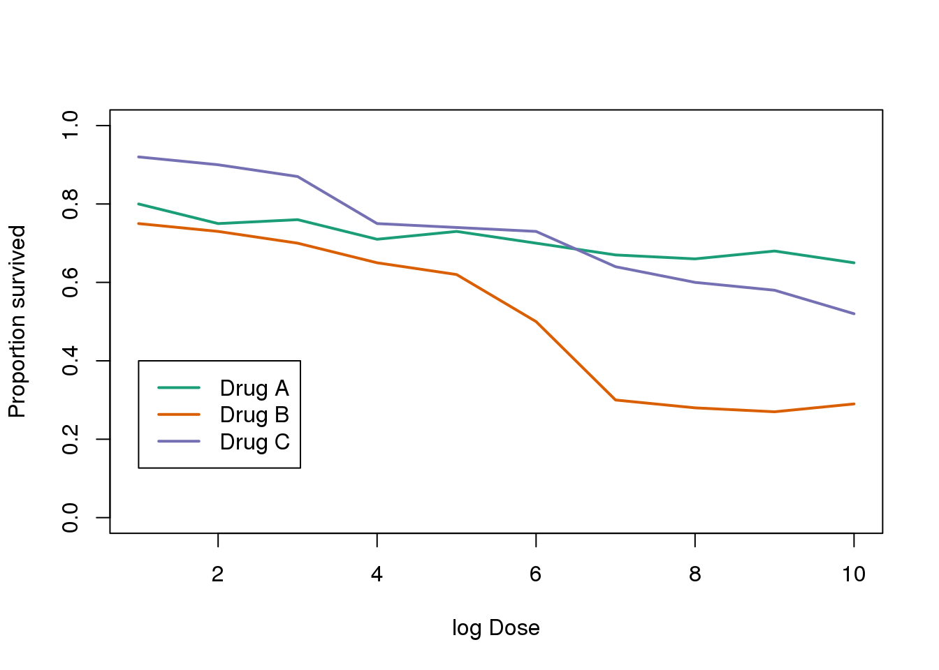
图 3.14: This plot demonstrates that using color is more than enough to distinguish the three lines.
3.6.0.7 Ignoring important factors
In this example, we generate data with a simulation. We are studying a dose-response relationship between two groups: treatment and control. We have three groups of measurements for both control and treatment. Comparing treatment and control using the common barplot.
Ignoring important factors.
Instead, we should show each curve. We can use color to distinguish treatment and control, and dashed and solid lines to distinguish the original data from the mean of the three groups.
plot(x, y1, ylim=c(0,1), type="n", xlab="Dose", ylab="Response")
for(i in 1:3) lines(x, y[,i], col=1, lwd=1, lty=2)
for(i in 1:3) lines(x, z[,i], col=2, lwd=1, lty=2)
lines(x, ym, col=1, lwd=2)
lines(x, zm, col=2, lwd=2)
legend("bottomleft", lwd=2, col=c(1, 2), c("Control", "Treated"))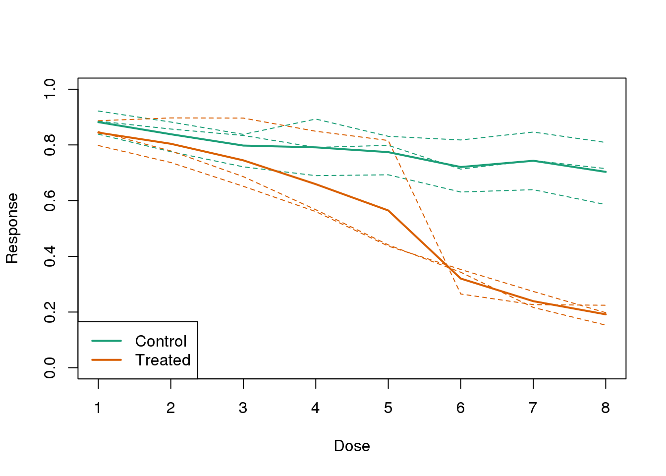
图 3.15: Because dose is an important factor, we show it in this plot.
3.6.0.8 Too many significant digits
By default, statistical software like R returns many significant digits. This does not mean we should report them. Cutting and pasting directly from R is a bad idea since you might end up showing a table, such as the one below, comparing the heights of basketball players:
heights <- cbind(rnorm(8,73,3),rnorm(8,73,3),rnorm(8,80,3),
                 rnorm(8,78,3),rnorm(8,78,3))
colnames(heights)<-c("SG","PG","C","PF","SF")
rownames(heights)<- paste("team",1:8)
heights
## SG PG C PF SF
## team 1 76.40 76.21 81.68 75.33 77.19
## team 2 74.14 71.10 80.30 81.58 73.01
## team 3 71.51 69.02 85.80 80.09 72.80
## team 4 78.72 72.81 81.34 76.30 82.93
## team 5 73.42 73.28 79.20 79.71 80.30
## team 6 72.94 71.81 77.36 81.69 80.40
## team 7 68.38 73.01 79.11 71.25 77.20
## team 8 73.78 75.59 82.99 75.58 87.68We are reporting precision up to 0.00001 inches. Do you know of a tape measure with that much precision? This can be easily remedied:
round(heights,1)## SG PG C PF SF
## team 1 76.4 76.2 81.7 75.3 77.2
## team 2 74.1 71.1 80.3 81.6 73.0
## team 3 71.5 69.0 85.8 80.1 72.8
## team 4 78.7 72.8 81.3 76.3 82.9
## team 5 73.4 73.3 79.2 79.7 80.3
## team 6 72.9 71.8 77.4 81.7 80.4
## team 7 68.4 73.0 79.1 71.2 77.2
## team 8 73.8 75.6 83.0 75.6 87.73.6.0.9 Displaying data well
In general, you should follow these principles:
- Be accurate and clear.
- Let the data speak.
- Show as much information as possible, taking care not to obscure the message.
- Science not sales: avoid unnecessary frills (especially gratuitous 3D).
- In tables, every digit should be meaningful. Don’t drop ending 0’s.
Some further reading:
- ER Tufte (1983) The visual display of quantitative information. Graphics Press.
- ER Tufte (1990) Envisioning information. Graphics Press.
- ER Tufte (1997) Visual explanations. Graphics Press.
- WS Cleveland (1993) Visualizing data. Hobart Press.
- WS Cleveland (1994) The elements of graphing data. CRC Press.
- A Gelman, C Pasarica, R Dodhia (2002) Let’s practice what we preach: Turning tables into graphs. The American Statistician 56:121-130.
- NB Robbins (2004) Creating more effective graphs. Wiley.
- Nature Methods columns
3.7 Misunderstanding Correlation (Advanced)
The use of correlation to summarize reproducibility has become widespread in, for example, genomics. Despite its English language definition, mathematically, correlation is not necessarily informative with regards to reproducibility. Here we briefly describe three major problems.
The most egregious related mistake is to compute correlations of data that are not approximated by bivariate normal data. As described above, averages, standard deviations and correlations are popular summary statistics for two-dimensional data because, for the bivariate normal distribution, these five parameters fully describe the distribution. However, there are many examples of data that are not well approximated by bivariate normal data. Raw gene expression data, for example, tends to have a distribution with a very fat right tail.
The standard way to quantify reproducibility between two sets of replicated measurements, say \(x_1,\dots,x_n\) and \(y_1,\dots,y_n\), is simply to compute the distance between them:
\[ \sqrt{ \sum_{i=1}^n d_i^2} \mbox{ with } d_i=x_i - y_i \]
This metric decreases as reproducibility improves and it is 0 when the reproducibility is perfect. Another advantage of this metric is that if we divide the sum by N, we can interpret the resulting quantity as the standard deviation of the \(d_1,\dots,d_N\) if we assume the \(d\) average out to 0. If the \(d\) can be considered residuals, then this quantity is equivalent to the root mean squared error (RMSE), a summary statistic that has been around for over a century. Furthermore, this quantity will have the same units as our measurements resulting in a more interpretable metric.
Another limitation of the correlation is that it does not detect cases that are not reproducible due to average changes. The distance metric does detect these differences. We can rewrite:
\[\frac{1}{n} \sum_{i=1}^n (x_i - y_i)^2 = \frac{1}{n} \sum_{i=1}^n [(x_i - \mu_x) - (y_i - \mu_y) + (\mu_x - \mu_y)]^2\]
with \(\mu_x\) and \(\mu_y\) the average of each list. Then we have:
\[\frac{1}{n} \sum_{i=1}^n (x_i - y_i)^2 = \frac{1}{n} \sum_{i=1}^n (x_i-\mu_x)^2 + \frac{1}{n} \sum_{i=1}^n (y_i - \mu_y)^2 + (\mu_x-\mu_y)^2 + \frac{1}{n}\sum_{i=1}^n (x_i-\mu_x)(y_i - \mu_y) \]
For simplicity, if we assume that the variance of both lists is 1, then this reduces to:
\[\frac{1}{n} \sum_{i=1}^n (x_i - y_i)^2 = 2 + (\mu_x-\mu_y)^2 - 2\rho\]
with \(\rho\) the correlation. So we see the direct relationship between distance and correlation. However, an important difference is that the distance contains the term \[(\mu_x-\mu_y)^2\] and, therefore, it can detect cases that are not reproducible due to large average changes.
Yet another reason correlation is not an optimal metric for reproducibility is the lack of units. To see this, we use a formula that relates the correlation of a variable with that variable, plus what is interpreted here as deviation: \(x\) and \(y=x+d\). The larger the variance of \(d\), the less \(x+d\) reproduces \(x\). Here the distance metric would depend only on the variance of \(d\) and would summarize reproducibility. However, correlation depends on the variance of \(x\) as well. If \(d\) is independent of \(x\), then
\[ \mbox{cor}(x,y) = \frac{1}{\sqrt{1+\mbox{var}(d)/\mbox{var}(x)}} \]
This suggests that correlations near 1 do not necessarily imply reproducibility. Specifically, irrespective of the variance of \(d\), we can make the correlation arbitrarily close to 1 by increasing the variance of \(x\).
3.8 Robust Summaries
当分析生命科学类数据的时候通常会利用正态逼近的方法。但是,由于测量设备的复杂性,通常会因为不理想的分析过程而产生错误的观察数据点。例如:一个扫描仪的缺陷会产生一些高亮的点或者一个PCR的偏好性会导致某些片段的扩增效率高于其他片段。因此,我们在一定情况下需要近似值,例如,有99个数据点符合正态分布,但是其中一个位点有较大的数值。
set.seed(1)
x=c(rnorm(100,0,1)) ##real distribution
x[23] <- 100 ##mistake made in 23th measurement
boxplot(x)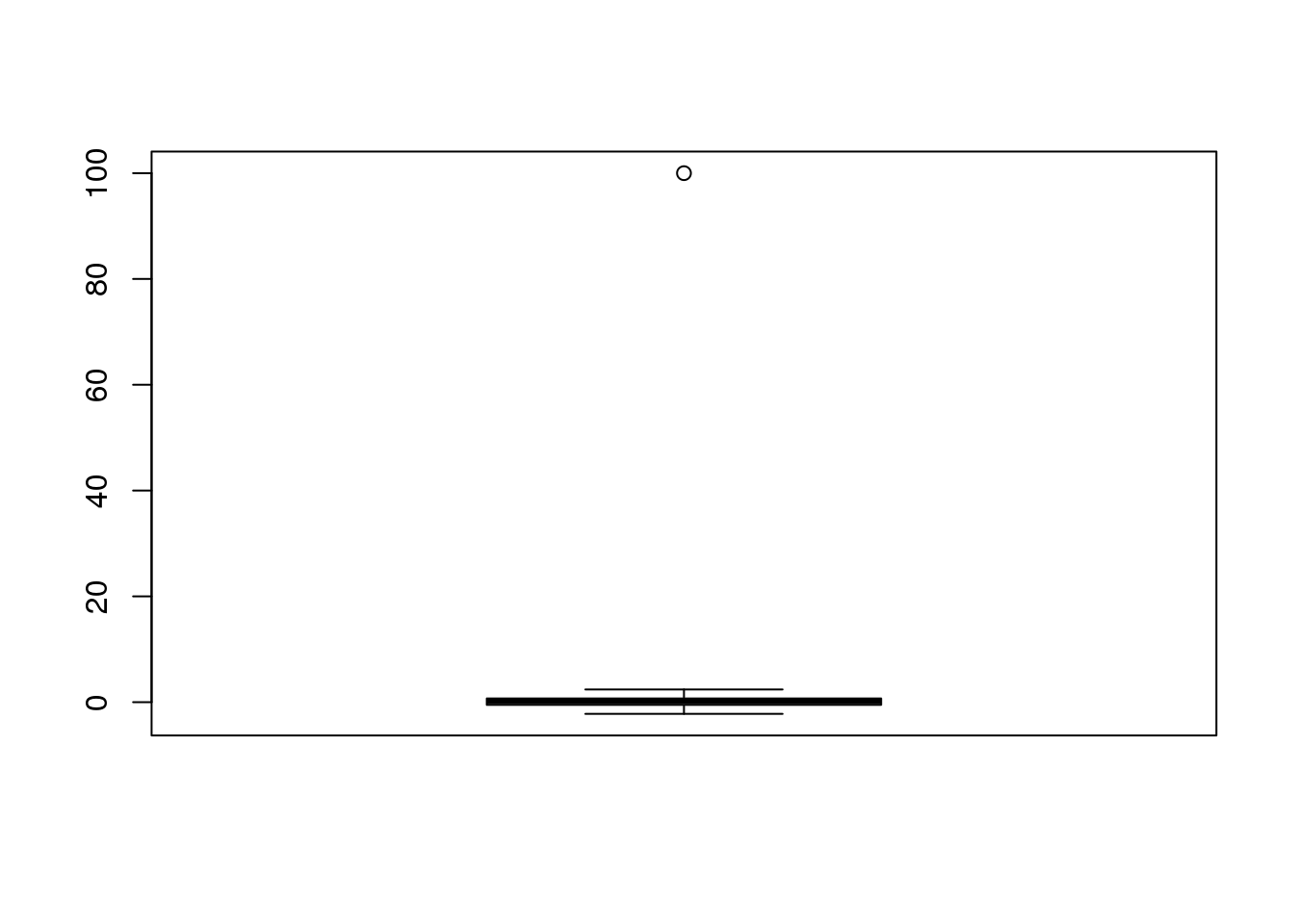
(#fig:boxplot_showing_outlier)Normally distributed data with one point that is very large due to a mistake.
在统计学中, 我们把这类的值认为是离群值。在整个的分析过程中,我们可以将少数离群值丢弃掉。例如有一个离群值的点影响了样本的平均值或者样本方差距离0和1较远。
cat("The average is",mean(x),"and the SD is",sd(x))## The average is 1.108 and the SD is 10.033.8.0.1 The median
中位数是一个总结性的统计量,不受离群值的影响,因为中位数是一个样本数据中的一个点,对于这个点有一半的数据比他大,有一半的数据比他小。注意,越靠近中位数的点,越能够靠近真实样本分布的中心值。
median(x)## [1] 0.16843.8.0.2 The median absolute deviation
绝对中位差是对标准偏差的一个强健的总结。它的定义是通过计算每一个样本值与中位数之间的差异,然后取它们和中位数差的的绝对值。 \[ 1.4826 \mbox{median} \lvert X_i - \mbox{median}(X_i) \rvert \]
1.4826是一个换算系数,因此绝对中位差是一个对标准偏差的无偏差估计。注意,我们计算时绝对中位差距离1的距离是多远。
mad(x)## [1] 0.88573.8.0.3 Spearman correlation
之前我们提到相关性同时也受离群值的影响。因此,我们构建了一个独立的数字列表,但是对于这个列表一个也会产生相同的问题。
set.seed(1)
x=rnorm(100,0,1) ##real distribution
x[23] <- 100 ##mistake made in 23th measurement
y=rnorm(100,0,1) ##real distribution
y[23] <- 84 ##similar mistake made in 23th measurement
library(rafalib)
mypar()
plot(x,y,main=paste0("correlation=",round(cor(x,y),3)),
     pch=21,bg=1,xlim=c(-3,100),ylim=c(-3,100))
abline(0,1)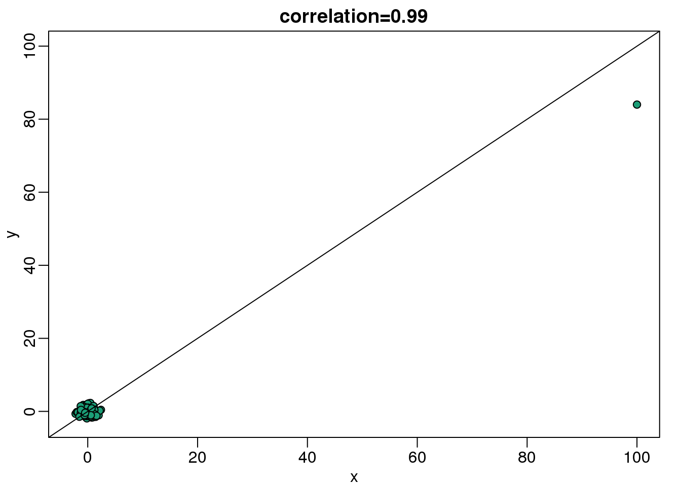
(#fig:scatter_plot_showing_outlier)Scatterplot showing bivariate normal data with one signal outlier resulting in large values in both dimensions.
斯皮尔曼相关系数遵循了中位数和绝对中位差的思想,用分位数来进行相应的相关性计算。这个想法很简单,就是通过将数据集进行排序,然后再进行相关性的计算。
mypar(1,2)
plot(x,y,main=paste0("correlation=",round(cor(x,y),3)),pch=21,bg=1,xlim=c(-3,100),ylim=c(-3,100))
plot(rank(x),rank(y), main=paste0("correlation=",round(cor(x,y,method="spearman"),3)),
     pch=21,bg=1,xlim=c(-3,100),ylim=c(-3,100))
abline(0,1)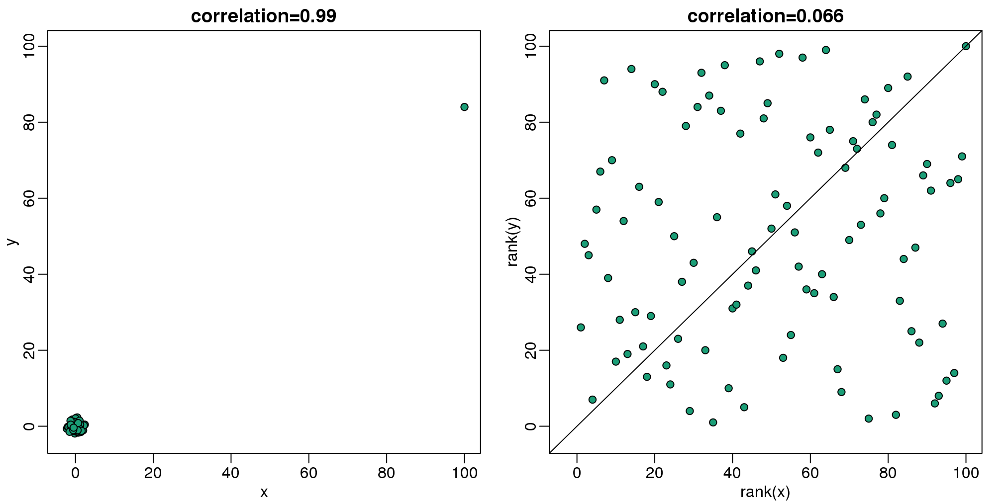
(#fig:spearman_corr_illustration)Scatterplot of original data (left) and ranks (right). Spearman correlation reduces the influence of outliers by considering the ranks instead of original data.
因此,如果这些统计方法能够很好的避免离群值的影响,我们为什么要用那些受离群值影响的版本呢?通常来说,如果我们知道数据集中有一些离群值,那么我们推荐使用中位数和绝对中位差来代替平均数和标准偏差来进行相关性计算。但是,也有一些例子表明,强健的统计方法较不强健的统计方法结果不是那么的有效。
我们也注意到,关于强健的统计方法有大量的统计学文献进行表述,这些方法有些要远远的超过了中位数和绝对中位差统计方法。
3.8.0.4 比率对数的对称性
比率是不对称的。为了验证这个,我们首先通过使用两个正相关的随机数据集的比率来进行模拟,这两个数据集代表了两个样本中基因的表达量。
x <- 2^(rnorm(100))
y <- 2^(rnorm(100))
ratios <- x / y
在生命科学领域中通常使用比率或者变化倍数。假设你正在研究基因在处理前后表达量的比率。你将得到基因表达量的比率,如果比率的值大于1表明基因在处理后表达量是升高的。如果处理样本没有影响,那么我们将会得到一些比率小于1或者等于1数据。柱状图似乎可以表明处理是否对样本产生了实际的影响。
mypar(1,2)
hist(ratios)

logratios <- log2(ratios)
hist(logratios)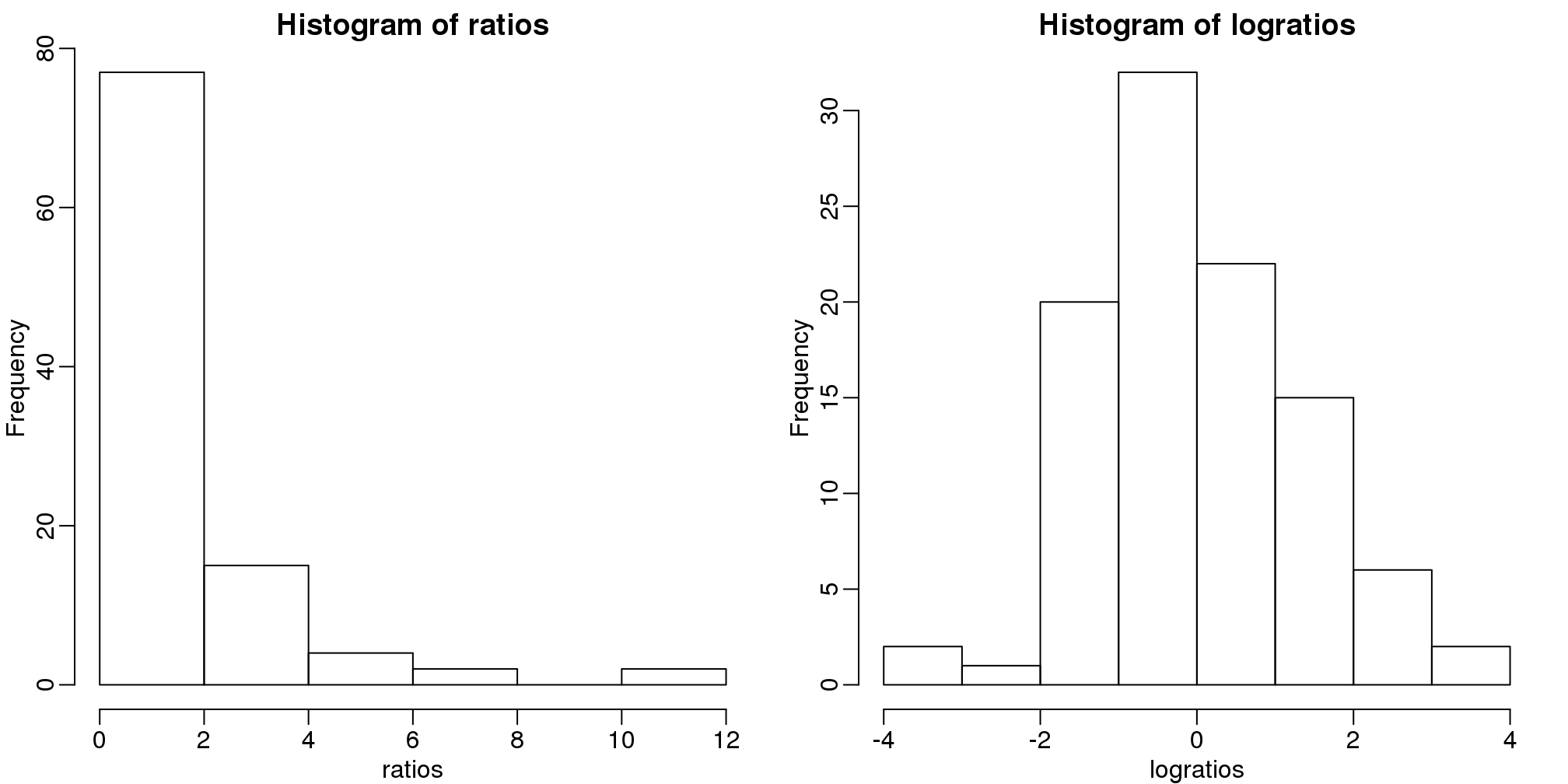
图 3.16: Histogram of original (left) and log (right) ratios.
在这里存在一个问题,就是比率不是在1左右相互对称的。例如,1/32比32/1更加的靠近1。使用对数可以解决这个问题。对数的比率一定是在0左右相互对称的。因为:
\[\log(x/y) = \log(x)-\log(y) = -(\log(y)-\log(x)) = \log(y/x)\]
正如这个简单的图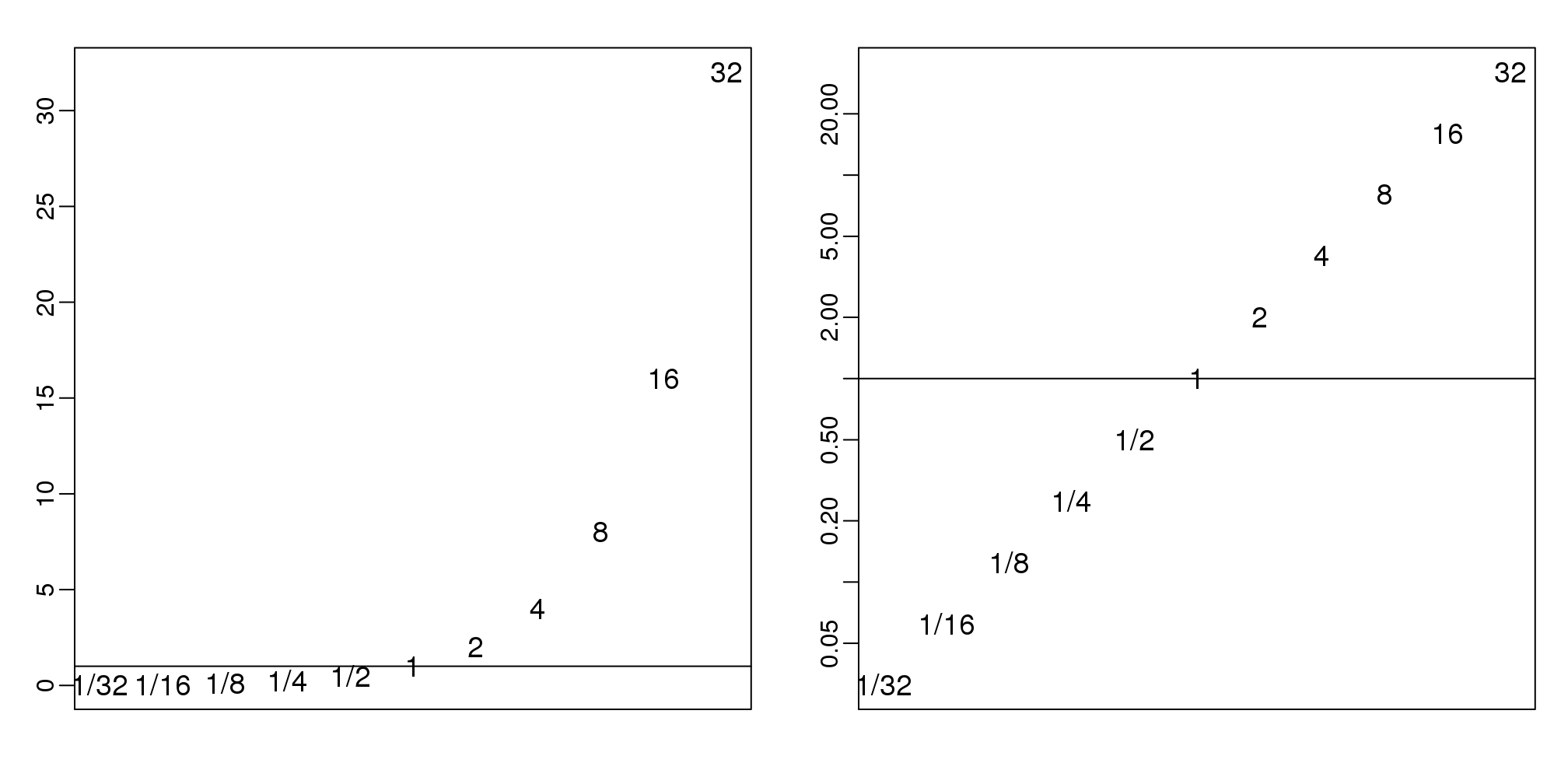
图 3.17: Histogram of original (left) and log (right) powers of 2 seen as ratios.
在生命科学领域,也经常使用将数据进行对数转换,因为在定量感兴趣的数据时(乘法)变化倍数是使用最多的方法。注意,变化倍数为100可能是100/1或1/100。但是,如果不使用变化倍数,1/100比100/1更加的靠近1,这就说明了数据不是在1左右相互对称的。
3.9 非参检验方法之Wilcoxon Rank Sum Test
我们知道样本的平均值和标准偏差是如何受离群值影响的。基于平均值和标准偏差的T-test同样也受离群值的影响。威尔科克森秩检验(曼-惠特尼检验)提供了另外的一个方法。在下面的代码中,我们完成了对一个非空数据集的t-test。但是,当我们在每一个样本中错误的改变一个和的观察值,我们发现得到的每一个错误的值也是不同的。因此,我们发现t-test会产生一个小的p-value值,而威尔科克森检验却不会。
set.seed(779) ##779 picked for illustration purposes
N=25
x<- rnorm(N,0,1)
y<- rnorm(N,0,1)
创建离群值。
x[1] <- 5
x[2] <- 7
cat("t-test pval:",t.test(x,y)$p.value)
## t-test pval: 0.0444cat("Wilcox test pval:",wilcox.test(x,y)$p.value)## Wilcox test pval: 0.131数据处理的基本思想是:1)整合所有的数据。2)将数据转化成秩。3)再把数据分回到它们的组中。4)计算数据的和或者平均秩,然后再进行统计检验。
library(rafalib)
mypar(1,2)

stripchart(list(x,y),vertical=TRUE,ylim=c(-7,7),ylab="Observations",pch=21,bg=1)
abline(h=0)

xrank<-rank(c(x,y))[seq(along=x)]
yrank<-rank(c(x,y))[-seq(along=x)]

stripchart(list(xrank,yrank),vertical=TRUE,ylab="Ranks",pch=21,bg=1,cex=1.25)

ws <- sapply(x,function(z) rank(c(z,y))[1]-1)
text( rep(1.05,length(ws)), xrank, ws, cex=0.8)
图 3.18: Data from two populations with two outliers. The left plot shows the original data and the right plot shows their ranks. The numbers are the w values
W <-sum(ws) 其中,w是相对于第二组数据的第一组数据秩的和。我们可以基于组合学对\(W\)计算出一个准确的p-value值。由于之前的统计学理论告诉我们W是趋于正态分布的,因此我门也可以利用CLT的方法来进行计算。我们可以按照如下的方法计算z-score:
n1<-length(x);n2<-length(y)
Z <- (mean(ws)-n2/2)/ sqrt(n2*(n1+n2+1)/12/n1)
print(Z)
## [1] 1.523因为这里的Z值不足够的大,因此我们不能计算得到一个小于0.05的p-value值。这里有一部分的数据是通过R语言里面的wilcox.test功能计算得到的.